A Loaded terms
This appendix is organized in three parts: §A.1 fleshes out the idea of an empirical distribution; §A.2 is on power analysis; and §A.3 is on Monte Carlo (MC) error. Although these are important topics, I avoided details earlier so as not to derail our conversation. I think you can appreciate these concepts in passing, and without extensive detail. But if you’re curious, here is slightly less quick overview.
A.1 Empirical distribution
I use the term empirical distribution, or
ECDF, a bunch
in the book. Actually, ECDF stands for “empirical cumulative distribution
function”, but that’s a mouthful. I like ECDF as an acronym for a variety of
reasons. One is that there’s an R function called ecdf which helps with
calculations and visualization. I’ll get more into that soon. The other is
that ED is a terrible acronym because it can easily be confused with a certain
health issue, so I’ll steer clear.
All calculations based on MC that require visualizing or calculating a confidence interval (CI) or \(p\)-value are implicitly leveraging an ECDF. Some non-P procedures, even those that avoid MC, make use of an ECDF, though sometimes indirectly. Anything based on ranks is using one, too. If you’ve gotten to this point in the book – here at the very back – without skipping ahead to this appendix, you probably have a vague idea of what an ECDF is simply by suggestion. I’m ok with you name-dropping ECDF without deep understanding. Fake it ’till you make it! I sometimes use the word manifold without deep understanding. I try to keep it light when I do. I’ll be the first admit that I’m not that kind of mathematician.
Loosely, an ECDF is a distribution that is defined by a discrete collection of values or examples, rather than on a particular functional form. Here’s a simple example. Suppose you had a sample of data values.
Those y-values came from a Gaussian, an actual (known) distribution with
particular values for parameters. Those are not material to our discussion.
In fact, I’m going to ask you to forget about the Gaussian, except as a ground
truth (an actual distribution) to compare an empirical one to. The ECDF for
y is the step function that uses sorted y values on the \(x\)-axis, and a
normalized “staircase” of “+1s” on the \(y\)-axis. Here’s what I mean.
Figure A.1 plots that wonky staircase (left panel) and compares it
to what’s produced by the ecdf function in R. They’re right on top of one
another, so I’ve tried to adjust the size of the points and line types so that
both are still visible. Each stair, as climbed from left to right, always has
a vertical height of \(1/n\), but the width of its horizontal platform is
determined by the gap between adjacent sorted \(y^{(i)}\)-values, or order
statistics (§8.1).
par(mfrow=c(1, 2))
sfun <- stepfun(y, c(0, ey))
ygrid <- seq(min(y) - 5, max(y) + 5, length=1000)
plot(sfun, xlab="y", ylab="ecdf", main="", xlim=range(ygrid), lwd=2)
lines(ecdf(y), col=2, lwd=2, lty=2, cex=0.75)
legend("left", c("by hand", "ecdf"), col=1:2, lwd=2, lty=1:2, bty="n")
plot(ygrid, pnorm(ygrid, 12, 3), lwd=2, type="l", xlab="y", ylab="e/cdf")
lines(ecdf(y), col=2, lwd=2, lty=2)
legend("left", c("truth", "ecdf"), col=1:2, lwd=2, lty=1:2, bty="n")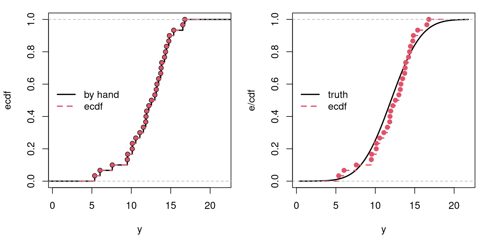
FIGURE A.1: Comparing the by-hand ECDF to R’s ecdf (left), and to the real CDF (right). The ecdf in both panels is the same.
The right panel of the figure offers a comparison to the true Gaussian
cumulative distribution function
(CDF) used to
generate y. Here we see that the empirical one is similar to the truth. As
you might imagine, the ECDF gets closer to the true CDF as \(n\) is increased. I
encourage you to try this example with n <- 1000 or larger. This is why,
when we use a really big \(N\) in a MC, we get accurate results. Our ECDF
approximation to the sampling distribution is then very close to the true CDF
of the sampling distribution. I’ll come back to that in a moment.
R’s ecdf actually returns a function that can be evaluated for any
\(y\)-value, sort-of like pnorm in R, but not specifically for a Gaussian –
for any y-values. Working with ranks, like in Chapters
9–12, is like working directly on an ECDF, except
skipping the divide-by-\(n\) part in the code block above. Notice how the
distribution function – any of the ones in Figure A.1 – is a
mapping between the domain of y, i.e., on the real number line/\(x\)-axis, to
the interval \((0,1)\) on the \(y\)-axis. Observations that are clumpy on the
\(x\)-axis (those are the y values) are uniform on the \(y\)-axis.
Inverting that logic … an inverse CDF can take something random uniform,
like ranks from random permutations (via sample), and impart on it a
non-uniform distribution. This is what quantile functions, like qnorm or
qbinom (any q*) do. The empirical analog is simply quantile in R.
Most people find it hard to intuit (cumulative) distribution functions. I’m
one of those people. Density or mass functions are easier. Whereas CDFs look
like s-curves, or sigmoids,
non-decreasing from left to right, densities go up and come back down, like
a bell curve or similar. Technically, a probability density (or mass)
function (PDF) is
the derivative of a CDF. Or, vice versa, a CDF is the indefinite integral
of a PDF from the left (usually \(-\infty\)). For samples of continuous
random variables, like our y vector, defining an ECDF, it’s hard to take a
derivative without making additional assumptions about smoothness, in a
calculus sense. Recall that derivatives are defined as limits.
Histograms have been our go-to for visualizing that derivative empirically. You might say they offer an “empirical (probability) density function (EPDF)”, although that isn’t really a thing. (Don’t go around talking about EPDFs. Anyone who knows this stuff will think you’re making things up. Even though it probably should be a thing.)
The closest thing to an EPDF is kernel density estimation
(KDE). KDE is like
a smooth version of a histogram. Whereas the ECDF is completely nonparametric
(non-P; see §8.1), histograms and KDEs are a bit of a
hybrid. They are still considered non-P, but since histograms have a bin size
and KDE involves a bandwidth parameter (and a choice of kernel), there’s
still a quantity that needs to be “dialed in”. Somewhat confusingly, the
command to fit a KDE in R is called density.
Figure A.2 offers a visual comparison between histogram and KDE
(left panel), and between KDE and truth (right). In both cases, the
“parameter” is estimated using an automatic procedure behind the scenes,
embedded in hist and density commands, respectively.
par(mfrow=c(1, 2))
hist(y, freq=FALSE, xlim=range(ygrid), ylim=range(kde$y), main="")
lines(kde, col=2, lwd=2, lty=2)
legend("topleft", "kde", col=2, lty=2, lwd=2, bty="n")
plot(ygrid, dnorm(ygrid, 12, 3), ylim=range(kde$y),
  lwd=2, type="l", xlab="y", ylab="pdf")
lines(kde, col=2, lwd=2, lty=2)
legend("topleft", c("truth", "kde"), col=1:2, lwd=2,
  lty=1:2, bty="n")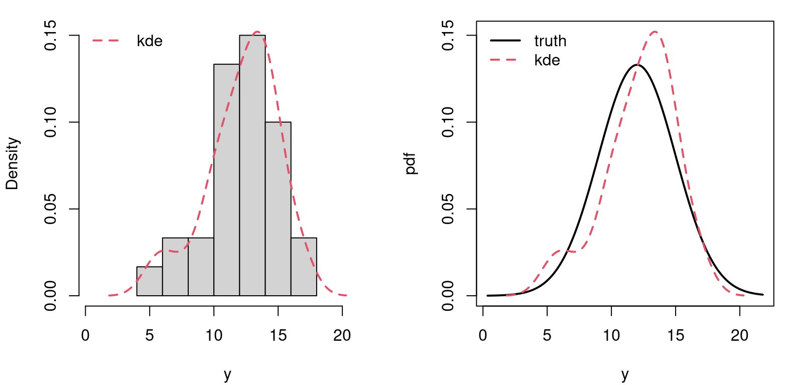
FIGURE A.2: Comparing histogram to kernel density (left) to the true Gaussian (right).
So, in conclusion, a sample may represent a distribution via an ECDF. The bigger that sample, the more accurate the representation. This is key to a MC calculation, where sample size \(N\) controls accuracy. Whereas an ECDF may be a crude approximation in the context of a small sample of data points of size \(n\), a sampling distribution based on big-\(N\) MC samples can be highly accurate. It can be lots better than an asymptotic approximation, for example based on the central limit theorem (CLT; Chapter 4). Size \(N\) gives you a dial on that accuracy, whereas \(n\) is fixed. MC \(p\)-value calculations essentially replace integrals from unknown distributions (or ones that are out of reach without hard math) with sums (or averages). In so doing, one is implicitly using an ECDF in that calculation. Quantiles of an MC sample can be used to calculate CIs.
A.2 Power analysis
I’ll be the first to admit this isn’t my area of expertise, which in part explains why power doesn’t play a more prominent role in the book. It’s also difficult stuff. My intention here is to provide some background for curious, engaged readers. Most of this material is derivative of Wasserman (2004), based on notes for a short course I once gave to a hedge fund in Chicago.
There are two types of errors we can make when basing decisions on the outcome of hypothesis tests like these. A type I error occurs when the null hypothesis (\(\mathcal{H}_0\)) is true, but it is rejected. This came up in Chapter 1, and when discussing the multiple testing hazard in §6.4. Type I error is sometimes called a “false positive”, indicating that a given condition is present (e.g., \(\theta \ne \theta_0\)) when it is actually not present.
The type I error rate, or significance level, is the probability of rejecting a null hypothesis, given that it is true. This is the \(\alpha\) we choose when comparing to a \(p\)-value or constructing a CI.
A type II error occurs when the null hypothesis is false but erroneously fails to be rejected. This is sometimes called a “false negative”, which happens when we fail to believe a truth, usually due to lack of enough evidence. Type II error is denoted by \(\beta\) and is related to the power of a test, denoted by \(1-\beta\).
We often think of them separately, Type I/II errors, \(\alpha\) and \(\beta\): choosing one, usually \(\alpha = 0.05\), and acknowledging \(\beta\) without appreciating just how intertwined they are. Delving a little into their interplay requires a few definitions.
Let \(Y\) generically represent random observations from a data generating process, e.g., \(Y_1, \dots, Y_n \stackrel{\mathrm{iid}}{\sim} \mathcal{N}(\mu, \sigma^2)\). Let \(S \equiv S(Y)\) be a statistic, e.g., \(S = \bar{Y}\), and let \(c\) be a critical value used to determine when a statistic leads to rejecting \(\mathcal{H}_0\), e.g., reject \(\mathcal{H}_0\) when \(S > c\). The rejection region \(R\) is the set of \(y\)-values, i.e., data sets, that would lead to rejecting \(\mathcal{H}_0\).
\[ R = \left\{y : S(y) >c \right\} \]
The power function of a test with rejection region \(R\) is defined by \(\beta(\theta) = \mathbb{P}_\theta(Y \in R)\), whereas its size is \(\alpha = \sup_{\theta \in \mathcal{H}_0} \beta(\theta)\). Technically, a test is said to have level \(\alpha\) if its size is less than or equal to \(\alpha\), though most don’t think of level as an inequality.
Suppose, with our Gaussian data (known \(\sigma^2\)) we want to test \(\mathcal{H}_0: \mu \leq 0\) versus \(\mathcal{H}_1: \mu > 0\) using \(S = \bar{Y}\) and reject \(\mathcal{H}_0\) when \(S > c\). The power function is
\[ \begin{aligned} \beta(\mu) &= \mathbb{P}_\mu (\bar{Y} > c) = \mathbb{P}_\mu \left(\frac{\sqrt{n}(\bar{Y} - \mu)}{\sigma} > \frac{\sqrt{n}(c - \mu)}{\sigma} \right) \\ &= \mathbb{P} \left(Z > \frac{\sqrt{n}(c - \mu)}{\sigma} \right) = 1 - \Phi \left(\frac{\sqrt{n}(c - \mu)}{\sigma} \right). \end{aligned} \]
Take \(\sigma = 1\) and \(n=25\). Figure A.3, left, traces out power as \(\beta(\mu, c)\). Observe that power is increasing in \(\mu\).
mu <- c <- seq(-1, 1, length=100)
g <- expand.grid(c, mu)
beta <- function(x) { 1 - pnorm(5*(x[,2] - x[,1])) }
par(mfrow=c(1, 2))
image(mu, c, matrix(beta(g), ncol=100), col=heat.colors(128))
plot(mu, beta(cbind(mu, 0)), type="l", lwd=2, ylab="beta(mu)")
abline(v=0, col="gray", lty=2)
text(c(-0.5, 0.5), c(0.5, 0.5), c("H0", "H1"))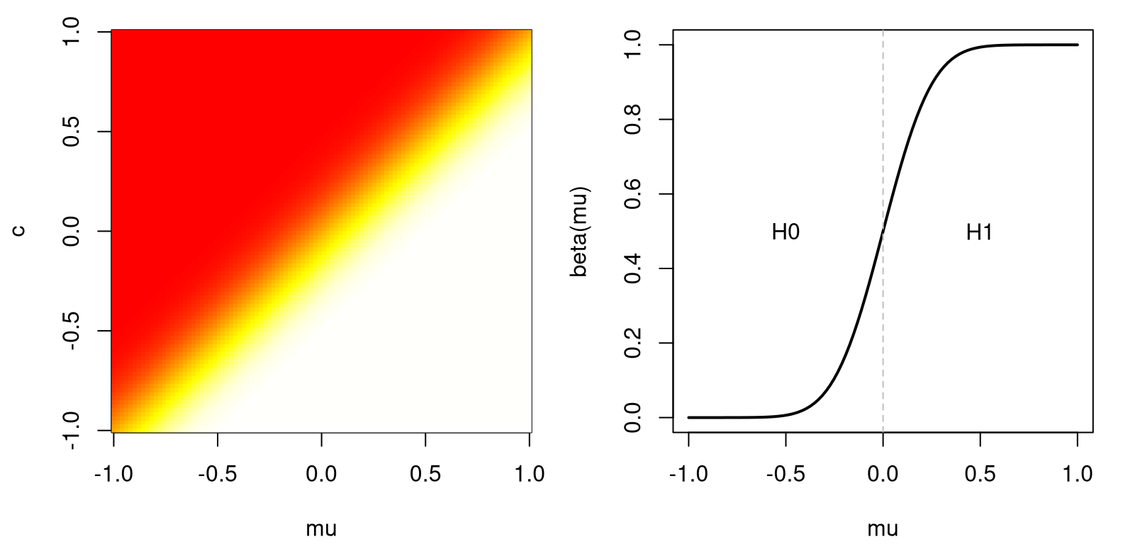
FIGURE A.3: Power for a Gaussian example (left) and a slice at \(c=0\) (right).
Fixing \(c=0\), say, the right panel of the figure shows the resulting slice through the 2D image. Then, \(\alpha\) is the spot on the graph where power crosses the \(y\)-axis, since \(\mathcal{H}_0: \mu \leq 0\).
\[ \alpha = \max{\mu \leq 0} \beta(\mu) = \beta(0) = 1 - \Phi \left(\frac{\sqrt{n} c}{\sigma} \right) \]
Turning things around, \(c = \frac{\sigma \Phi^{-1} (1 - \alpha)}{\sqrt{n}}\). We reject when \(\bar{y} > \sigma \Phi^{-1}(1 - \alpha)/\sqrt{n}\), or equivalently when \(\bar{y}/\sigma/\sqrt{n} > q_{1-\alpha}\).
It would be desirable to find the test with highest power under \(\mathcal{H}_1\), among all such size \(\alpha\) tests. Such a test, if it exists, is called uniformly most powerful. Finding most powerful tests is hard and, in many cases, they don’t exist. For that reason, focus is typically on generic recipes, like tests based on averages, a Wald test, or tests based on maximum likelihood.
Whenever you have two tests of the same, or similar hypotheses, they can be compared based on power and size. In practice this is difficult. Ironically, many such analyses involve MC.
A.3 Monte Carlo error
You might think this discussion would be more prominent in a book that evangelizes MC. I’m burying it in an appendix. This is an important topic, but also it isn’t. If you’re worried that you don’t have an accurate MC estimate of something, like a \(p\)-value or a CI, just make \(N\) bigger.
The \(N\) values I used in simulations has tended to drift higher, as models and inferential goals became more complex, as chapters progressed. \(N = 1{,}000\) was enough until Chapter 5. \(N = 10{,}000\) sufficed for a while, and then by Chapter 9 we touched \(N = 1\) million (M). I even suggested trying 10 M at one point. Then things cooled off a little, and I was back down to 100,000 by Chapter 13.
How did I decide what to use? I’d run the MC a couple of times and take note of what I got, and how much it changed from one run to the next. If things seemed to vary more than I’d like, I’d make \(N\) bigger. If I thought I could make \(N\) smaller, I would. In early chapters I didn’t want to frighten you off, so I tried to make \(N\) as small as possible. It’s not an exact science, but it’s not rocket science either. (If you’re using MC for rocket science, or brain surgery, make \(N\) really big please!)
The idea of “running the MC a couple of times” can be formalized into a robust
assessment of uncertainty. Take a two-sample Bernoulli test of
§5.1, for example. The function do.MC below serves as a
wrapper around code for that experiment, set up in a way that allows me to
entertain calculations for various \(N\), returning a \(p\)-value estimate and
timing details.
do.MC <- function(N=100)
 {
  ## for timing
  tic <- proc.time()[3]

  ## pasted data from Chapter 5
  sy <- 18
  ny <- 30
  sx <- 19
  nx <- 53

  ## pasted estimates from Chapter 5
  that.d <- sy/ny - sx/nx
  that.pool <- (sy + sx)/(ny + nx)

  ## pasted MC loop from Chapter 5
  That.ds <- rep(NA, N)
  for(i in 1:N) {
    Sy <- sum(rbinom(ny, 1, that.pool))
    Sx <- sum(rbinom(nx, 1, that.pool))
    That.ds[i] <- Sy/ny - Sx/nx
  }

  ## pasted p-value calculation from Chapter 5
  pval.mc <- 2*mean(That.ds >= that.d)

  ## finish timing and return
  toc <- proc.time()[3]
  return(list(est=pval.mc, time=toc - tic))
}
Now, the code block below calls do.MC for a range of \(N\) values in a grid,
Ngrid. Although I generally prefer powers of ten for \(N\), this code uses
powers of two to stretch things out a little for dramatic effect. Fair
warning: the first few \(N\)-values on the grid are fast, but the last few are
very slow. I do thirty reps of each so that I may assess MC variability in
the output, which is the whole point of this study.
Ngrid <- 2^(7:20)
reps <- 30
time <- est <- matrix(NA, length(Ngrid), reps)
for(i in 1:length(Ngrid)) {
  for(r in 1:reps) {
    out <- do.MC(Ngrid[i])
    est[i,r] <- out$est
    time[i,r] <- out$time
  }
}
Figure A.4 plots the standard deviation of those \(p\)-values,
assessed over the thirty reps (left) and average compute times (right). Both
panels use a \(\log_{10}\) axis, so things aren’t stretched or compressed too
much horizontally. The right panel is in log-log so that an exponential
increase in runtime, owing to exponentially increasing \(N\) across Ngrid,
appears nearly linear.
sd.est <- apply(est, 1, sd)
atime <- rowMeans(time)
par(mfrow=c(1, 2))
plot(log10(Ngrid), sd.est, type="b", lwd=2,
  xlab="log_10 N", ylab="sd(pval)")
plot(log10(Ngrid), log10(atime), type="b", lwd=2,
  xlab="log_10 N", ylab="log_10 time (seconds)")
FIGURE A.4: Exploring standard deviation of \(p\)-value estimates (left) and execution time (right) for an increasing number of MC “trials” \(N\). Both plots use a \(\log_{10}\) \(x\)-axis, and the right panel uses \(\log_{10}\) on both axes.
The right panel shows that computing time scales commensurately with computational effort, \(N\). That one is boring, so I dispensed with it first. The left panel shows diminishing returns on accuracy as \(N\) is increased. In this example, after \(N = 10^5\) or so, \(p\)-values are accurate to within about 0.001. More precisely …
## [1] 1.311e+05 1.206e-03In other words, when \(N = 1.3107\times 10^{5}\) (since powers of two), we get a
standard deviation of \(6.0289\times 10^{-4}\). Therefore, MC error is assessed as
plus-or-minus two times that value with 95% probability, using a CLT argument.
I chose thirty reps to have a big enough \(n\), which is actually reps, to
use the CLT.
What just happened? I performed an experiment on a computer code – a computer simulation experiment. You could even fit a regression, possibly after transformation, to interpolate or smooth those points and assess predictive uncertainty. That’s known as surrogate modeling, or computer model emulation. I know someone who wrote a whole book on that. I’ll try to keep it simple here. After all, this is a pretty basic computer experiment.
Getting that estimate required a decent amount of work. The total time of
the entire double-for loop simulation was …
## [1] 7And that was just for a Chapter 5 example. I don’t recommend going to such great lengths generally, even though 7 minutes isn’t that long in the landscape of computer simulation experiments, generally speaking. Here’s something I might suggest instead.
Fixate on a particular \(N\) value, like \(N=10{,}000\), as a good starting point. Run your MC with that \(N\) a number of times. Ten repetitions are probably sufficient, but I’ll stick with thirty here for an accurate CLT approximation.
Alright, now I have thirty \(p\)-value estimates, and so with 95% probability the \(p\)-value lies in the following range.
##    2.5%   97.5%
## 0.03093 0.04171
If that \(p\)-value interval is too wide, just increase \(N\) and try again. Or, if that’s too much work, salvage the \(30 \times N\) that you’ve already done! Check this out. We have thirty sample \(p\)-values already, and the CLT says a good estimate of the population \(p\)-value is the sample average.
## [1] 0.03612That estimate is based on thirty times more simulations than any individual estimate is. Since all MC simulations are iid, the effective \(N\) is like 3^{5}. However, without even more simulations like those in Figure A.4, we may not know how accurate that aggregate \(p\)-value is.
Or do we? The CLT also tells us something about the accuracy of sample average estimates. Let \(\bar{P}_r\) be an average-based \(p\)-value estimator based on \(r\) repetitions.
\[ \mathbb{V}\mathrm{ar}\{\bar{P}_r\} = \frac{\sigma^2}{r} \quad \mbox{ as } \quad r \rightarrow \infty. \]
I’m really just regurgitating Eq. (4.1) with different letters, using \(\bar{Y}_n \equiv \bar{P}_n\) and \(n \equiv r\). An estimate for \(\sigma^2\) is easy …
## [1] 0.0005621Using that standard error, a CLT approximation allows our \(p\)-value interval to be updated via Student-\(t\).
## [1] 0.03497 0.03727That interval is for all \(N' = N \times r = 3\times 10^{5}\) simulations.
But wait, that’s not all! If s2 is trustworthy as an estimator of
\(\sigma^2\), then we may further deduce what the interval would be for any
value of \(N'\). For example, consider \(N' = 1\)M.
## [1] 100## [1] 0.03549 0.03675Any changes to the \(p\)-value estimate from a 3.3 times larger MC simulation would only affect the third decimal place, and by at most two “points” for that digit.
The actual estimate of the \(p\)-value remains unchanged without doing more MC simulations. By deducing the new interval, we may make an informed decision about whether or not more simulations would be worth the time and computing energy. If that improvement is worth the extra effort, computationally speaking, then go for it! I’ll pass.
So why did I leave this to the appendix? Because, by the time you get to the end of this book, you already know how to do it! It just may not have occurred to you yet. Estimating MC error is a matter of turning a computer simulation into an experiment, and performing statistical inference. A virtuous cycle!