Chapter 12 Non-P correlation and regression
This is the non-P image of Chapter 7, first with correlation and then with simple linear regression (SLR). I bet you can guess how that goes because there’s been a recurring theme. Convert to ranks and then apply a rather more conventional method on those. That’s about right here, but there’s some nuance to it. Don’t worry, it’ll be – I’ll try to make it – interesting.
I say “more conventional method” because most non-P analyses based on ranks involve averages, or averages of squares depending on the situation. This is easy to say but could be hard to do depending on how you wish to work with the sampling distribution. Monte Carlo (MC) is simple: just randomly draw ranks: shuffle integers from 1 to \(n\) (assuming no ties) for sample size \(n\). Closed-form calculations require solving a subset sum problem (SSP). Although there are libraries available (see §B.3), they’re not speedy and there’s still the question of how to tailor an SSP solver to the statistical inference task at hand.
Correlation and linear regression are inherently linear enterprises. Lines involve slopes and intercepts. So there are still parameters in that sense. But no more Gaussians. By non-P, I mean no parameters defining distributions or controlling randomness.
12.1 Spearman’s \(\rho\)
This one’s pretty easy. Spearman’s \(\rho\), which I shall notate as \(\rho_s\), is Pearson’s \(\rho\) from §7.2 on ranks. The long form of its name is Spearman’s rank correlation coefficient. Characterizing \(\rho_s\) as “\(\rho\) on ranks” is apt but also fast and loose. Pearson’s \(\rho\) is a parameter in a bivariate Gaussian model (7.5). It’s hard to characterize \(\hat{\rho}_s\) as parameter in anything. Rather, Spearman offers a framework for working with a statistic on ranks in a stochastic setting. That’s a mouthful.
My own feeling is that \(\rho_s\) shouldn’t be Greek. Rather, the notation should be \(r_{yx}^{(s)} \equiv r^{(s)}\) or something similar, because it’s an estimate not a parameter. Yet Greek is how you’ll find it in the literature. At the very least, \(\rho_s\) ought to have a hat on it, like \(\hat{\rho}_s\) to indicate that it’s an estimate. I’m going to give you a formula momentarily, for completeness, but you’re never going to use it because it’s so much simpler in code.
Suppose we have paired data \((x_1, y_1), \dots, (x_n, y_n)\) and wish to know if there is a linear association between them. Convert to ranks separately for \(x\) and \(y\) and denote these as \(r^{(y)}_1, \dots, r^{(y)}_n\) and \(r^{(x)}_1, \dots, r^{(x)}_n\), with ties as usual. Then, an estimate of Spearman’s \(\rho_s\) follows ordinary sample correlation (7.4) on those ranks.
Notation gets a little cumbersome since ranks and estimated \(\rho\) both use the letter \(r\), thwarting shorthand like in Eq. (7.4). When there are no ties, both sets of ranks fill out \(\{1,\dots, n\}\) providing some simplification, but the formula is still a hot mess.
\[\begin{equation} \hat{\rho}_s = \frac{\sum_{i=1}^n r^{(y)}_i r^{(x)}_i - n\left(\frac{n+1}{2}\right)^2}{ \left(\sum_{i=1}^n r^{(y)2}_i - n\left(\frac{n+1}{2}\right)^2\right)^{1/2} \left(\sum_{i=1}^n r^{(x)2}_i - n\left(\frac{n+1}{2}\right)^2\right)^{1/2} } \tag{12.1} \end{equation}\]
Like I said, you won’t ever have to code that up, but you could if you’d like to check. To show you what to do instead, I shall introduce a running example earlier in the chapter than usual. Consider the (N)ELS data, first introduced in §10.2, recording high-schoolers’ scores on a math test. We shall investigate a linear association between socioeconomic status (SES) and scores for school one.
nels <- read.csv("nels_math.csv")
s1 <- which(nels$school == 1)
y <- nels$score[s1]
x <- nels$ses[s1]
n <- length(y)
Here a visual is helpful, I think; Figure 12.1 shows a scatterplot. Whereas we were able to determine in Chapter 7 that observed scores alone were (univariate) Gaussian, entertaining a bivariate relationship is not so simple. The observed scatter does not concentrate elliptically the way a bivariate Gaussian would, at least to my eye. It’s technically possible to extend a goodness-of-fit test (§10.1) into higher dimension. Yet binning just \(n = 31\) values via Cartesian product would result in very few observations in each bin, and many categories \(c\). We’d have a low-resolution quilt of bins.

FIGURE 12.1: Math scores versus socioeconomic status (SES) for school one.
Also note from the figure that there’s not an obviously linear relationship
between \(y\) (score) and \(x\) (SES). R code provided below converts raw \(y\)- and
\(x\)-values into ranks and computes correlations on those in several
variations. It’s worth re-plotting the visual in Figure 12.1
with rx and ry instead. Give that a try. The presence, or not, of a
linear relationship isn’t any clearer, but marginal distributions are more
uniform – that’s exactly what ranks are for.
ry <- rank(y)
rx <- rank(x)
rshat <- sum(rx*ry) - n*((n + 1)/2)^2
rshat <- rshat / sqrt(sum(ry^2) - n*((n + 1)/2)^2)
rshat <- rshat / sqrt(sum(rx^2) - n*((n + 1)/2)^2)
c(hand=rshat, pearr=cor(ry, rx), spear=cor(y, x, method="spearman"))
## hand pearr spear
## 0.3858 0.3858 0.3858These are all the same. Going forward, keep it simple and use the last one.
We wouldn’t hesitate to use cor(y, x) for \(r_{yx}\), the sample analog of
Pearson’s \(\rho\). And like Pearson’s \(\rho\), the hippopotamus-us-es
(7.6) are pretty basic. In non-P settings, the null is almost
exclusively zero, which is how I’ve written it out here.
\[\begin{align} \mathcal{H}_0 &: \rho_s = 0 && \mbox{null hypothesis (“what if")} \tag{12.2} \\ \mathcal{H}_1 &: \rho_s \ne 0 && \mbox{alternative hypothesis} \notag \end{align}\]
And so this is a straightforward setup where a sample version is taken as the statistic \(\hat{\rho}_s\) in order to investigate a “what if”. Straightforward, that is, as long as you don’t mind having a “parameter” without a model. I like to think of \(\rho_s\) as a reverse-engineered population quantity from a statistic calculated on a sample (12.1). All that remains is to develop its sampling distribution.
Spearman’s \(\rho\) via MC
By now I hope that sampling ranks is automatic. Here I’ve gotta do it twice,
first for \(y\) and then for \(x\). I’m going to ignore the presence of any ties,
even though there are some tied scores. See Figure 12.1. If
desired, one may always use rank.ties from
rank_ties.R on the book
webpage, as first demonstrated in §9.2 and explained in
more detail in §B.2.
N <- 1000000
Rs <- rep(NA, N)
for(i in 1:N) {
  RYs <- sample(1:n, n)      ## random Y ranks
  RXs <- sample(1:n, n)      ## random X ranks
  Rs[i] <- cor(RXs, RYs)     ## Pearson correlation on ranks
}
Figure 12.2 shows the resulting empirical sampling distribution, indicating a close call. The observed statistic and its reflection are partway into the tails.
hist(Rs, main="", xlim=c(-0.75, 1))
abline(v=c(rshat, -rshat), lty=1:2, col=2, lwd=2)
legend("topright", c("obs", "reflect"), lty=1:2, lwd=2, col=2, bty="n")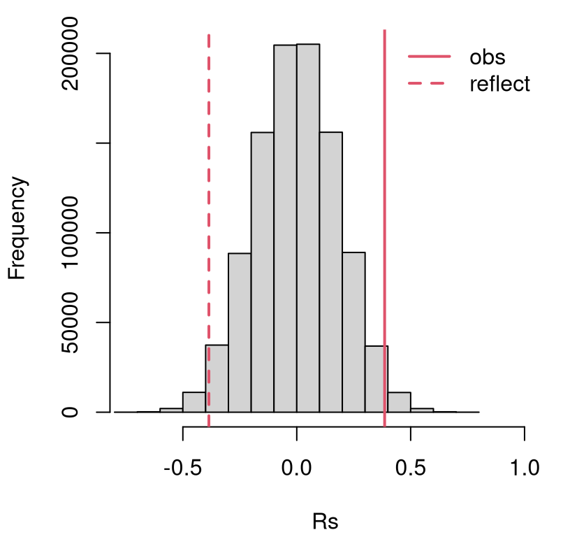
FIGURE 12.2: Empirical sampling distribution of \(\hat{\rho}_s\) for association between SES and math test scores for school one.
A \(p\)-value calculation reveals a reject of the null at the 5% level.
## [1] 0.0328Our conclusion is that SES is linearly related to math scores. I encourage you to check and see how this result compares (or contrasts) with a P-based analysis, following §7.2.
Spearman’s \(\rho\) via math
An SSP counting argument works here like it does for Wilcoxon and squared
ranks tests (§B.3), but things are even more complex because
of the cross-term \(\sum_i r_i^{(y)} r_i^{(x)}\) in Eq. (12.1). Rather
than take us on that wild-goose chase, let me point you Best and Roberts (1975), which is
the basis of several library-based methods for evaluating the cdf of a \(\rho_s
= 0\) sampling distribution. For example, SuppDists on CRAN (Wheeler 2025)
provides pSpearman, which is pretty easy to use.
This seems to give the same result as the library method built into R.
However, that one warns that it “Cannot compute exact p-value with ties”.
Hence, suppressWarnings(...).
suppressWarnings(pval.lib <- cor.test(y, x, method="spearman")$p.value)
c(mc=pval.mc, math=pval.math, lib=pval.lib)
## mc math lib
## 0.03280 0.03246 0.03207If you’re concerned about the quality of this approximation when there are many ties, a CLT argument works. Look at Eq. (12.1). Things are already centered and normalized: correlations divide covariances by standard deviations (7.4). The denominator, if it is to be interpreted as a standard error, has one too many \(1/\sqrt{n-1}\) terms. Since a CLT approximation is only accurate asymptotically, you could equally well say it has one too many \(n^{1/2}\) terms, which is a little clearer from the equation. Putting that in the numerator to cancel it out gives
\[ Z \equiv \hat{\rho}_s \sqrt{n-1} \sim \mathcal{N}(0,1) \quad \mbox{ as } \quad n \rightarrow \infty. \]
In R …
## [1] 0.03459… is pretty close to the others. My understanding is that this
approximation isn’t common in practice. Anecdotally, R’s built-in library
function mentions an “asymptotic \(t\) approximations” for cor.test(..., method="spearman", exact=FALSE), but I couldn’t find any details on that to
relay to you. To add insult to injury, cor.test always provides exact=TRUE
output in both cases, no matter what you ask for. Give it a try. One
explanation for this sleight/oversight may be implicit preference for another
non-P approach; one which has a different “system” for keeping track of
associations; one that doesn’t involve ranks. And that’s up next.
12.2 Kendall’s \(\tau\)
This one’s a trip: a great example of thinking outside the box. I found it fun when I first learned it. If you’re bored with ranks, you’ll appreciate a change of scenery.
Pearson- and Spearman-based calculations measure tendencies for pairs \((x_i,
y_i)\), or their ranks, to be above or below their averages, aggregated over
all \(i=1,\dots,n\) indices. Kendall’s method looks directly at the agreement of
all pairs of pairs \((x_i, y_i)\) and \((x_j, y_j)\), for \(i\ne j\), of which there
are many more: \(n(n-1)/2\). While it’s known as Kendall’s rank correlation
coefficient,
I promise there are no ranks involved. That’s true in an operational sense:
you won’t use rank. However, Kendall (1948) showed that actually both
\(\tau\) and Spearman’s \(\rho_s\) are a special case of a third, more general
correlation coefficient.
A pair of pairs \((x_i, y_i)\) and \((x_j, y_j)\) are called
\[\begin{align} \mbox{ concordant if } \quad \frac{y_i - y_j}{x_i - x_j} & > 0 & \mbox{ or discordant if } \quad \frac{y_i - y_j}{x_i - x_j} & < 0. \tag{12.3} \end{align}\]
A pair of pairs is considered to be half-concordant and half-discordant if \(y_i = y_j\). Any \(x_i = x_j\) are eliminated from the sample. Lack of symmetry in treatment of \(y\) versus \(x\) makes things lopsided and label-dependent in the case of ties. Let me put a pin in that to focus first on core concepts. Recall Figure 7.2 where concepts of concordance and discordance were first introduced. The difference here is that measurements are pairwise, among \((x_i, y_i)\) and \((x_j, y_j)\) pairs, whereas in §7.1 comparisons are drawn to the average pair \((\bar{x}, \bar{y})\).
Figure 12.3 provides a visual upgrade of Figure 7.2.
Here, point \((x_i, y_i)\) for \(i=1\) is arbitrarily singled out. Each other \(j
\ne i\) indexes a point that is either concordant with \((x_i, y_i)\), lying in
the green-shaded region, or discordant otherwise. Notice how my code for
this figure simply replaces xbar with x[i] and ybar with y[i] compared
to the code behind Figure 7.2.
plot(x, y, xlab="SES", ylab="math test score")
i <- 1
abline(h=y[i], lty=2, lwd=2)
abline(v=x[i], lty=2, lwd=2)
inf <- 1000
gx <- c(-inf, x[i], x[i], inf, inf, x[i], x[i], inf)
gy <- c(y[i], y[i], inf, inf, y[i], y[i], -inf, -inf)
polygon(gx, gy, col=3, density=10, angle=45)
point <- paste0("(x[", i, "], y[", i, "])")
legend(x=0.2, y=45, c(point, "concordant"), col=c(1, 3),
  lty=2:1, lwd=2:1, bty="n")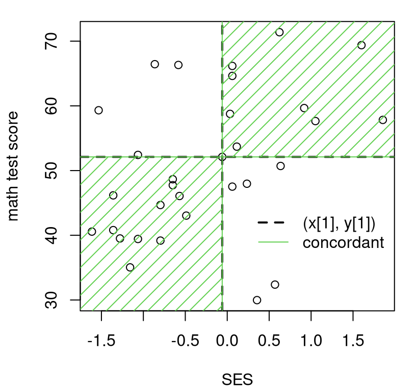
FIGURE 12.3: Illustrating concordant and discordant pairs (of pairs) relative to \((x_1, y_1)\).
Eyeballing points in the plot, there are nine pairs discordant (in the
white) with \((x_1, y_1)\), leaving 22 concordant (in the green). You
may wish to try another \(i\) by adjusting i in the code. I’ll show you how
to automate counting concordant and discordant pairs momentarily. That’ll be
important for what’s coming next.
Let \(n_c\) and \(n_d\) denote the number of concordant and discordant pairs, respectively, over all \(i=1,\dots,n-1\) and \(j=i+1,\dots,n\). Note how ranges for \(i\) and \(j\) are set up so as not to double-count. Kendall’s \(\tau\) is defined as follows.
\[\begin{equation} \hat{\tau} = \frac{n_c - n_d}{n_c + n_d} \tag{12.4} \end{equation}\]
As with \(\hat{\rho}_s\), I’m putting a hat on the Greek letter when a statistic is being calculated from an observed sample. When there are no ties in the \(x\)’s, the denominator simply counts all pairs: \(n_c + n_d = n(n-1)/2\). The numerator is large in absolute value when there is a strong association, positive (many concordant) or negative (many discordant). Like \(\rho\) and \(\rho_s\), \(\tau\) is a proportion: \(-1 \leq \tau \leq 1\) by design, with equality only if all pairs are concordant or discordant, which only happens when all observations perfectly fall on a line.
R code below counts those pairs by looping over \((x_i, y_i)\) in \(x\)-order.
Pre-ordering over \(x\) avoids a double for loop in favor of factorized
inequalities with indices like (i + 1):n.
o <- order(x)                                    ## process pairs ...
yo <- y[o]                                       ## ... (x, y) in  ...
xo <- x[o]                                       ## ... order of x
concord <- discord <- rep(NA, n)
for(i in 1:(n - 1)) {
  xu <- xo[i] != xo[(i + 1):n]                   ## catch ties in xs
  yties <- sum((yo[i] == yo[(i + 1):n])*xu)      ## catch ties in ys
  concord[i] <- sum((yo[i] < yo[(i + 1):n])*xu) + yties/2
  discord[i] <- sum((yo[i] > yo[(i + 1):n])*xu) + yties/2
}
Lines of code defining xu and yties are crucial when there are ties in \(x\)
and \(y\), respectively. Notice how xu is used in a product to zero-out any
subsequent counts via inequalities, whereas yties augments with a fractional
component. The last ten rows of counts, again in order of x, are provided
in Table 12.1.
kable(cbind(cbind(x=round(x, 3), y)[o,], concord, discord)[(n - 10):n,],
caption="Partial table of counts of concordant and discordant pairs.")| x | y | concord | discord |
|---|---|---|---|
| 0.061 | 47.52 | 8 | 2 |
| 0.114 | 53.70 | 5 | 4 |
| 0.235 | 47.97 | 6 | 2 |
| 0.355 | 29.98 | 7 | 0 |
| 0.570 | 32.38 | 6 | 0 |
| 0.623 | 71.38 | 0 | 5 |
| 0.636 | 50.71 | 4 | 0 |
| 0.918 | 59.66 | 1 | 2 |
| 1.052 | 57.65 | 2 | 0 |
| 1.601 | 69.38 | 0 | 1 |
| 1.855 | 57.83 |
Printing a table like this isn’t essential, but can help for understanding and
for carrying out your own calculation with pen and paper, say on an exam.
Take the first of those rows. To figure out what belongs in the concord
column, scan with your eyes down the y column and count how many of those
are bigger than the one in the current (e.g., first) row. Then do the same,
but counting smaller ones, for discord. Repeat for the next row, filling
out concord and discord entries looking only at y-values. Ignore the x
column, which is ordered and only provided for reference.
Code found below follows Eq. (12.4) to complete a \(\hat{\tau}\)
calculation. Using na.rm=TRUE is important, since the last entries of
concord and discord are NA, leading to blank cells in the last row of
Table 12.1.
## [1] 0.2751In our SES/score example there are no ties in y, but there are several in x.
## [1] 1.0000 0.8065 458.0000 465.0000Consequently, if you were to switch labels for y and x you’d get a
slightly different tauhat. That’s unsatisfying, but there’s an easy fix.
Just do it again with x and y swapped, and combine the two results. There
are many equally good ways of doing that. One option is to simply add them
and divide by two. Or, a fancier solution involves aggregating counts:
\[\begin{equation} \hat{\tau} = \frac{n_c^{yx} - n_d^{yx} + n_c^{xy} - n_d^{xy}}{ n_c^{yx} + n_d^{yx} + n_c^{xy} + n_d^{xy}} \tag{12.5} \end{equation}\]
I’ll leave that for you to try as an exercise in §12.5. In the meantime, note that the library calculation is symmetric, and therefore similar to our by-hand calculation, but not identical.
## [1] 0.273 0.273Most of the discrepancy can be accounted for by symmetrizing
(12.5); however, there’s also a slight difference in how
ties are tabulated. Ultimately it doesn’t matter much which version of
\(\hat{\tau}^2\) is used – remember, the statistic is your choice – and it’s
probably simplest to use the library since for loops are cumbersome. I
just wanted to give you a glimpse under the hood.
Like with Spearman’s \(\rho_s\) in Eq. (12.2), competing hypotheses target a population \(\tau\) which corresponds to an estimate calculated from data, \(\hat{\tau}\), and almost exclusively checks for zero association.
\[\begin{align} \mathcal{H}_0 &: \tau = 0 && \mbox{null hypothesis (“what if")} \tag{12.6} \\ \mathcal{H}_1 &: \tau \ne 0 && \mbox{alternative hypothesis} \notag \end{align}\]
All that’s left is to decide how to study \(\hat{\tau}\)’s sampling distribution under the null.
Kendall’s \(\tau\) via MC
Interestingly, MC for Kendall’s \(\tau\) is nearly identical to Spearman’s
\(\rho_s\). Below, I sample from 1:n for both \(y\) and \(x\) populations directly.
You can think of them as ranks if you want to, but they’re not used that
way in construction of \(\tau\). In fact, any mechanism for sampling random Ys
and Xs values would do.
Taus <- rep(NA, N)
for(i in 1:N) {
  Ys <- sample(1:n, n)                      ## random Ys (or ranks)
  Xs <- sample(1:n, n)                      ## random Xs (or ranks)
  Taus[i] <- cor(Xs, Ys, method="kendall")  ## Kendall's tau calculation
}
If you’re concerned about ties, rank.ties could be used to mimic any ties
present in the data. Although not ranks, that function would work as long as
ordered values like 1:n are used, and which may subsequently be permuted
randomly. I’m content to move along with a simple setup, skip the visual this
time and move straight on to \(p\)-value calculation.
## [1] 0.02883Like with Spearman’s \(\rho_s\), a reject of the null.
Kendall’s \(\tau\) via math
There’s an SSP counting method for this one, too, but again I’m skipping it in
favor of pKendall in SuppDists. Before calculating a \(p\)-value, I’d like
to take a look at the mass of the null (12.6) distribution via
dKendall. See Figure 12.4. A view like this isn’t strictly
necessary to complete a testing procedure, but I think it helps explore the
range of possibilities, especially along the \(x\)-axis in the plot.
nc2 <- choose(n, 2)
tgrid <- ((-nc2):nc2)/nc2
plot(tgrid, dKendall(tgrid, n), type="l", lwd=2)
abline(v=c(tauhat, -tauhat), lty=1:2, col=2, lwd=2)
legend("topright", c("obs", "reflect"), lty=1:2, lwd=2, col=2, bty="n")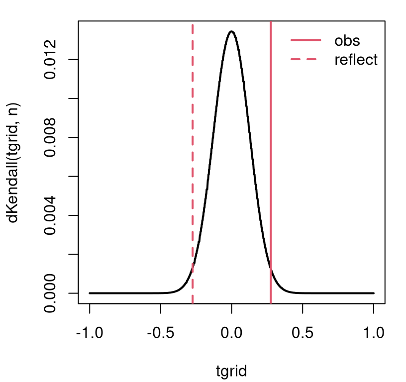
FIGURE 12.4: Exact Kendall’s \(\tau\) sampling mass for the SES/scores example.
Although the graph looks continuous, like a density plot, \(\tau\)’s support (counting concordant and discordant pairs) is the discrete set of integers from \(-(n(n-1)/2\) to \(n(n-1)/2\). Calculating a \(p\)-value involves summing that mass into the tails.
## [1] 0.02874There’s no built-in library function to compare this exact result to because,
like with Spearman, cor.test ignores exact=TRUE in the presence of ties.
The CLT approximation behind the exact=FALSE goes like this. Under
\(\mathcal{H}_0\), \(\mathbb{E}\{\hat{\tau}\} = 0\) since when \(\tau = 0\) you have
about the same number of concordant as discordant pairs: \(\mathbb{E}\{N_c -
N_d\} = 0\). It may be shown that \(\mathbb{V}\mathrm{ar}\{\hat{\tau}\} =
2(2n+5)/9n(n-1)\). Combining those:
\[ Z = \frac{3 \tau \sqrt{n(n-1)}}{\sqrt{2(2n+5)}} = \frac{(n_c - n_d)\sqrt{18}}{\sqrt{n(n-1)(2n+5)}} \sim \mathcal{N}(0, 1) \quad \mbox{ as } \quad n\rightarrow \infty. \]
The first option is preferred when using a \(\hat{\tau}^2\) value calculated
from cor(..., method="kendall"). When working on pen-and-paper, the second
one might be simpler. All are asymptotic approximations, meaning that it
doesn’t matter which you use for large \(n\), and it’s hard to judge accuracy
for smaller \(n\). In R …
Here’s the library version of the CLT, which provides a similar estimate.
pval.cltlib <- cor.test(y, x, method="kendall",
  exact=FALSE, correct=FALSE)$p.value
c(mc=pval.mc, exact=pval.exact, clt=pval.clt, cltlib=pval.cltlib)
## mc exact clt cltlib
## 0.02883 0.02874 0.03223 0.03204Those CLT results don’t match up exactly because my \(\hat{\tau}\) has not been symmetrized, and there are other small details with how ties are calculated. In case you’re curious, the continuity correction is \(\pm 1\) in the numerator depending on what side of zero the observed statistic is on.
zc <- (nc - nd - sign(tauhat))*sqrt(18)/sqrt(n*(n - 1)*(2*n + 5))
c(byhand=2*pnorm(-abs(zc)), lib=cor.test(y, x, method="kendall",
  exact=FALSE)$p.value)
## byhand lib
## 0.03362 0.03204Again, no match because of symmetrization, etc. All of these \(p\)-values are in the same ballpark and lead to the same conclusion at the 5% level.
12.3 Trending?
One use case for non-P correlation tests applies to a single sample \(y_1, \dots, y_n\) where a set of coordinates, the \(x_i\)’s, are derived from the order (or time) in (at) which each \(y_i\) sample was collected. That order may be determined by any indexing, but it’s almost always time-of-collection. In that setup, an association measured by \(\rho_s\) or \(\tau\) can test for trend over those indices. It’s not possible to use Pearson’s \(\rho\) in this context because the \(x\) coordinate, i.e., an ordered set of indices, cannot plausibly be regarded as marginally Gaussian.
Climate variables are a great example, like precipitation in the continental United States. Data in usprecip.csv was originally downloaded from the National Oceanic and Atmospheric Administration (NOAA) National Centers for Environmental Information, Climate at a Glance: National Time Series pages. (Apologies for using “National” three times in one sentence.) These data contain more than a century of precipitation measurements, recorded as space-aggregated inches of rainfall. Figure 12.5 provides a visual. For such so-called time series, it’s customary to “connect the dots” with lines as a cue to a left-to-right interpretation as time wanders on.
precip <- read.csv("usprecip.csv")
x <- precip$date
y <- precip$inches
plot(x, y, type="b", xlab="year", ylab="inches") 
FIGURE 12.5: NOAA USA precipitation time series.
These data can help answer an important climate question. Is rainfall increasing over time; is there a trend? Looking at Figure 12.5, to my eye the answer is yes, but there’s a lot of noise. We know how to be more scientific, more statistical than that. Humans are hard-wired to see patterns, even when they don’t exist. It’s best to get ourselves out of the loop and let data speak for themselves through mathematics and probability.
Here are our two rank correlation coefficients for a non-P analysis.
rshat <- cor(y, x, method="spearman")
tauhat <- cor(y, x, method="kendall")
c(rhos=rshat, tau=tauhat)
## rhos tau
## 0.2773 0.1865There are some degree-2 ties in the observed tallies, even though measurements are recorded to two decimal places.
## y
## 27.52 29.47 29.68 30.09 30.38 30.41 30.62 30.63 31.25 32.29
##     2     2     2     2     2     2     2     2     2     2
There are not a substantial number, but noteworthy. Just to be on the safe
side, I’ve decided to incorporate rank.ties into my MC analysis. The for
loop in R below combines both Spearman’s \(\rho_s\) and Kendall’s \(\tau\)
calculations, since they share many aspects of their MC virtualization.
source("rank_ties.R")
Taus <- Rs <- rep(NA, N)
for(i in 1:N) {
  RXs <- sample(1:n, n)
  Yis <- rank.ties(1:n, d2ties, 2)            ## deal with ties in y
  RYs <- sample(Yis$ranks, n)
  Rs[i] <- cor(RXs, RYs)                      ## for rho_s
  Taus[i] <- cor(RXs, RYs, method="kendall")  ## for taus_s
}
Figure 12.6 provides histograms summarizing both empirical
sampling distributions, for Spearman’s \(\rho_s\) and Kendall’s \(\tau\) on the
same axes. In order to ensure that the bins have commensurate heights, I have
provided a breaks=20 argument to both hist() commands. This is purely
cosmetic, and doesn’t affect \(p\)-value calculations below.
hist(Rs, main="", xlim=c(-0.5, 0.7),
  ylim=c(0, 300000), breaks=20)                   ## same number of bins
hist(Taus, add=TRUE, col=0, border=2, breaks=20)  ## for both histograms
abline(v=c(rshat, -rshat), lty=1:2, lwd=2)
abline(v=c(tauhat, -tauhat), lty=1:2, col=2, lwd=2)
legend("topright", c("rshat", "reflect"), lty=1:2, lwd=2, bty="n")
legend("right", c("tauhat", "reflect"), lty=1:2, lwd=2, col=2, bty="n")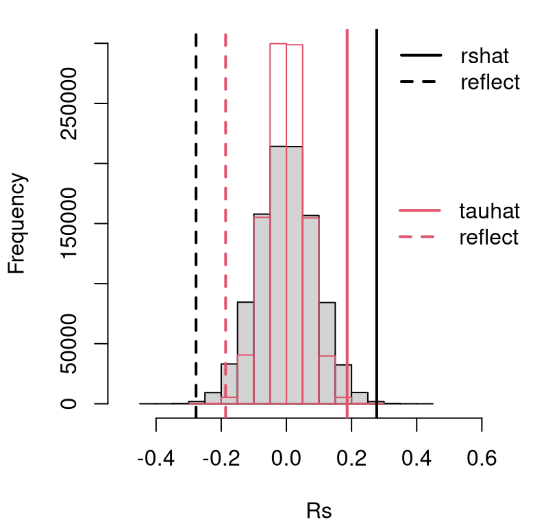
FIGURE 12.6: Empirical sampling distribution of \(\hat{\rho}_s\) and \(\hat{\tau}\) under null hypotheses (12.2) and (12.6), testing trend in continental US precipitation over a century.
See how the black/gray-filled histogram for \(\rho_s\) is slightly wider than the red/transparent one for \(\tau\) (which is more peaked). So too is the observed statistic \(\hat{\rho}_s\) and its reflection compared to \(\hat{\tau}\). Consequently, \(p\)-values calculated from either are similar.
pval.rhos.mc <- 2*mean(Rs >= rshat)
pval.tau.mc <- 2*mean(Taus >= tauhat)
c(rhos=pval.rhos.mc, tau=pval.tau.mc)
## rhos tau
## 0.001530 0.001614This is an easy reject of \(\mathcal{H}_0\) under either test at the 5% level.
We may conclude that there is indeed a trend over the years – a trend which
appears to be increasing, but hold that thought for a moment. Just
to double-check everything, the code below calculates \(p\)-values for
both tests using math, by hand, and via library calculations. I
provided exact=FALSE to the library-based Spearman test because it
spits out a warning otherwise.
pval.rhos.math <- 2*pSpearman(rshat, n, lower.tail=FALSE)
pval.tau.math <- 2*pKendall(tauhat, n, lower.tail=FALSE)
pval.rhos.lib <- cor.test(y, x, method="spearman", exact=FALSE)$p.value
pval.tau.lib <- cor.test(y, x, method="kendall")$p.value
rbind(mc=c(rhos=pval.rhos.mc, tau=pval.tau.mc),
  math=c(rhos=pval.rhos.math, tau=pval.tau.math),
  lib=c(rhos=pval.rhos.lib, tau=pval.tau.lib))
## rhos tau
## mc 0.001530 0.001614
## math 0.001404 0.001561
## lib 0.001403 0.001657All give about the same result, which is reassuring. Recall that our MC respects the distribution of ties observed in the data, whereas the by-hand “math” ones do not. I haven’t provided by-hand versions of CLT-based tests here. Perhaps let me encourage you to check those on your own if you’re curious.
So we’ve established that there’s likely a trend in these data, by not what that trend is. Determining the yearly increase in precipitation over the last century or so would require estimating a slope. We know how to do that parametrically from §7.6. Here are tidy library calculations.
fit <- lm(y ~ x)
sumcoef <- summary(fit)$coefficients
colnames(sumcoef) <- c("est", "stderr", "t stat", "p val")
kable(round(sumcoef, 4), caption="Precipitation LM/SLR fit.")| est | stderr | t stat | p val | |
|---|---|---|---|---|
| (Intercept) | -3.7971 | 9.734 | -0.3901 | 0.6971 |
| x | 0.0173 | 0.005 | 3.4815 | 0.0007 |
Observe in the summary provided by Table 12.2 that estimated
slope \(\hat{\beta}_1 = 0.0173\) is positive and that the
\(p\)-value for the null of \(\beta_1 = 0\) is small at
\(\phi_1 = 7\times 10^{-4}\). So each year precipitation
increases by about 0.0173 inches. And although small, this
estimate is statistically significant. Over a century, that adds up to almost
2 inches, or about 10%. No wonder the
continental US has seen historic flash flooding of
late.
That analysis of slopes leverages a Gaussian assumption. How could we do that non-P? I’m so glad you asked.
12.4 Non-P lines
Correlation is linear, and non-P SLR analysis leans on that connection. In fact, testing is an application of Spearman’s \(\rho_s\), and confidence interval (CI) calculations use Kendall’s \(\tau\). Emphasis throughout is on slope, with intercepts being treated as a nuisance parameter. That’s fine – slopes are the most interesting parts of lines.
The setup has similarities to §7.5. Data are comprised of \((x_i, y_i)\) pairs, and we assume
\[\begin{equation} \mbox{Model:} \quad\quad \mathbb{E}\{Y_i\} = \beta_0 + \beta_1 x_i \quad \mbox{ for } \quad i=1,\dots,n. \tag{12.7} \end{equation}\]
Each \(Y_i\) is treated as independent of the others given \(x_i\). Similarities end there. In this chapter, no distribution is assumed for random errors; for points around the line. They’re in Eq. (12.7) implicitly, of course, since that’s what the expectation is integrating over. Without committing to a distributional form for them, there’s no need to introduce any \(\varepsilon_i\) into the model description. Likewise, there’s no \(\sigma^2\).
We haven’t gotten rid of all parameters; there’s still \(\beta_0\) and \(\beta_1\), and these are the main inferential quantities of interest – especially \(\beta_1\). Intercepts and slopes are unavoidable when working with lines. Crucially, there are no probabilistic parameters because there are no explicit distributions.
Below I shall cover testing and CI calculation separately. As I said, each involves a different technology from earlier in the chapter. The chapter concludes with some commentary on prediction. Throughout I shall use the US precipitation data as a running example. Reanalysis of the frat dash example from from Chapter 7 is another good choice, and is left to you as homework exercise. Math score vs. SES would also work.
Testing
Suppose we wish to test the null hypothesis that \(\beta_1 = \beta_1^{(0)}\) for some value of \(\beta_1^{(0)}\). So the same setup as Eq. (7.20), where \(\beta_1^{(0)} = 0\), but here I’m being slightly more generic and allowing for any slope \(\beta_1^{(0)}\) to be tested. Usually interest lies in testing for a zero slope since that means no linear relationship; no power in \(x\) to predict \(Y\). I have a somewhat unconventional test in mind here.
Material in §7.6 can be similarly generic, and indeed the
MC therein used a value of beta1 <- 0 that can easily be changed. Here
things are a little different since the value of \(\beta_1^{(0)}\) is important
at the outset no matter how a sampling distribution is derived.
I said that slope testing is an application of Spearman’s \(\rho_s\). Actually, it’s Spearman’s \(\rho_s\) on so-called zero-intercept or intercept-free residuals. Let
\[ u_i = y_i - \beta_1^{(0)} x_i \quad \mbox{ for } \quad i=1,\dots, n. \]
So that’s just like \(e_i\) in Eq. (7.12) except that \(\beta_0 = 0\). In fact this is inconsequential. Any value \(\beta_0\), including some estimate \(\hat{\beta}_0\), would work fine. Considering that, however, a choice of zero, or in other words “intercept-free”, is the simplest option. Now, perform a Spearman’s \(\rho_s\)-test on \((x_1, u_1), \dots, (x_1, u_n)\). The outcome of that test directly determines the outcome for the slope \(\beta_1^{(0)}\).
Consider testing if the 100-year rise in precipitation of 2 inches, alluded to above in §12.3, were supported by these data. That would correspond to testing \(\beta_1 = 0.02\). If you’d like, you can go back through this analysis with \(\beta_1 = 0\), but I think you already know how that’ll turn out considering our earlier test for trend. This twist, of testing for 2 inches in a century, helps keep things interesting. Or at least I think so.
Here we go in code.
## [1] 2Notice how there’s just two ties in u even though raw y-values had
several. This is because each of the x-values involved in the tie is
unique. I’ve decided to forgo any special handling of ties going forward.
First via MC, cutting-and-pasting from above
Rs <- rep(NA, N)
for(i in 1:N) {
  RYs <- sample(1:n, n)
  RXs <- sample(1:n, n)
  Rs[i] <- cor(RXs, RYs)
}
pval.mc <- 2*mean(Rs <= rs.ux)    ## this time in the left tail
Then via math and library calculations, again cutting-and-pasting and ignoring by-hand CLT calculations.
pval.exact <- 2*pSpearman(rs.ux, n)
pval.lib <- cor.test(u, x, method="spearman", exact=FALSE)$p.value
c(mc=pval.mc, exact=pval.exact, lib=pval.lib)
## mc exact lib
## 0.3543 0.3554 0.3554These are all about the same and there’s not enough evidence to reject the null. Put together a press release! Newsflash: continental US now gets about two more inches of rain per year, on average (year-over-year), than it used to in the early 1900s. By the way, there’s no library function that I’m aware of that automates all of these steps. You can write one!
Confidence Interval
Have a look at Eq. (12.3). Each check for a concordant or discordant pair involves rise over run – a calculation for slope – over each pair of pairs \((x_i, y_i)\) and \((x_j, y_j)\):
\[\begin{equation} s_{ij} = \frac{y_i - y_j}{x_i - x_j}, \tag{12.8} \quad \mbox{ for } \quad 1 \leq i < j \leq n. \end{equation}\]
Here’s how to calculate that in R via outer products.
Except the only problem with that is that it does all \((i,j)\) pairs, not just
the ones where \(i < j\). The output object s is an \(n \times n\) matrix.
## [1] 130 130I wish to extract the upper triangle of that matrix to avoid duplication.
Although convenient mathematically, I don’t need double-indexing, as \(s_{ij}\),
in code below. A vector of s-values, as provided by upper.tri indexing, is
sufficient.
Each entry of s is a slope, estimated from one pair of points on the
scatterplot in Figure 12.5. Be careful to check here that there
are no NaN values as might arise if any pair of \(x_i = x_j\) for \(i \ne j\).
Eliminate any of those.
Let \(n_s\) denote the number of slopes which remain. If there are no
ties in x then \(n_s = n(n - 1)/2\).
## [1] 8385 8385A histogram of those \(n_s\) values is shown in Figure 12.7. This
visual is for inspection purposes only. Those s values do not comprise a
sampling distribution. They’re just a collection of (all non-infinite)
slopes derived from pairs of points in the data. The reason I say that is
I don’t want you to see that most of those \(s_{ij}\) values straddle zero and
think that means slope is likely zero, or that a CI straddles zero.
Those samples aren’t weighted by their mass under the sampling distribution.
Neither are the larger \(s_{ij}\) values weighted that fill out heavy tails in
the histogram, both positive and negative. What really matters for a CI is
where the extremes of that empirical distribution lie relative to those
\(s_{ij}\) values. That’s what Kendall’s \(\tau\) is for.
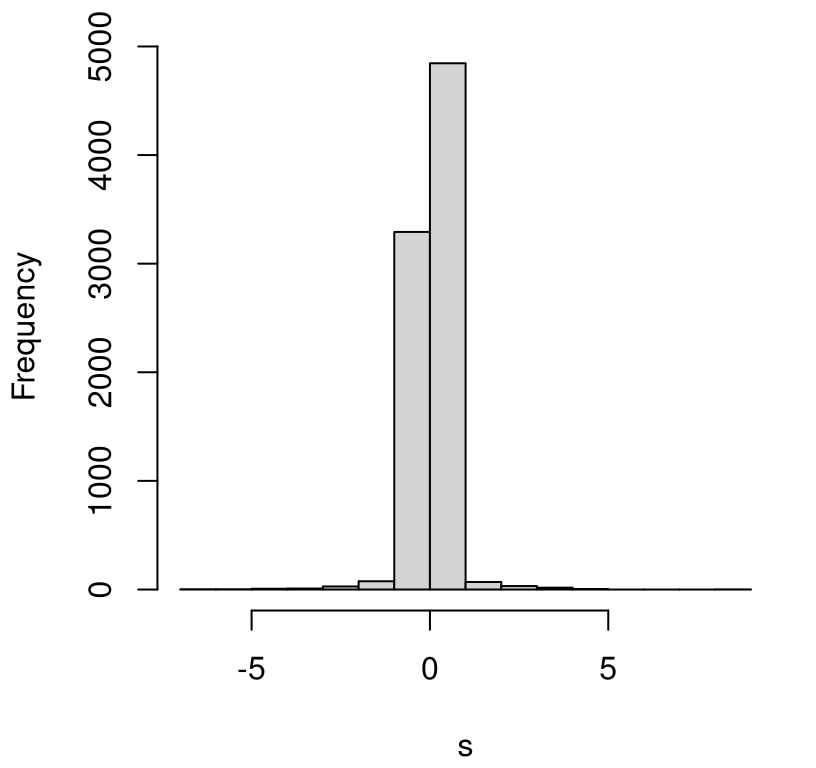
FIGURE 12.7: Pointwise slopes from precipitation data. (This is not a sampling distribution.)
Let \(\alpha\) denote level desired for the CI. Find \(q_{\alpha/2}\) under Kendall’s distribution for \(\tau\). You could do that in closed form, or via MC.
alpha <- 0.05
q <- qKendall(1 - alpha/2, n)
c(q, quantile(Taus, 1 - alpha/2))    ## Taus were simulated earlier
## 97.5%
## 0.1160 0.1161Both should give about the same result. Now \(q \in [-1, 1]\), the range of any
correlation coefficient. Using \(q\) with s requires re-scaling to integers
\(1,\dots, n_s\). I’ve done this below defining quantities \(q_r\) and \(q_l = 1 -
q_r\) bracketing \((1-\alpha/2) \times 100\) percent of the distribution of slopes
in a way that I think is both sensible and transparent.
There are other good choices here. I used ceiling(...) in order to round up
to the nearest larger integer to be conservative – possibly making the
interval a little wider than round(...), which would also work. Indices
\(q_l\) and \(s_r\) define the largest and smallest entries of \(s_{ij}\), stored in
s, that bracket the interval of interest. Specifically, sort (forming order
statistics) entries of s providing \(s^{(1)}, \dots, s^{(n_s)}\), and take
the \(q_l\) and \(q_r\) entry in that sorted order.
## [1] 0.005873 0.025634That CI does not include zero, but it does include 0.02, supporting results from earlier tests for trend and slope, respectively.
Prediction
As with P-based linear modeling, knowing what to use for prediction is easy. Here’s a version of Eqs. (7.9)–(7.10) based on medians:
\[\begin{equation} \hat{\beta}_1 = s^{(n_s/2)} \quad \mbox{ and } \quad \hat{\beta}_0 = y^{(n/2)} - \hat{\beta}_1 x^{(n/2)}. \tag{12.9} \end{equation}\]
In R:
##       b0       b1
## -0.13972  0.01551
Prediction for any new \(x_p\) could follow \(\hat{\beta}_0 + \hat{\beta}_1 x_p\). Quantifying uncertainty is the hard part. I have not seen this addressed in the literature (the “math way”), but MC is not hard if you follow your nose. Suppose predictions were desired for the following grid of \(x_p\) values.
R code below loops over Kendall’s \(\tau\) samples similar to a CI
calculation. I used a smaller \(N\) compared to examples earlier in the
chapter to speed things up a bit. Filling out \(n_p = 100\) predictions for
xp many thousands (or millions) of times is lots of work. We still get a
great visual with a coarser sample, as I’ll show you momentarily.
Each sampled slope is combined with an estimate of intercept via a (single) bootstrap sample median \(y^{(n/2)}\). This choice acknowledges randomness in \(y\) without additionally imposing it on \(x\), which are fixed timesteps (years) in this precipitation example. An ordinary bootstrap would jointly sample \((x,y)\), which is not what I want here.
N <- 100000 ## smaller N for faster execution
Yps <- matrix(NA, nrow=N, ncol=length(xp))
Es <- rep(NA, N)
for(i in 1:N) {

  ## Kendall's tau slope sampling
  RXs <- sample(1:n, n)
  RYs <- sample(1:n, n)
  Taus <- cor(RXs, RYs, method="kendall")
  si <- round(ns*(Taus + 1)/2)
  B1s <- so[si]

  ## combine with bootstrap median of Y (not X)
  Ys <- sample(y, n, replace=TRUE)
  B0s <- median(Ys) - B1s*medx

  ## put them together and predict
  Yps[i,] <- B0s + B1s*xp

  ## residual quantile assumes symmetric distribution
  Es[i] <- quantile(abs(y - (B0s + B1s*x)), 0.95)
}
In the second half of the loop above, sampled slope(s) and intercept(s) are put together to derive samples of predictive \(Y(x_p)\) which may be used for CI calculation. Finally, the 95% quantile of observed absolute residuals, \(e\), from that sampled line are saved so that a predictive interval (PI) may be constructed. Using an absolute value here makes an implicit assumption about symmetry of errors, which might not always be appropriate.
The code chunk below extracts quantiles from those sampled \(Y(x_p)\) values and \(Y(x_p) + e\) for CI and PI error bar calculations, respectively. A grand average of \(Y(x_p)\) samples is also calculated, so that this may be compared with our point-estimate (12.9).
## Confidence Interval
CI.l <- apply(Yps, 2, quantile, prob=0.025)
CI.u <- apply(Yps, 2, quantile, prob=0.975)

## Predictive Interval
Emat <- matrix(rep(Es, length(xp)), nrow=N, ncol=length(xp))
PI.l <- apply(Yps - Emat, 2, quantile, prob=0.025)
PI.u <- apply(Yps + Emat, 2, quantile, prob=0.975)

## Prediction, for comparison to median-based calculation
Ypmean <- colMeans(Yps)
Figure 12.8 shows those predictive quantities overlayed onto a scatterplot of the data. The shape of that summary, particularly its hyperbolic error bars, looks similar to ones you might get for an ordinary P-based analysis. See, for example, Figure 7.10.
plot(x, y, type="b", ylim=range(c(y, PI.l, PI.u)),
  xlab="year", ylab="inches")
abline(b0, b1, col=3, lwd=3)          ## median-based
lines(xp, Ypmean, lwd=3)              ## average of medians
lines(xp, CI.l, lty=2, lwd=3)
lines(xp, CI.u, lty=2, lwd=3)
lines(xp, PI.l, col=2, lty=2, lwd=3)
lines(xp, PI.u, col=2, lty=2, lwd=3)
legend("topleft", c("95% CI", "95% PI"), lty=2, col=1:2, lwd=3, bty="n")
legend("bottomright", c("mean", "(b0, b1)"), col=c(1,3), lwd=3, bty="n")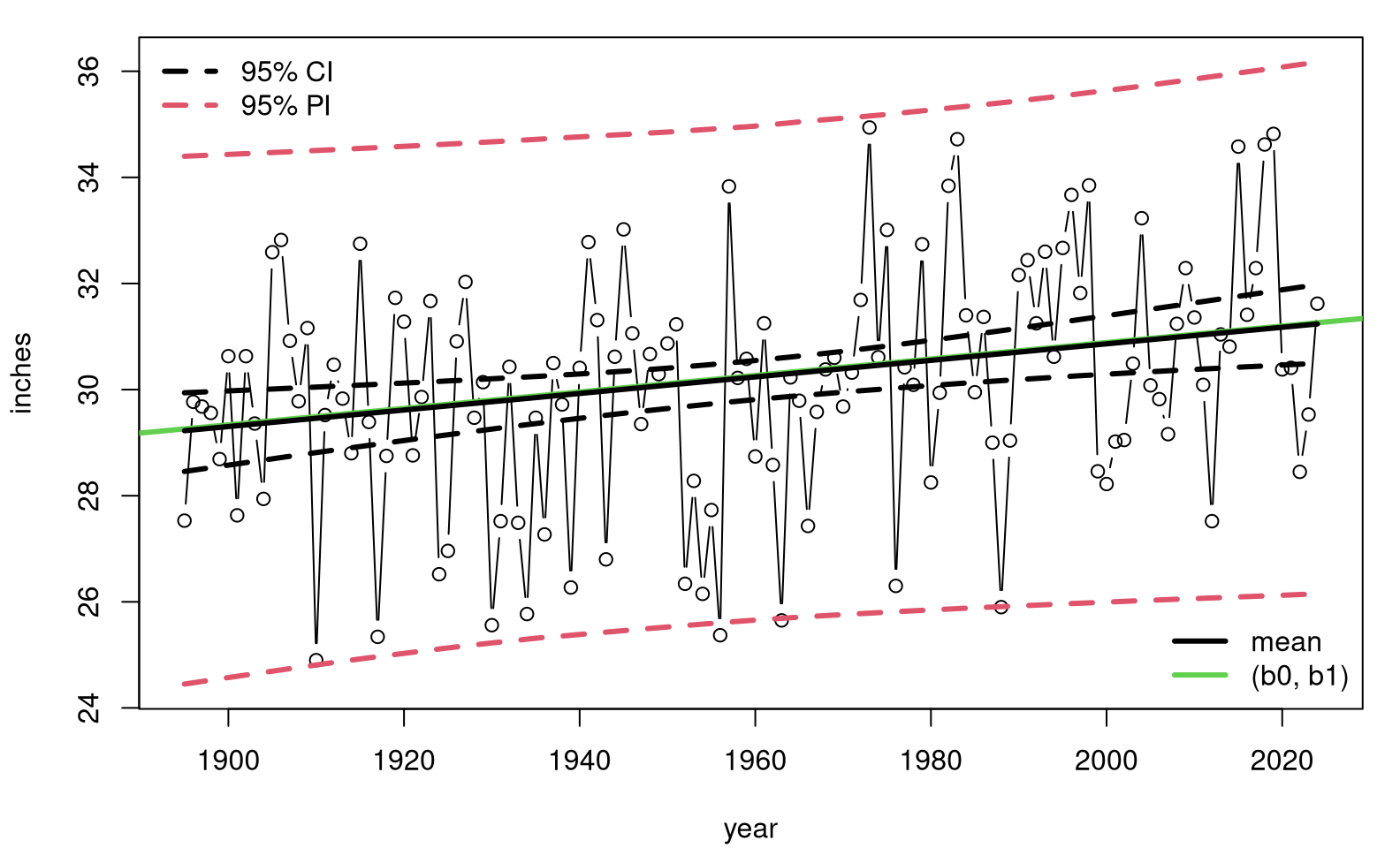
FIGURE 12.8: Non-P predictive distribution for precipitation data.
This time, our analysis is free of many of the assumptions underlying a simple linear model (SLR). Conditional independence is used for \(y_i\) values, and symmetry is imposed on residuals, but only for predictive purposes. That’s it. Observe that our median-based estimate (12.9) is nearly identical to the average of medians from the MC loop. These are equivalent.
12.5 Homework exercises
These exercises help gain experience with non-P correlation and regression. Don’t forget to try each test multiple ways, e.g., via MC and math calculations. If you’re looking for more practice, any of the questions on P-based tests in §7.8 are appropriate as well. Needless to say, the intention here is that you use a non-P test.
Do these problems with your own code, or code from this book. Unless stated explicitly otherwise, avoid use of libraries in your solutions.
#1: Symmetrizing Kendall’s \(\tau\)
Explore (12.5) and at least one of your own ideas for
symmetrizing an estimate for Kendall’s \(\tau\). Verify that it works, i.e.,
that you get the same answer when you swap x and y, and compare to what
the library provides: cor(y, x, method="kendall").
#2: Upgrade monty.cor
Upgrade monty.cor from §7.8 to include non-P options
via Spearman’s \(\rho_s\) and Kendall’s \(\tau\). Support MC and closed-form/math
alternatives including asymptotic approximations via CLT. Incorporate
your solution to #1.
Hint: many of the following questions are easier after this one is squared away.
#3: Voting and income
The file voting.csv linked from the book webpage contains median income in 2023 by state (and Washington, DC), and percent voting for Trump in the 2024 election by state (and DC). These data were collected from two separate Wikipedia pages on median income by state and US presidential election results. See Figure 12.9.
voting <- read.csv("voting.csv")
plot(voting$income, voting$trump, type="n",
  xlab="median state income in 1000 USD",
  ylab="percent voting Trump/Republican")
text(voting$income, voting$trump, labels=voting$state, cex=0.7)
FIGURE 12.9: Percent Republican (Trump) vote by median state income during the 2024 US election season.
Is there a correlation between wealth at the state level, and propensity to vote Republican?
#4: SES vs. math score
Revisit the analysis in §12.1–12.2 two ways.
- Use school 100.
- Use all schools.
Comment on any linear association between SES and score in these two contexts. Use both Spearman- and Kendall-based tests via MC and closed-form calculations.
#5: Non-Gaussian correlation, redux
In §7.8 #6 some data was presented and you were asked to evaluate if a Gaussian correlation (Pearson’s \(\rho\)) was appropriate, and adjust as necessary. Revisit that data here with non-P correlation via Spearman’s \(\rho_s\) and Kendall’s \(\tau\). How do results compare?
#6: Average January temperature in VA
Data in VAjantemp.csv linked on the book webpage provides average January temperatures (in degrees Fahrenheit) in Virginia for a period of more than 100 years. These data came from a similar NOAA search query as the precipitation data.
Is there evidence of a trend in this time series? Use both Spearman- and Kendall-based tests.
#7: Mosquitoes
Data provided below come from Hribar (2019) and were download via the VecDyn database. They are yearly observed counts of mosquitoes (genus and species Aedes taeniorhynchus, aggregated from weekly) from 1998 until 2019 in Big Pine Key, Florida, USA.
mosquitoes <- c(902, 1442, 847, 2322, 801, 455, 847, 26, 366, 79, 256,
  196, 84, 439, 76, 107, 60, 122, 84, 172, 102, 85)
The first observation corresponds to 1998, and the last one to 2019. Is there evidence of trend in these data?
#8: Library functions monty.nPslr and predict.monty.nPslr
Write the non-P version of monty.slr and predict.monty.slr from
§7.8. Automate testing and CI calculation for slopes
with the former, and prediction (with CI and PI) with the latter. You won’t
be able to share as much information between the two *.nPslr functions as
with their *.slr counterparts, but it’ll be nice if they otherwise have the
same feel for the user (you).
Hint: many of the following questions are easier after this one is squared away.
#9: Frat dash, redux
Revisit the frat dash example from Chapter 7 with a test of the null hypothesis that \(\beta_1 = 0\), CI for \(\beta_1\) and predictions, including CI and PI, providing a non-P analog of Figure 7.11.
#10: Rent for all dwellings
Revisit rent.csv, linked from the book webpage and first explored in §7.8 #15. Except, now, base your analysis on all dwellings, not just those smaller than 20,000 square feet.
Answer the following.
- Why were those large dwellings excluded in §7.8, and why are they less of a concern here, in a non-P setup? Considering that non-P setup …
- Is square-feet a useful predictor of rent?
- How much more does an additional 1,000 square feet cost? Provide a
- Provide a visual of your fit, and overlay a prediction with CI and PI error bars for dwellings ranging from zero to 20,000 square feet. Note here I’m still focusing on smaller dwellings, limiting \(x_p\), mostly to have a cleaner visual.
How do your answers to #b–#d compare to the P-analysis in Chapter 7.
#11: MPG vs. weight
File mileage.csv linked
from the book webpage contains gasoline mileage ($mpg) ratings for cars and
light trucks of various makes and models, including information on their
weight ($wt, in hundreds of pounds), and other specs. These data come from a
study published by the U.S. Environmental Protection Agency in 1991.
Answer the following with a non-P analysis.
- Is weight a useful predictor of mileage?
- How much does each additional 100 pounds “cost” you in terms of gasoline efficiency? Provide a CI.
- Provide a visual of your fit, and overlay predictions with CI and PI error bars for cars weighing 1,700 to 6,500 pounds.
- Can you foresee any problems with extrapolating your prediction to even heavier vehicles?
#12: Import elasticity
This question is meant to whet your appetite for Chapter 13.
Data recorded in imports.csv contain import values and gross domestic product (GDP), both in billions of US dollars (USD), for a collection of countries during the early 2000s. The plot in Figure 12.10 provides a visual of these data on a log-log scale.
imports <- read.csv("imports.csv")
x <- log(imports$imports)
y <- log(imports$gdp)
plot(x, y, type="n", xlab="log imports", ylab="log GDP",
  xlim=c(-2.5, 7.5), ylim=c(-1, 10))
text(x, y, labels=imports$country, cex=0.7)
FIGURE 12.10: Gross domestic product (GDP) versus imports, both in billions of USD and on a log-log scale.
There are two reasons for log-log modeling here. The first one is the subject of §13.1, and basically it has to do with the challenge of linear modeling on multiplicative scales. For our purposes here, let’s just say that \(x\) and \(y\) look better when logged. (I encourage you to make the same plot with unlogged coordinates. You’ll see what I mean.)
The second one is more practical. In economics, the estimated slope \(\hat{\beta}_1\) of a linear model is known as the elasticity of the two variables under study. Economic theory says that imports and GDP should have an elasticity of one. Do these data support this hypothesis?
References
SuppDists: Supplementary Distributions. https://doi.org/10.32614/CRAN.package.SuppDists.