Chapter 7 Correlation and linear regression
You might think I’m lumping together two topics that don’t belong again, like in Chapter 6. But these two go hand in hand. On the Wikipedia page for correlation it says, “Although in the broadest sense, correlation may indicate any type of association, in statistics it usually refers to the degree to which a pair of variables are linearly related.” So look, both linear and correlation in the same sentence. I’ll explain this in more detail later.
Correlation and linear regression both involve measurements on two sets of variables. Call them \(X\) and \(Y\) as in previous chapters. In this chapter we shall exclusively study samples from these populations in pairs.
\[ (x_1, y_1), \dots, (x_n, y_n) \]
We presume they’re paired this way because each of \(x_i\) and \(y_i\) were observed under similar conditions. Earlier, like with the paired \(t\)-test of §5.3, we inspected samples from these populations and evaluated the extent to which they were the same (or different). Now we’re going to take for granted that they’re different but entertain that one may have useful “association” information about the other, and vice versa. So correlation and (linear) regression are about association, like in that Wikipedia quote.
Correlation involves a study of the extent (or not), or strength of that association. Regression is where you lean on that association in order to make a prediction, or to investigate the mechanism behind that association. If \(X\) and \(Y\) are associated, you might be able to leverage the nature of that relationship to determine \(Y\) given a value of \(X = x\). In other words, you could lean on the conditional probability \(\mathbb{P}(Y \mid X = x)\).
Quick digression to refresh you on conditional probability and independence. If \(\mathbb{P}(Y \mid X = x)\) changes with \(x\), then \(X\) and \(Y\) are not independent of one another. Recall the definition of conditional probability: \(\mathbb{P}(Y \mid X) = \mathbb{P}(Y, X) / \mathbb{P}(X)\), abbreviating things a little. If these two events are independent, then \(\mathbb{P}(Y, X) = \mathbb{P}(Y) \mathbb{P}(X)\). In that case \(\mathbb{P}(Y | X) = \mathbb{P}(Y)\), i.e., \(Y\) doesn’t change with \(X\). So correlation and regression have something to do with independence, or lack thereof. These aren’t exactly the same concept. Two random variables can be dependent (not independent) but not (linearly) correlated. Let me get back to that later. However, the opposite does work: if \(X\) and \(Y\) are correlated, they are definitely not independent. This means they have an association which can be quantified and that can be exploited for prediction.
Alright, back from the refresher. Let me introduce some data to use as a running example, beginning with an illustration of broad themes. Suppose a crop of fraternity pledges at \(\Sigma \Sigma \Sigma\) (the ultimate stats frat!), were timed at a 100 yard dash both before (\(X\)) and after \((Y)\) chugging a 40 (oz of beer). Figure 7.1 offers a visual of these data. Going forward, I shall refer to these values as the frat dash data.
x <- c(12.3, 16.1, 18.6, 13.5, 16.8, 14.1, 18.1, 17.8, 15.2, 13.1)
y <- c(13.6, 17.1, 19.3, 13.9, 16.3, 16.9, 17.9, 15.9, 16.1, 16.1)
plot(x, y, xlab="time before beer", ylab="time after beer")
FIGURE 7.1: Frat dash data: times (seconds) to run 100 yards before (\(x\)) and after (\(y\)) a beer.
In any correlation or linear regression analysis, visualizing \((x_i,y_i)\) pairs as a scatterplot is definitely the way to go before jumping in with calculations. Judging by these times, pledges might not have been taking the exercise too seriously. (They’re a little on the slow side.) It may also have been that the time keepers were a few 40s in too. (I didn’t interface much with Greek life in college, so what would I know?)
As to whether there’s an association, to my eye maybe so, but perhaps not a strong one. It looks like pledges that were faster before were also faster after, and likewise with slower times. The relationship isn’t perfect, but there’s definitely an upward trend from left to right. That association is also plausibly linear, by which I mean that the trend seems to go up and to the right along a (noisy) line. It doesn’t turn around and go back down or anything like that.
What if a time of \(x=14.5\) seconds was recorded for one recruit – call him Brandon (my middle name) – before a beer, but somehow a second time was not recorded later. Maybe Brandon decided to sleep it off. Could we use this association to make a prediction \(Y(x)\)? Could we perhaps also couple that with a range of times summarizing uncertainty? If I had to use my eyeballs, I’d go with \(\hat{y}(x) = 15.5\) with a range of \([14, 17]\). Could those guestimates be made precise, with probabilities attached? How can I determine if there’s an association at all? That’s where statistics comes in.
7.1 Correlation reminders
Covariance is the expectation of the product of differences between two random variables and their respective means.
\[\begin{equation} \mathbb{C}\mathrm{ov}(Y, X) = \mathbb{E}((Y - \mathbb{E}\{Y\})(X - \mathbb{E}\{X\})) \tag{7.1} \end{equation}\]
Covariance is a property of the joint distribution of \(Y\) and \(X\), capturing both scale (note \(\mathbb{V}\mathrm{ar}\{Y\} = \mathbb{C}\mathrm{ov}(Y, Y)\)) and association. In this form (7.1), covariance is a theoretical construct – a definition for a quantity that can only be calculated if you can perform those expectations, which are either integrals or sums. Notice that, unlike variance, \(\mathbb{C}\mathrm{ov}(Y, X)\) can be negative, indicating a negative association. If \(Y\) tends to be above its mean while \(X\) tends to be below, or vice versa, then covariance will be negative (as a product of negative and positive values). However, if both tend to be below their respective means, then a product of two negatives is positive.
Quick digression to address my choice of order in notation. Often you’ll see \(X\) listed before \(Y\), as \(\mathbb{C}\mathrm{ov}(X, Y)\), because that puts the letters in order alphabetically. But this is arbitrary, since \(\mathbb{C}\mathrm{ov}(X, Y) = \mathbb{C}\mathrm{ov}(Y, X)\). I often, but not always, do it the other way around. You may have noticed me doing that back as early as Chapter 5, when introducing two-sample tests. I do this to privilege \(Y\) as the main object of interest, even though often it isn’t. In many situations both \(Y\) and \(X\) may be of interest. However, in the absence of a second sample, I strongly prefer \(Y\) (for the only sample), not \(X\). This preference isn’t universal in statistics, but it is common.
When analyzing association, or in a two-sample test of means, \(X\) and \(Y\) are
on equal footing. However, in regression we usually write \(Y\) as the
“response” – the main random quantity of interest – that we wish to predict,
given \(X\). So \(X\) is on the right-hand side of the conditioning bar:
\(\mathbb{P}(Y \mid X)\). Therefore, I try to keep it on the right as much as
possible. One exception, however, is when listing data as in \((x_1, y_1),
\dots, (x_n, y_n)\) and plotting them as plot(x, y). If you flip them, you
get a different plot! So don’t do that. However, when you’re looking at the
plot, from left to right, you see the \(y\)-axis before the \(x\)-axis, so it
works that way in a sense. I guess just be nimble, and be aware of when order
matters and when it doesn’t. In most cases it doesn’t, and you get identical
(or at least similarly interpretable) results either way around.
Alright, back to covariance. Given data, we may calculate their sample covariance, an estimate of Eq. (7.1), as follows.
\[\begin{equation} s_{yx} = \frac{1}{n-1} \sum_{i=1}^n (y_i - \bar{y})(x_i - \bar{x}) \tag{7.2} \end{equation}\]
Notice that \(s^2 \equiv s_y^2 = s_{yy}\), so sample covariance nests sample variance the same way that covariance nests variance. And like covariance, sample covariance provides an estimate of both scale and association.
Figure 7.2 offers an illustration on the frat dash data. Averages are shown as horizontal (for \(\bar{y}\)) and vertical (for \(\bar{x}\)) dashed lines. Covariance tends to be larger when the scale is large, meaning big ranges on the axes, and when \(y_i\) tends to be above \(\bar{y}\) when \(x_i\) is above \(\bar{x}\). We say that \((x_i, y_i)\) is concordant with \((\bar{x}, \bar{y})\) when the points land in the area shaded in green. Any points in the white quadrant are discordant. For now, those definitions are for your entertainment. We’ll use them more seriously later in Chapter 12.
plot(x, y, xlab="time before beer", ylab="time after beer")
ybar <- mean(y)
abline(h=ybar, lty=2, lwd=2)
xbar <- mean(x)
abline(v=xbar, lty=2, lwd=2)
inf <- 1000
gx <- c(-inf, xbar, xbar, inf, inf, xbar, xbar, -inf)
gy <- c(ybar, ybar, inf, inf, ybar, ybar, -inf, -inf)
polygon(gx, gy, col=3, density=10, angle=45)
legend("topleft", c("xbar or ybar", "concordant"), col=c(1, 3),
  lty=2:1, lwd=2:1, bty="n")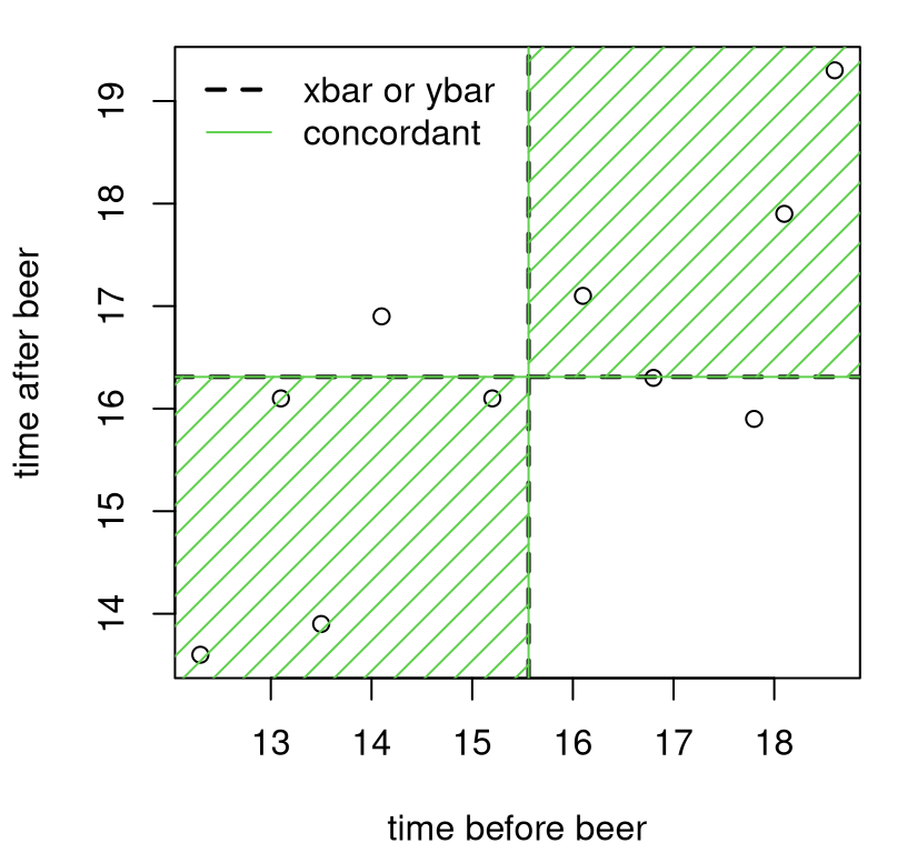
FIGURE 7.2: Illustrating covariance on frat dash data.
In R, covariance can be calculated with cov.
## [1] 2.906Observe that this particular sample covariance is positive. That happened, intuitively speaking, because there are many more pairs in the data that are concordant (in the green region) with their averages than discordant (in the white), as shown in Figure 7.2. Estimated covariance would be negative if there were more pairs discordant with their averages.
It can be hard to separate out scale and association and make sense of a number like this. To focus just on association, divide by the (square root) of the scales estimated for \(Y\) and \(X\) to get correlation.
\[\begin{equation} \rho_{yx} = \mathbb{C}\mathrm{or}(Y, X) = \frac{\mathbb{C}\mathrm{ov}(Y, X)}{\sqrt{\mathbb{V}\mathrm{ar}\{Y\} \mathbb{V}\mathrm{ar}\{X\}}} \tag{7.3} \end{equation}\]
This is known as Pearson’s product-moment coefficient, or more simply “Pearson’s \(\rho\)”. It is named for Karl Pearson, yet another notable British statistician who, like Fisher, has a bunch of other stuff named after him. Apparently, Pearson and Fisher had a bit of a rivalry going, despite sharing similar (now widely considered) racist beliefs.
Note that \(\rho = \rho_{yx} = \rho_{xy}\), by virtue of similar symmetry in covariance. Since covariance can be positive or negative, and we are dividing by only positive values, correlation can also be positive and negative. Normalization gives that \(\rho\) is at most one, in absolute value: \(-1 \leq \rho \leq 1\). Closer to one, in absolute value, means stronger association. Random variables that have \(\rho = 0\) are uncorrelated, and thus have no (linear) association.
Estimating \(\rho\) is simply a matter of following the formula (7.3) in sample analogs.
\[\begin{equation} r \equiv r_{yx} = \frac{s_{yx}}{s_y s_x} \tag{7.4} \end{equation}\]
Like \(\rho\), we have that \(-1 \leq r \leq 1\), measuring the strength and direction of association. In R:
## [1] 0.7608So the estimate calculated on the frat dash data indicates a positive association. This makes sense. Although pledges seem to slow down after a beer, their time before is indicative of their time after. If they tended to be among the slowest before a beer, then they were among the slowest afterwards. The same goes for the middle and fastest runners.
Some discussion
Can you think of any examples where correlation would be negative? We’ll see some later in the homework exercises of §7.8. But in the meantime, here are some complicated ones to get your wheels spinning. I’m not going to provide any formal references. You’ll find many by Googling.
People who are wealthier/more affluent tend to live longer and have children who are taller than they are. There’s two positive associations. I bet if you collect data on the height difference (or difference in lifespan) between fathers and sons, or mothers and daughters (that’s your \(Y\)), and parent’s income \((X)\) or some other measure of their socioeconomic status (SES), you’ll find a positive association. This is certainly true in my family, many-fold over generations.
But … controlling for income/SES (e.g., holding it fixed), I bet you’ll find that shorter people live longer than taller people. Women tend to be shorter than men and also live longer. The association is negative. My uncle is shorter than my dad by almost a foot, and lived 15 years longer. RIP Dad and Uncle Bill. That’s anecdotal, and I’m sure there are many exceptions. On average, I suspect lifespan \((Y)\) is negatively associated with height \((X)\), all else being equal.
Another weird one is US voting preferences in the 20th century. (Things have changed on this recently, though not as much as you might think.) Income was/is an excellent predictor of propensity to vote Republican on an individual level. More money (\(X\)) better chance of voting Red (\(Y\)).
But … it’s different on the state level. I’ve got a homework question for you on this in §12.5. Wealthier states (think CA, NY) tend to vote Blue (Democrat, not Republican), whereas poorer ones (think MS, AL) tend to vote Red. The association is negative. You can even see this over time. Virginia, where I live, used to be a poorer state. But as Northern VA amassed wealth in the late-20th century, attracting affluence with proximity to DC and government work, VA flipped from Red to Blue. These days it’s considered a Purple state.
Both pairs of examples owe their quirkiness to something called Simpson’s paradox, which is a fancy way of saying “it depends on how you look at it”. Things sometimes look different zoomed out, with wider perspective, than if you look really closely. So just be careful. Resolution matters. It can go either way.
Alight, one last thing before we actually start doing statistics. Why is it called linear correlation? For that, let’s look at some examples. Figure 7.3 depicts six sets of \((x, y)\) pairs. Never mind how they were generated. Putting all that code here would be a distraction.
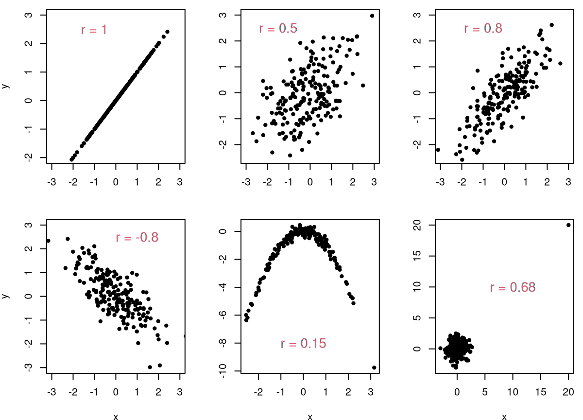
FIGURE 7.3: Some example correlation calculations.
Consider the panels in turn, clockwise from the top-left. If pairs perfectly follow a line, then \(r = \pm 1\). It doesn’t matter what the slope is as long as it’s nonzero. A non-noisy association that follows a straight line is perfectly correlated. So that’s one reason to call it “linear” correlation. If data are noisy, like in the other five panels, correlation is less-than-perfect: \(-1 < r < 1\). The next pair of panels depict a weaker and somewhat stronger relationship, respectively. The bottom-left panel is the reverse of the top-right, showing a similarly strong negative association.
The final two panels in Figure 7.3 are the most interesting. The bottom-middle one shows that you can fool correlation if the association is nonlinear. Visually, the relationship between \(Y\) and \(X\) is stronger than in any other panel except the first one, yet here \(r\) is smallest of all. Correlation is not a good measure of association – at least not in its most basic, linear form – when that association is nonlinear. The final panel represents a caution of a different sort, which we shall address later in Chapter 12. Whenever there are extreme outliers, they can exert undue influence on a correlation. You can’t trust estimates in this case.
The reason for this last phenomenon is that the mathematical construct, \(\rho\) in Eq. (7.3), is making an implicit Gaussian assumption, which we’ll get to momentarily. You can calculate \(\rho\) for any joint distribution, and estimate \(r\) for any pairwise sample, whether Gaussian or not. Deciding what an estimate means requires additional modeling scaffolding. You can’t just look at an estimate, \(r\), and judge whether or not it’s significant (different from zero) in a vacuum. How \(r\) compares to a hypothesis about \(\rho\) depends on modeling assumptions which (usually) involve distributions. If those assumptions are egregiously at odds with reality, as they are on the bottom-right Figure 7.3, then all bets are off.
7.2 Pearson’s \(\rho\)
Suppose we make a marginally Gaussian assumption for \(X\) and \(Y\) in addition to \(\mathbb{C}\mathrm{or}(Y, X) = \rho\). Copying from Eq. (5.5), that means:
\[\begin{align*} Y_1, \dots, Y_{n} &\stackrel{\mathrm{iid}}{\sim} \mathcal{N}(\mu_y, \sigma_y^2) & & \mbox{and} & X_1, \dots, X_{n} &\stackrel{\mathrm{iid}}{\sim} \mathcal{N}(\mu_x, \sigma_x^2). \end{align*}\]
If you want to be fancy, you could say that \(X\) and \(Y\) have a bivariate Gaussian (or normal) distribution.
\[\begin{equation} \mbox{Model:} \quad\quad \begin{bmatrix} Y_i \\ X_i \end{bmatrix} \stackrel{\mathrm{iid}}{\sim} \mathcal{N}_2 \left( \begin{bmatrix} \mu_y \\ \mu_x \end{bmatrix}, \begin{bmatrix} \tag{7.5} \sigma_y^2 & \rho \sigma_y\sigma_x \\ \rho \sigma_x \sigma_y & \sigma_x^2 \end{bmatrix} \right), \quad \mbox{ for } \quad i=1,\dots,n \end{equation}\]
The bivariate Gaussian is a special case of the multivariate normal (MVN), often notated as \(\mathcal{N}_p(\mu, \Sigma)\). Above, \(p = 2\), \(\mu = [\mu_y, \mu_x]^\top\) and \(\Sigma\) is the matrix in the second argument to \(\mathcal{N}_2(\cdot, \cdot)\). It is worth clarifying, briefly, that iid here doesn’t mean that \(Y_i\) is independent of \(X_i\). They are, in fact, quite dependent through \(\rho\). That’s the whole point of this chapter! Here, as previously, iid is interpreted over \(i=1,\dots,n\), meaning that \((Y_i, X_i)\) is independent of \((Y_j, X_j)\) for \(i \ne j\).
Don’t let matrices and vectors frighten you. When \(\rho = 0\), e.g., when testing under the null hypothesis of no linear correlation (the most common case), we won’t need them at all. It’s only when generating under a nonzero null correlation that the bivariate Gaussian is important. We’ll lean on a library-based pseudo-random number generator in that case.
In my first draft of this chapter, I totally forgot to discuss options for estimating \(\rho\), along with all other parameters in the model (7.5): \(\mu_y, \mu_x, \sigma_y^2, \sigma_x^2\). I guess it seemed automatic that \(\hat{\rho} = r\) would work, along with usual suspects from earlier chapters: \(\bar{y}, \bar{x}, s_y^2, s_x^2\). Those are definitely sensible choices, but are they good? What are the best settings of those parameters? For example, what parameter settings maximize the likelihood (MLE)?
Perhaps I’m being lazy, but I’ve decided to leave that to you as a homework exercise. To figure that out, you’ll have to work with a bivarate Gaussian density, which you can find in the links above, and take logs and derivatives. Some other interesting considerations include the following. Is the estimate you find for \(\rho\) unbiased? What is its variance? (That might require asymptotic analysis.)
Going forward, my narrative will focus on inference for \(\rho\) via observed \(r\). Remember that you can estimate a parameter however you’d like, and your test statistic need not be a parameter estimate at all. It’s totally up to you. Some things are easier when you stick to MLEs, especially when the math benefits from asymptotic analysis. You’re a lot freer to choose otherwise with Monte Carlo (MC).
Before jumping into that, here is a formal characterization of competing hypotheses. For some \(\rho_0\), which is usually zero, we wish to test as follows.
\[\begin{align} \mathcal{H}_0 &: \rho = \rho_0 && \mbox{null hypothesis (“what if")} \tag{7.6} \\ \mathcal{H}_1 &: \rho \ne \rho_0 && \mbox{alternative hypothesis} \notag \end{align}\]
As previously, I’ll be a little cavalier with my notation, often write \(\rho_0\) as \(\rho\) with the understanding that this is the value specified by \(\mathcal{H}_0\). Or, I’ll just substitute in the particular numerical value, usually \(\rho = 0\) but not always. The test statistic is \(r\). How to run the test? As usual, that depends on whether you like simulation or math, and I’ll show you both in turn.
Pearson’s \(\rho\)-test via MC
Here I shall utilize a, by now, familiar sampling framework for Gaussian populations. An estimated variance has a \(\chi^2\) distribution, e.g.,
\[ \sigma_y^2 \sim (n-1) s_y^2 / \chi^2_{n-1} \quad \mbox{ and } \quad \sigma_x^2 \sim (n-1) s_x^2 / \chi^2_{n-1}. \]
Those random variables, along with the value of \(\rho\) specified by \(\mathcal{H}_0\), pin down a bivariate Gaussian (7.5) covariance structure. Since parameter \(\rho\) is a (co-) variance quantity, and we know from Chapter 5 that estimated variances of Gaussians are independent of means, \(\mu_y\) and \(\mu_x\) specifications won’t affect testing. We can use whatever values we want. Below I use data averages, but I encourage you to try other settings.
Looking back at the frat dash example, the main “what if” (7.6) of interest centers around \(\rho = 0\). We want to know if the times are correlated before and after an intervention (beer). This \(\mathcal{H}_0\) simplifies simulation. When \(\rho = 0\) we don’t really have a bivariate Gaussian, but rather two completely independent univariate ones. Those off-diagonal terms in \(\Sigma\) are zero. So we’re ready to go.
N <- 100000
Rs <- rep(NA, N)
for(i in 1:N) {
  sigma2ys <- (n - 1)*s2y/rchisq(1, n - 1)
  Ys <- rnorm(n, ybar, sqrt(sigma2ys))
  sigma2xs <- (n - 1)*s2x/rchisq(1, n - 1)
  Xs <- rnorm(n, xbar, sqrt(sigma2xs))
  Rs[i] <- cor(Xs, Ys)
}
Figure 7.4 shows these sampled correlations in our usual histogram format, summarizing an empirical sampling distribution for \(r\), with the data-estimated \(r\)-value and its reflection overlayed.
hist(Rs, xlim=c(-1.15, 1.15), main="")
abline(v=c(r, -r), lty=1:2, col=2, lwd=2)
legend("topright", c("r", "reflect"), col=2, lty=1:2, lwd=2, bty="n")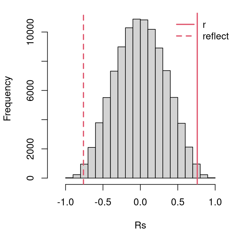
FIGURE 7.4: Histogram of sampled \(R\) for testing \(\rho = 0\) in the frat dash experiment, with estimated \(r\) and it’s reflection overlayed.
This looks like a reject of the null, but a \(p\)-value calculation can help add precision.
## [1] 0.01042Indeed, this is less than our default 5% threshold. It’s a close call, but it turns out that there is indeed an association between dashing times before and after chugging a beer.
How about a confidence interval (CI) for \(\rho\)? Just go back through the
simulation, but instead of using \(\rho = 0\), use the estimated value of
\(\hat{\rho} = r\). That’s easier said than done in this case, however. Since \(r
\ne 0\) we must draw from a bivariate Gaussian. After sampling marginal
variances \(\sigma_y^2\) and \(\sigma_x^2\), the code below builds a \(2 \times 2\)
matrix \(\Sigma\) using those values and \(\hat{\rho}\) following Eq.
(7.5). Then, I draw from a \(p=2\)-variate MVN using a function from
the mtvnorm library (Genz and Bretz 2009).
Rs <- rep(NA, N)
library(mvtnorm)                                       ## for rmvnorm
for(i in 1:N) {
  sig2ys <- (n - 1)*s2y/rchisq(1, n - 1)
  sig2xs <- (n - 1)*s2x/rchisq(1, n - 1)
  syxs <- sqrt(sig2ys*sig2xs)                          ## product of sds
  Sigs <- rbind(c(sig2ys, r*syxs), c(r*syxs, sig2xs))  ## Build 2x2 Sigma
  XYs <- rmvnorm(n, c(ybar, xbar), Sigs)               ## library MVN RNG
  Rs[i] <- cor(XYs)[1, 2]                              ## diag always 1
}
CI.mc <- quantile(Rs, c(0.025, 0.975))
CI.mc
## 2.5% 97.5%
## 0.3105 0.9446The code above would be useful, with a minor tweak, in order to test for \(\rho = \rho_0\) vs. \(\rho \ne \rho_0\). Remember that for your homework.
One thing you’ll notice is that this code is lots slower than the chunk earlier, for \(\rho = 0\). Drawing from an MVN involves a Cholesky decomposition of \(\Sigma\), which is a lot of work computationally. There are work-arounds in the bivariate case, but the code is cleaner the way it is above.
Pearson’s \(\rho\)-test via math/asymptotics
Ok, here is what in my opinion will be the first big let-down in the book. Maybe it’s not the first for you. Correlation is among the most fundamental ideas in statistics. Yet the test for significance and associated CI for \(\rho\) is an inscrutable mess. Why? Because the math is hard. Not only that, there are two different procedures depending on the situation. That means more to remember, a burden of choice, and potentially consternation if you try both and they don’t agree.
This is a shame for several reasons. One is that I’m going to quote results with intuition rather than through derivation. Another is that a related idea, of slopes in a linear model coming next, is so simple by comparison and gives you pretty much the same information. (It’s not exactly the same because lines involve both slopes and intercepts, two unknown parameters compared to correlation’s lone \(\rho\). But I haven’t, in my whole career, come across a problem where the outcome of a slope-based test differed from a \(\rho\) one.) Finally, it’s particularly a shame when the MC is so easy – no fancy math. I’m hoping that’s a running theme in this book that resonates with you.
Both math-based testing approaches for \(\rho\) involve a transformation of \(r\), similar to how we transform \(r^2\) into \(f\) for an \(F\)-test in §6.3. In fact, \(r\) here and \(r^2\) there have another thing in common, but that’ll have to wait until §7.6, and we won’t fully appreciate the connection until we get to multiple linear regression (MLR) in Chapter 13. I don’t want to spoil it here.
The first testing approach for \(\rho\) is an asymptotic approximation, based on a CLT-like argument so that you can use a Gaussian. The second one is exact, but can only be used for testing \(\rho = 0\), and consequently does not yield a CI. Often, software libraries mix the two in some way, which is not always made obvious in the output.
Ok, here goes. Let \(R\) be the random version of \(r \equiv r_{yx}\). It can be shown that an inverse hyperbolic tangent transformation of \(R\), i.e., \(\mathrm{artanh}(R)\), is Gaussian asymptotically.
\[\begin{align} W &= \frac{1}{2} \log \frac{1+R}{1-R} \sim \mathcal{N}(\mu_w, \sigma^2_w) \quad \mbox{ as } n \rightarrow \infty, \tag{7.7} \\ \mbox{where } \quad \mu_w &= \frac{1}{2} \log \frac{1 + \rho}{1 - \rho} \quad \mbox{ and } \quad \sigma_w^2 = \frac{1}{n-3} \notag \end{align}\]
This is also known as the Fisher \(z\)-transformation. Now we can follow the usual \(z\)-test approach with \(z = (w - \mu_w) / \sigma_w\) and calculate a \(p\)-value as \(\psi = 2 \Phi(-|z|)\) for a two-sided test. At least that part is pretty easy. This test can be used for any \(\rho\), but in our frat dash example we’re interested in \(\rho = 0\).
w <- 0.5*log((1 + r)/(1 - r))           ## also atanh(r)
rho <- 0
muw <- 0.5*log((1 + rho)/(1 - rho))     ## also atanh(rho)
s2w <- 1/(n - 3)
z <- (w - muw)/sqrt(s2w)
pval.clt <- 2*pnorm(-abs(z))
c(mc=pval.mc, clt=pval.clt)
## mc clt
## 0.010420 0.008279This agrees with the MC version when rounded to the second decimal place. Of course, \(n = 10 \ll \infty\), so a Gaussian approximation may not be accurate.
Similarly, a CI may be built by inverting \(z \pm q_{\alpha/2}\) via Eq. (3.19).
\[\begin{align*} & w \pm q_{\alpha/2} \sigma_w && \mbox{is a CI for $\mu_w$} & \\ \mbox{so } \quad & \frac{\exp\left\{2(w \pm q_{\alpha/2} \sigma_w)\right\} - 1}{\exp\left\{2(w \pm q_{\alpha/2} \sigma_w)\right\} + 1} && \mbox{is a CI for $\rho$} & \end{align*}\]
Check it.
q <- qnorm(0.975)
mu.ci <- w + c(-1, 1)*q*sqrt(s2w)
emu.ci <- exp(2*mu.ci)
CI.clt <- (emu.ci - 1)/(emu.ci + 1)
rbind(mc=CI.mc, clt=CI.clt)
## 2.5% 97.5%
## mc 0.3105 0.9446
## clt 0.2517 0.9401This CLT-based CI is similar to the MC one, but shifted a little bit lower toward zero. It’s important to remember which is the gold standard here. Although both are approximations, you can always make \(N\) bigger in the MC. I encourage you to try that, but spoiler alert: it doesn’t change much in this instance. With \(n\) and the CLT, you’ve got what you’ve got and it is what it is, and \(n\) is small in this instance.
When \(\rho = 0\), it may be shown that
\[ U = \frac{R \sqrt{n - 2}}{\sqrt{1 - R^2}} \sim t_{n-2}, \quad \mbox{exactly.} \]
That is, this is not an approximation. You can actually work out what the
distribution is for \(R\) in generality (i.e., for any \(\rho\)) in closed form,
but it’s not pretty to look at and it isn’t a standard distribution that has a
density function (like pt or pnorm) to go with it. That makes it more
of an intellectual curiosity as far as testing goes. The special case of
\(\rho = 0\) reduces to a standard density, making it more useful in practice.
u = r*sqrt(n - 2)/sqrt(1 - r^2)
pval.t <- 2*pt(-abs(u), df=n - 2)
lib <- cor.test(y, x) ## see below
c(mc=pval.mc, clt=pval.clt, math=pval.t, lib=lib$p.value)## mc clt math lib
## 0.010420 0.008279 0.010615 0.010615This one is much closer to our MC calculation, identical up to two digits.
Limiting to \(\rho = 0\) means no CI, so libraries tend to mix CLT and exact
versions. In fact, the cor.test function built into R doesn’t allow you to
test anything but \(\rho = 0\), yet it still mixes CLT calculations for the CI
with the other, exact variation for testing. Above, observe that the library
output matches pval.t exactly, which is close to the MC calculation. Below,
notice that the CI matches the CLT alternative.
##       2.5%  97.5%
## mc  0.3105 0.9446
## clt 0.2517 0.9401
## lib 0.2517 0.9401But again, I trust the MC answer more because (a) I understand what’s going on, and (b) I can always refine it with larger \(N\).
7.3 Lines refresher
You probably remember from middle school that there are three ways to describe a line: point–point, point–slope, and slope–intercept. There are others, but those are the main ones; the last one is actually a special case of the second one. You can go back and forth between them because they each uniquely describe a line. That means there’s only one line that goes through two distinct points, and only one with a particular slope and intercept. The opposite isn’t true: there are many ways to describe the same line with pairs of points, since lines are made up (in a certain sense) of infinitely many points.
But I digress. Here I’ll primarily work with the slope–intercept form. Later, in Chapter 12 we shall mostly use point–point. Each can be handy in its own way. You’re probably familiar with the following mathematical depiction of the slope–intercept form: \(y = m x + y_0\). The slope is \(m\), and the intercept is \(y_0\). The intercept tells you where the line crosses the \(y\)-axis. Put another way, it’s giving you that point \((0, y_0)\) on the line, when \(x = 0\). The slope is telling you how far to go up (or down for negative \(m\)) in \(y\) as \(x\) increases by one. You can think of that as giving you the point \((1, y_0 + m)\) on the graph, but actually it’s giving you \((x, y_0 + mx)\) for any \(x\).
Conversely, if someone gives you two points \((x_1, y_1)\) and \((x_2, y_2)\), then you can calculate slope by following the rise-over-run formula
\[ m = \frac{y_2 - y_1}{x_2 - x_1}. \]
Once you have \(m\), you can solve for \(y_0\) by plugging in either point and solving:
\[ y_0 = y_1 - m x_1. \]
I sure hope that was enough of a review so we can move on to some stats. Actually, before I jump in, I want to change the notation a little. In linear regression the intercept and slope are parameters of interest, and statisticians like Greek letters for unknowns. So the linear equation is usually notated as:
\[ y = \beta_0 + \beta_1 x, \]
so that the intercept is \(\beta_0\) and the slope is \(\beta_1\). I know these Greek letters and subscripts seem cumbersome, but you’ll have to take my word for it that it’s well thought out and makes sense. You’ll find some references that use \(\alpha\) and \(\beta\) for intercept and slope, avoiding subscripts. Our investment in subscripts will pay off when we get to MLR in §13.3.
Our interest is in choosing values for these parameters to compactly describe \((x, y)\) relationships in data. For example, what settings of \((\beta_0, \beta_1)\) would give a good fit to the frat dash data in Figure 7.1? What “good fit” means is something we’ll have to unpack a little later. First, I want to suggest one fit that connects to correlation.
Suppose we were to assume that the conditional distribution \(\mathbb{P}(Y \mid X)\) was such that it follows a linear relationship. Notice that I’m leaving much to the imagination here. I’m not saying what the distribution for \(Y\) is – or for \(X\) – but just how the two are related to one another in their conditional distribution. If you wanna get fancy, I’m telling you something about the copula of the joint distribution, but not its margins. Don’t worry, I’m not going to pull us into a copula rabbit hole. I just wanted you to know a nerdy stats word.
That was a long-winded way of saying: suppose \(Y = \beta_0 + \beta_1 X\). Now, what happens if we try to calculate covariance between \(Y\) and \(X\) under this relationship? The development below uses a property for covariance of linear combinations, similar to ones I used in Chapters 2 and 4 for expectations.
\[ \begin{aligned} \mathbb{C}\mathrm{ov}(Y,X) &= \mathbb{C}\mathrm{ov}(\beta_0 + \beta_1 X, X) = \mathbb{C}\mathrm{ov}(\beta_1 X, X) = b_1 \mathbb{V}\mathrm{ar}\{X\}. \\ \mbox{Then solve: } \quad \beta_1 &= \frac{\mathbb{C}\mathrm{ov}(Y,X)}{\mathbb{V}\mathrm{ar}\{X\}}. \\ \end{aligned} \]
Next replace those theoretical covariance and variance quantities with their sample analog which can be calculated from data.
\[\begin{equation} b_1 = \frac{s_{yx}}{s_x^2} \tag{7.8} \end{equation}\]
Notice how I switched from Greek to Roman lettering, because we can actually calculate \(b_1\) from data. I want you to think of it as an estimate. I’m not saying it’s an MLE or anything like that, which is why I’m not using \(\hat{\beta}_1\).
Now suppose we do the same thing for correlation, which is easy because that just means divide both sides by the standard deviation of \(Y\) and \(X\).
\[ \mathbb{C}\mathrm{orr}(Y,X) = \beta_1 \frac{\sqrt{\mathbb{V}\mathrm{ar}\{X\}}}{\sqrt{\mathbb{V}\mathrm{ar}\{Y\}}} \quad \mbox{or in sample terms } \quad r_{yx} = b_1 \frac{s_x}{s_y} \]
Solving for \(\beta_1\) or \(b_1\) gives
\[\begin{equation} b_1 = r_{yx} \frac{s_y}{s_x} \equiv \mbox{corr } \times \frac{\mathrm{rise}}{\mathrm{run}}. \tag{7.9} \end{equation}\]
This could be an “Ah-ha!” moment. It was for me when I first saw it. Apparently, slope from example data pairs \((x_1,y_1), \dots, (x_n, y_n)\) is correlation times rise over run, where rise and run are measured in standard deviations. Using the frat dash data in R:
## [1] 0.572This number is telling us that for every one second slower a frat boy is before a beer, he is 0.57 seconds even slower afterward. That’s complicated to say, because not having an intercept makes it so that I have to express everything on relative terms. I can’t be concrete and make a prediction.
How about that intercept? We’ve got slope, so all we need now is a point. How about insisting that the line “go through the middle” of the data? In other words, what if I insist that the point \((\bar{x}, \bar{y})\) is on the line. Then solve to get …
\[\begin{equation} b_0 = \bar{y} - \bar{x} b_1. \tag{7.10} \end{equation}\]
I call this the “correlation and means” method for dialing in a line from a cloud of points. In R:
## [1] 7.41This number isn’t super meaningful in and of itself, but it allows the line to be plotted. See Figure 7.5. I jammed a few other things into the figure, because it had been a while, so it’ll take a bit to narrate.
plot(x, y, xlab="time before beer", ylab="time after beer")
abline(b0, b1, col=2, lwd=2)            ## adding the estimated line
points(xbar, ybar, col=2, pch=19)       ## indicating intercept
xs <- c(13, 14, 14)                     ## indicating slope (next 4 lines)
ys <- c(b0 + xs[1]*b1, b0 + xs[1]*b1, b0 + xs[3]*b1)
lines(xs, ys, col=2, lty=2)
text(xs[2], (ys[2] + ys[3])/2, "b1", pos=4, col=2)
legend("topleft", c("cor and means line", "slope"),
  lty=1:2, col=c(2, 2), lwd=2:1, bty="n")
legend("bottomright", "(xbar, ybar)", pch=18, col=2, bty="n")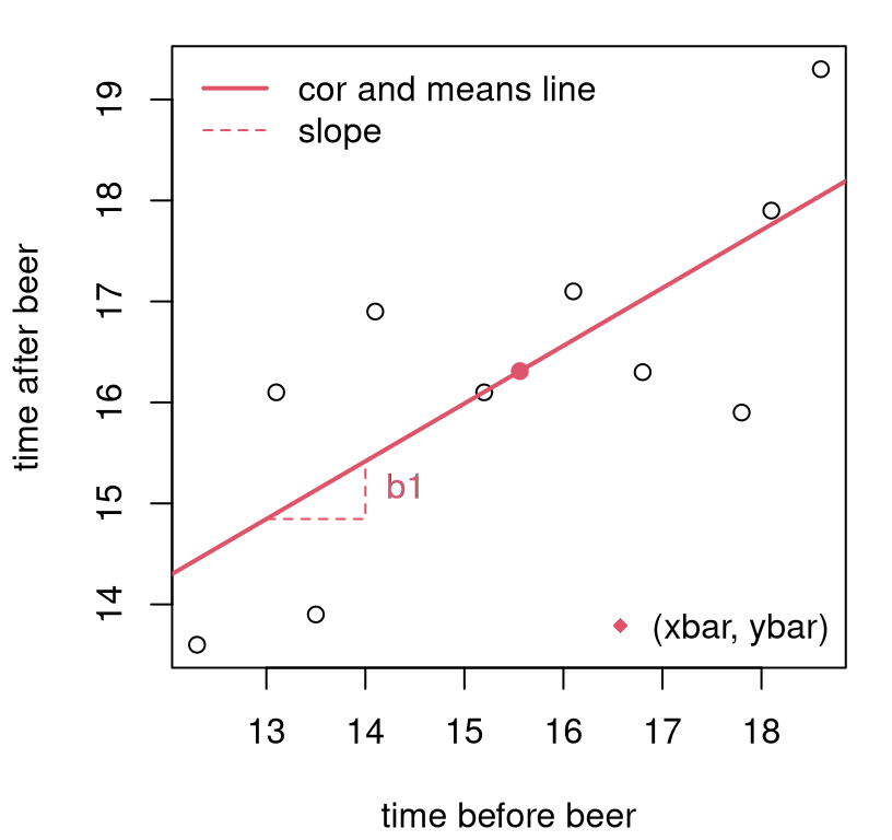
FIGURE 7.5: Line fit to frat dash data via “correlation and means”.
Check out the new way I’m using the abline function. Actually, a is for
intercept and b for slope in abline. Pretty good line, right? I
tried to indicate estimated slope (\(b_1\)) and intercept (\(b_0\)), but
somewhat indirectly. Slope is the change in \(y\) for one unit of change in
\(x\), so that’s shown by the vertical travel (of about \(0.57\)) in
the dashed red line near \(x=[13,14]\). There is nothing special about those
coordinates. I could have indicated slope anywhere along the line. I
chose a spot a little out-of-the-way to reduce clutter. The intercept isn’t on
the plot, because it lies outside the plotting window near
\((0, 7.41)\). We pinned that down through
\((\bar{x}, \bar{y}) = (15.56, 16.31)\),
and those coordinates are shown on the plot as
a red dot.
Now we can make a prediction that is quantitatively precise. Recall I said a time of \(x=14.5\) seconds was recorded for one recruit, Brandon. Here’s what I would predict for Brandon, using the line, after he chugged a beer.
## [1] 15.7This is not too far off my guess from earlier. Using the line has some benefits. It’s automatic, precise, and objective. But it has some downsides too. That line looked good, but how do we know it is good? How do we know there isn’t a better line that’ll give more accurate predictions? Acknowledging that our estimate of the line is from a small sample of data, how can we assess the uncertainty of that estimation, and how does that uncertainty filter through to predictions?
7.4 Ordinary least squares
First, I’ll talk about getting the best line. Then, I’ll bring in some probabilities so that we can have a full statistical model and understand its sampling distribution. There’s absolutely nothing statistical or probabilistic about what’s in this section. It’s pure optimization. In particular, there are no Greek letters. They’ll be back.
Generically, regression means tending to revert back to something, like how observations in a sample tend to regress to the mean. I said I wasn’t going to do statistics here, but bear with me. On a cold summer day, you could guess that tomorrow’s temperature will be warmer because you believe that temperature will regress to whatever the historical average has been on that particular day over the years. Linear regression extends that idea, which is inherently pointwise in nature, to lines where the notion of average can vary, linearly, as a function of \(x\).
One way to do linear regression is to posit a line, say \(y = b_0 + b_1 x\) and ask, what values of \(b_0\) and \(b_1\) make the line as close as possible to some data \((x_1, y_1), \dots, (x_n, y_n)\). Then that line would represent the average (\(y\) as a function of \(x\), or equally for \(x\) as a function of \(y\)) that those values tend to revert to. Linear regression, therefore, is all about summarizing \(2n\) quantities, or \(n\) data pairs, with two quantities, \(b_0\) and \(b_1\). This is information extraction, the essence of learning: simplifying many observations into a compact rule that can be used to generalize, i.e., to make predictions. Obviously, we’re interested in optimal information extraction.
What does it mean to be “as close as possible”? What’s a good line and how to find the best one by that criterion? There are many good choices here, but only one that has nice properties and is easy to work with. I’ll explain why as we go. First, I need some definitions.
Fix some intercept \(b_0\) and slope \(b_1\); any values will do. If it helps, imagine \(b_0 = 0\) and \(b_1 = 1\). You don’t have to imagine good or optimal values for a particular data set, though in what follows I shall use the ones we estimated with “correlation and means” for the frat dash example. Now, for a particular data set let the fitted values be what the line predicts for \(y_i\) given \(x_i\).
\[\begin{equation} \mbox{Fitted values: } \quad \hat{y}_i = b_0 + b_1 x_i, \quad \mbox{for } \quad i=1,\dots,n \tag{7.11} \end{equation}\]
Note that \(\hat{y}_i \ne y_i\); fitted values are not the same as observed values. Technically, actually, that’s possible. For example, if you only had \(n=2\) points, we could use the two-point approach to dial in a slope and intercept that would give a “perfect fit” line to those two points. However, for \(n > 3\) and distinct \((x_i, y_i)\), that’s not possible. And in all interesting situations it’s not possible, so let’s presume that’s the case going forward. Using values calculated for the frat dash example in §7.3, we may calculate these as follows.
## [1] 14.45 16.62 18.05 15.13 17.02 15.47 17.76 17.59 16.10 14.90Since fitted and observed values aren’t equal, we can measure the discrepancy between them. That’s called a residual.
\[\begin{equation} \mbox{Residuals: } \quad e_i = y_i - \hat{y}_i, \quad \mbox{for } \quad i=1,\dots,n \tag{7.12} \end{equation}\]
In R:
##  [1] -0.845289  0.481122  1.251129 -1.231686 -0.719277  1.425116
##  [7]  0.137127 -1.691274 -0.004081  1.197113
Let’s take a look at fitted values and residuals for frat dash. See Figure 7.6. Notice that fitted values are parts of the line that correspond to observed \(x_i\) locations, whereas residuals “connect” fitted values \(\hat{y}_i\) to observed \(y_i\). Residuals comprise the length and direction (i.e., sign indicating above/positive or below/negative) of the green lines, not their position in \((x,y)\) space.
plot(x, y, xlab="time before beer", ylab="time after beer")
points(x, yhat, col=2, pch=19)                       ## fitted values
arrows(x, yhat, x, y, col=3, length=0)               ## residuals
legend("topleft", "fitted values", pch=19, col=2, bty="n")
legend("bottomright", "residuals", lty=1, col=3, bty="n")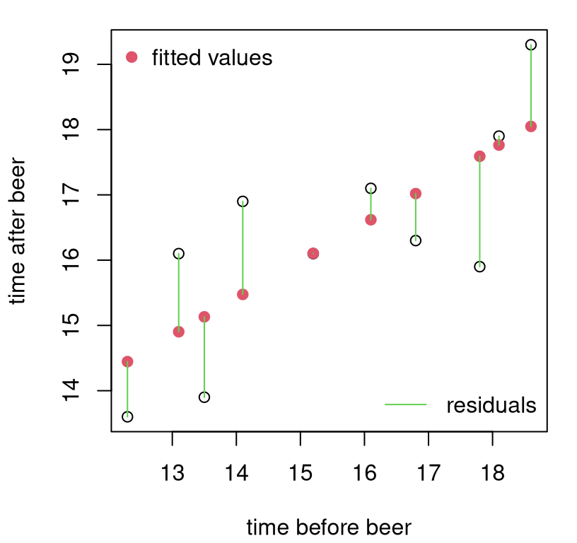
FIGURE 7.6: Fitted values and residuals for the frat dash example. It looks like there’s no residual for that middle point, but it’s just very small because the line is very close to the observed \(y_i\) value.
It makes sense, intuitively, to describe a good (fitting) line as one which has small residuals. If residuals are small, then the line is close to the points. But not all residuals can be small. There’s a trade-off. Although it’s possible to make residuals zero for any pair of points (because that’s one way to define a line), unless all \(n\) points already line up on a line, perfectly, then you’re faced with a balancing act. You can move the line (adjust \(b_0\) and \(b_1\)) closer to some points, but only at the expense of moving it farther from others.
Presuming it doesn’t matter how often the line under-predicts (\(e_i > 0\)) compared to over-predicting (\(e_i < 0\)), a sensible way to quantify total distance, for all fitted and observed values in search of balance, is to aggregate squares: \(\sum_{i=1}^n e_i^2\). This is sometimes called the residual sum of squares (RSS). There are lots of other reasonable choices here. For example, we could replace the square with an absolute value. This is known as absolute deviation. RSS is special because of what I’m about to do next.
The best line, according to the least squares criteria, solves the following mathematical program, known as ordinary least squares (OLS).
\[\begin{equation} \min \sum_{i=1}^n e_i^2 = \min \sum_{i=1}^n (y_i - b_0 - b_1 x_i)^2 \tag{7.13} \end{equation}\]
The second “equals” on the right is intended to serve as a reminder that \(b_0\) and \(b_1\) are embedded in each \(e_i\). Sometimes people say OLS to signify that they are using LS in the simplest, most ordinary way, with raw \((x_i, y_i)\) values. If you compare the contents of those two Wikipedia links, you’ll see what I mean. There are many non-ordinary applications of LS, but I don’t want to get us off-track here. And I don’t mind if you say LS when you mean OLS, and vice versa. It’s an arbitrary distinction.
How do you solve that mathematical program (7.13)? Well, it’s an optimization, and we know all about those, right? Derivative calculus! “Oh no!”, you say. Check this out, it’s not that bad. Just do \(b_0\) and \(b_1\) one at a time, and when you’re boasting to your colleagues, say “gradient” to sound fancy. Starting with \(b_0\), where the first step uses sum, chain and power rules all at once …
\[ \begin{aligned} 0 &\stackrel{\mathrm{set}}{=} \frac{\partial}{\partial b_0} \sum_{i=1}^n (y_i - b_0 - b_1 x_i)^2 \\ 0 &= \sum_{i=1}^n 2 (y_i - b_0 - b_1 x_i)(-1) \\ 0 &= \sum_{i=1}^n y_i - n b_0 - b_1 \sum_{i=1}^n x_i \\ \mbox{solving } \quad b_0 &= \frac{1}{n} \sum_{i=1}^n y_i - b_1 \frac{1}{n} \sum_{i=1}^n x_i \\ b_0 &= \bar{y} - b_1 \bar{x} \end{aligned} \]
Does this look familiar? It’s the same as Eq. (7.10). Coincidence? What do you think is going to happen with slope?
\[ \begin{aligned} 0 &\stackrel{\mathrm{set}}{=} \frac{\partial}{\partial b_1} \sum_{i=1}^n (y_i - b_0 - b_1 x_i)^2 \\ 0 &= \sum_{i=1}^n 2 (y_i - b_0 - b_1 x_i)(-x_i) \\ 0 &= \sum_{i=1}^n y_i x_i - b_0 x_i - b_1 x_i^2 \\ 0 &= \sum_{i=1}^n y_i x_i - (\bar{y} - b_1 \bar{x}) x_i - b_1 x_i^2 &\mbox{sub } \quad b_0 &= \bar{y} - b_1 \bar{x} \\ 0 &= \left(\sum_{i=1}^n y_i x_i - \bar{y} x_i \right) - b_1 \left( \sum_{i=1}^n x_i \bar{x} + x_i^2\right) \\ \mbox{so} \quad b_1 &= \frac{\sum_{i=1}^n y_i x_i - \bar{y} x_i}{\sum_{i=1}^n x_i \bar{x} + x_i^2}= \frac{\sum_{i=1}^n (y_i - \bar{y})(x_i - \bar{x})}{\sum_{i=1}^n (x_i - \bar{x})^2} & \mbox{i.e., } \quad b_1 &= \frac{s_{yx}}{s_x^2} = r_{yx} \frac{s_y}{s_x} \end{aligned} \]
Ok, this can’t be a coincidence if it happens twice. Check Eqs. (7.8) and (7.9). The “correlation and means” line is not just a sensible line, it is the best line by the OLS criteria. No other line is closer to the points in a least-squares sense. I don’t need to write new code, and I don’t need to re-plot Figure 7.5 because nothing has changed in practical terms. But we have a new interpretation. We know that the line is good. We know it’s the best!
Don’t celebrate yet. We still don’t understand the sensitivity of our estimate to a small sample of data. That’s because we’ve been avoiding probability and statistical reasoning.
7.5 Simple linear regression
I just explained (I hope) a connection between the slope of a line and correlation (7.9); in fact, to the best line! Since correlation is a property, or component, in the joint distribution of \(Y\) and \(X\), apparently the best line is somehow connected to that joint distribution. That is correct, and makes for a nice warmup, but also irrelevant for what I’m about to pivot to next. The dirty little secret of a statistical approach to linear regression is that the only variable that’s random is \(Y\). Yes, we study \(Y\) conditional on \(x\), by developing \(\mathbb{P}(Y \mid x)\), but we don’t concern ourselves with \(\mathbb{P}(X = x)\).
This is a double-edged sword. It’s good because it makes things a lot simpler. We don’t have to juggle two random quantities. It also allows the inputs \((x)\) to an input–output experiment \(Y(x)\) varying \(x\) to come from a design of planned inputs, like a grid. A grid does not have a probabilistic distribution. This is why I have been privileging \(Y\) all along, because the distribution of \(X\) doesn’t matter for what I’m about to show you. And that stuff is huge: this is like 75%8 of statistics and machine learning in ten pages. Buckle up.
It’s bad because sometimes inputs \(X\) have a population, and when they’re sampled at random they impart uncertainty on the sampling distribution of estimators (like for the slope). A statistical approach to linear regression, as I’m about to present, does not acknowledge that possibility. So it could be missing something. Ignoring the distribution of \(X\) will generally undercut any assessments of uncertainty. This is important to know, but it is what it is. I apologize if you’re bummed that we’re not going to talk too much more about it. I admire you if you find this unsatisfying. You might want to think about pursuing a graduate degree in statistics. For now, I can point you to errors in variables regression. There are many similarities to what’s below, but it’s lots more complicated.
We’re almost ready to get started with technical detail. First, I want to dispense with some terminology. Output \(Y(x)\) for input \(x\) is sometimes referred to as the response variable \(Y(x)\) measured under a condition or explanatory variable \(x\) that is varied in an experiment. Or, it could be dependent \(Y(x)\) at independent \(x\). This latter vocabulary emphasizes a designed experiment where \(x\) is controlled. There are others, but I really prefer input–output verbiage, which you might say has a machine learning bias. Stats-specific verbiage forces you to think about how the two quantities covary with one another. Sometimes, \(Y(x)\) and \(x\) are called covariates, although again it’s important to recognize that \(Y(x)\) varies probabilistically, and whereas we think of \(x\) as a level that can be controlled with precision. See Table 7.1 for a grouping of synonyms.
| output \(Y(x)\) | input \(x\) |
|---|---|
| response variable | explanatory variable |
| dependent variable | independent variable |
| covariate | covariate |
A simple linear regression (SLR) setup can be written as follows. Actually, I’m writing it two different ways that are common. There’s a third way, in fact, but I’ll delay that until we get to MLR in §13.3.
\[\begin{align} \mbox{Model:} \quad\quad Y_i &= \beta_0 + \beta_1 x_i + \varepsilon_i & \mbox{where } \quad \varepsilon_i &\stackrel{\mathrm{iid}}{\sim} \mathcal{N}(0, \sigma^2) \tag{7.14} \\ \mbox{or} \quad\quad Y_i &\stackrel{\mathrm{ind}}{\sim} \mathcal{N}(\beta_0 + \beta_1 x_i, \sigma^2) & i&=1,\dots,n \tag{7.15} \end{align}\]
These two versions say the same thing, but in a way that emphasizes a different perspective. I wanted to show you both ways because you’ll often see it one way or another depending on where you look. It can also be helpful to briefly contrast the two versions.
Eq. (7.14) expresses deviations from the line as additive, iid noise variables with a known mean (0) but unknown variance (\(\sigma^2\)). These \(\varepsilon_i\) are similar to residuals \(e_i\), but they’re not exactly the same. The \(e_i\) are quantities that can be calculated from data given coefficients \(b_0\) and \(b_1\). This is why they’re notated with Roman lettering. Greek \(\epsilon_i\) can never be known exactly, but we assume a distribution. That distribution can be used to deduce a sampling distribution for all estimated quantities. It can even parlay into a distribution for all \(e_i\) values, but that comes a little later in Chapter 13.
Eq. (7.15) instead puts the line inside the mean of the Gaussian. I like to think of \(\mu_i = \beta_0 + \beta_1 x_i\) in order to make a connection with Chapter 2 on simple location models (\(\mu\) without a subscript) and §6.3 on ANOVA where we have a different \(\mu_i\) for each group \(i\). Now we have \(\mu_i\) that varies with \(x_i\), which we assume follows a line but with coefficients \(\beta_0\) and \(\beta_1\), which are unknown to us. This is why it says “ind” for “independent” above the \(\sim\). Each \(Y_i\) does not have an identical distribution to \(Y_j\), when \(i \ne j\) and as long as \(x_i \ne x_j\), because they have different means \(\mu_i\) and \(\mu_j\). But they are still independent of one another, conditional on \(\beta_1\), which determines the mean
\[ \beta_1 = \frac{d \, \mathbb{E}\{Y \mid x\}}{d x}. \]
Only errors \(\varepsilon_i\) are iid.
I hope that was helpful. Now I want to talk about how to estimate unknown parameters: \(\theta = (\beta_0, \beta_1, \sigma^2)\). We actually already have a way to estimate \(\beta_0\) and \(\beta_1\), and we know it’s optimal in a “least-squares” sense, but not in a statistical context. Parameter \(\sigma^2\), which imparts noise through \(\varepsilon_i\), is new to this discussion, but not new to Gaussian modeling at large.
How to infer \(\theta\), which here is \(p=3\)-dimensional? That’s exactly what Alg. 3.1 is for. It tells you what to do when you have a statistical model: figure out what the likelihood is and then maximize it (via the log) with calculus. I know you remember that from earlier chapters, but I wanted to say it out loud again because it’s been a while.
The fact that the model involves independent Gaussians is crucial. It means that a lot can be borrowed from Chapter 3. This is where the idea of \(\mu_i\) (here) rather than \(\mu\) (there) is really handy. We can just copy things over and add an \(i\) subscript. Then just replace \(\mu_i = \beta_0 + \beta_1 x_i\). The equation below is Step 3 from Eq. (3.3) relabeled in exactly that way.
\[\begin{equation} \ell(\beta_0, \beta_1, \sigma_2) = c - \frac{n}{2} \log \sigma^2 - \frac{1}{2\sigma^2} \sum_{i=1}^n (y_i - \beta_0 - \beta_1 x_i)^2 \tag{7.16} \end{equation}\]
Look how similar that is to Eq. (7.13). Really the only thing that’s new is \(\frac{n}{2} \log \sigma^2\), and everything is negative. So taking derivatives with respect to \(\beta_0\) and \(\beta_0\) to maximize the likelihood is the same as minimizing for \(b_0\) and \(b_1\) in OLS. There’s nothing to do; we already have the answer.
\[\begin{align} \hat{\beta}_0 &= b_0 = \bar{y} - \hat{\beta}_1 \bar{x} \tag{7.17} && \mbox{ and } & \hat{\beta}_1 &= b_1 = \frac{s_{yx}}{s_x^2} = r_{yx} \frac{s_y}{s_x} \end{align}\]
All that’s left is \(\sigma^2\). Here we can make another deduction and avoid reinventing the wheel. Look back at the lead up to Eq. (3.5) in §3.1 for \(\hat{\sigma}^2\) in a simple mean setup (\(\mu\)). Now we have \(\mu_i\), but otherwise no difference. Just pop in
\[ \hat{\mu}_i \equiv \hat{y}_i = \hat{\beta}_0 + \hat{\beta_1} x_i \quad \mbox{ for } \quad \hat{\mu} = \bar{y} \]
and you’re good to go. In other words, differentiating \(\ell(\beta_0, \beta_1, \sigma_2)\) with respect to \(\sigma^2\) in Eq. (7.16), setting equal to zero and solving gives
\[\begin{equation} \hat{\sigma}^2 = \frac{1}{n} \sum_{i=1}^n (y_i - \hat{\beta}_0 - \hat{\beta}_1 x_i)^2. \tag{7.18} \end{equation}\]
As in Chapter 3 this is a biased estimate. I shall leave it to you as an exercise to show that \(\mathbb{E}\{ \hat{\sigma}^2 \} = (n-2) \sigma^2/n\). Consequently, it’s common to adjust the denominator to correct for that bias.
\[\begin{equation} s^2 = \frac{1}{n-2} \sum_{i=1}^n (y_i - \hat{\beta}_0 - \hat{\beta}_1 x_i)^2 \tag{7.19} \end{equation}\]
The square-root of this quantity is sometimes called the residual standard error, because it is the standard error of residuals \(e_i = \hat{\varepsilon}_i = y_i - \hat{\beta}_0 - \hat{\beta}_1 x_i\), for \(i=1,\dots,n\).
The intuition here, involving degrees of freedom (DoF), is similar to Chapter 3. You’re estimating two parameters, \(\beta_0\) and \(\beta_1\) before estimating \(\sigma^2\), so you’ve lost two DoF. Said another way: two points define a line, so if you only have \(n=2\) then you can’t possibly observe any variance around that line. All of your DoF are used up in estimating the line. You need \(n \geq 3\) in order to estimate \(\sigma^2\). Moreover, at least three must be distinct – more than three unique \((x_i, y_i)\) pairs. Note that if your responses truly follow the SLR model (7.14)–(7.15), then there can’t be any duplicate \(y_i\)-values. You’ll never get duplicates when drawing samples from a Gaussian. So all you need is (at least three) distinct \(x_i\) values.
Here is a by-hand calculation that uses fitted values calculated earlier.
## [1] 1.361In R, you can fit a linear model (all parameters at once) with the lm
command. The syntax is a little funny if you’ve never used a formula
construct before. Fortunately, we got a glimpse when using library commands to
fit an ANOVA at the end of §6.3. The most important thing
to remember is that y goes on the left of the ~, and x on the right.
Aren’t you glad I’ve been doing that all along?
##      (Intercept)     x
## [1,]        7.41 0.572
## [2,]        7.41 0.572
Many other quantities may be extracted from the fit object returned by lm.
For example, you can get fitted values \(\hat{y}_i\) as fit$fitted.values and
residuals \(e_i\) as fit$residuals. One way to calculate \(s^2\) is through
those residuals.
## [1] 1.361I’ve always found it strange that \(s^2\) is not explicitly saved in the lm
object. Its square root is available as summary(fit)$sigma, but I want to
wait to describe the summary command for lm-objects until later in
§7.6.
That covers estimation of unknown parameters in a SLR. Now what do we do with that? Two things. One is prediction. I already gave you an example in §7.4 of what to do when a new \(x\) comes along, and you want to know what \(Y(x)\) is. Remember Brandon? But we didn’t have any uncertainty attached to that. I want to get to that.
An important stepping stone is understanding how sensitive estimated intercept and slope coefficients are to the training data: their sampling distribution. And that’s the second thing. So I’ll show you that first, which can be interesting in its own right. If the slope is zero \((\beta_1 = 0)\), which is one important “what if”, then \(x\) isn’t useful for predicting \(Y\). Ultimately, prediction uncertainty involves a synthesis of parameter uncertainty and underlying population variability, both of which involve \(\sigma^2\) as estimated by \(s^2\).
Diagnostics
Before doing that, I want to make a connection to correlation – to earlier in the chapter – and make two other quick notes. It’s always a good idea to visualize your fit along with a scatterplot of the data, like in Figure 7.5, if for no other reason than as a sanity check. The line should “look good” to you, or something isn’t right. What does it mean to “look good”? Well, that’s subjective. One way to make that quantitative is to measure the correlation between what you predict (your fitted values) and the values in the data.
## [1] 0.7608 0.7608Notice that this is the same as \(r_{yx}\). Interesting, right? How could that be? Well, we already know that the fitted values follow a line, because that’s how they’re defined: \(\hat{y}_i = b_0 + b_1 x_i\). (Notice how I’m using \(\hat{\beta}\) and \(b\) interchangeably.) So, they are perfectly correlated with the \(x\)-values.
## [1] 1That makes fitted values interchangeable with inputs \(x\) as regards correlation. In linear modeling, one usually looks at the square of this correlation.
## [1] 0.5787This \(r^2\) value is intimately related to the ANOVA one from §6.3, but we’ll have to wait until §13.5 for more detail. It has similar interpretation: the proportion of variability explained by the model fit. Apparently, our MLE line fit explains 58% of that variability. That seems better than nothing, but is it statistically significant? I bet you know how to answer that question by MC already. Wait for Chapter 13. With all the waiting I’m asking you to do one wonders who is getting impatient, you or me? In the meantime, I’ll show you a more direct way to answer that question next in §7.6.
Another way to judge
goodness-of-fit is through
residuals, rather than through fitted values. This may seem indirect, but
there’s good insight here from additional perspective, especially visually.
Figure
7.7 shows residuals versus fitted values as a scatterplot.
(And this is basically the same as residuals versus inputs \(x\) because, again,
these are perfectly correlated with fitted values. I encourage you to remake
the plot with x rather than yhat.)

FIGURE 7.7: Residuals versus fitted values.
If your fit is good – no matter how it is obtained (but for us, it was via MLE from a SLR) – there should be no pattern in what’s left over. Your residuals, as a function of \(x\) or \(\hat{y}\), should look like a scatter of noise. That’s not guaranteed to happen. Your fit could be crap because your data doesn’t follow a linear relationship, or maybe it’s not independent Gaussian. But this one is pretty good. It’s customary to overlay a horizontal line at zero, as I have done in red, as a visual assist. You should have about the same number of residuals above as below the line anywhere you look from left to right.
Again, that’s not guaranteed for all data, but here’s something that is.
## [1] 0 0Every single time you fit a line via OLS/MLE under SLR, the average residual will be zero, and there will be no (linear) correlation between the prediction (or the original inputs \(x\)) and your residual. I rounded to ten digits because if you don’t do that you get numbers like \(10^{-15}\), which are numerically nonzero. That happens because computer arithmetic isn’t perfect. You should, technically speaking, get exactly zero. Anything less than \(10^{-8}\) is basically zero on a 64-bit machine. Your computer can report numbers smaller than that, but they’re not accurate.
Why do we always get zero? Because OLS is “efficient”, in a sense. It takes
all of the “linearness” out of the data, leaving no residual linearity left
over. That means no intercept is left over (mean(e) = 0) and no slope
(cor(yhat, e) = 0). This happens even if the data aren’t linear or the
responses aren’t independent Gaussian. You might see some nonlinear pattern
left over in your residuals, but not a linear one.
Perhaps you find that verbal justification unsatisfying, and would have preferred a more technical one. Good, I’ve got just the exercise for you in §7.8! It’s not hard to show that the two statistics provided in the code chunk above are the same as “correlation and means”, and therefore the same as an SLR MLE. You can do it; I believe in you.
7.6 SLR inference
My presentation here will privilege testing the slope, \(\beta_1\), because that’s the most interesting “what if”. When slope is zero, there’s no (linear) relationship between \(x\) and \(y\), because it means multiply \(x\) by zero, then add something, to get \(y\). But along the way, I shall mention how things work for the intercept, \(\beta_0\), too. We’ll need results for both when it comes to prediction.
Just to be pedantic about it, and so that we’re all on the same page, formal hypotheses for testing are provided below.
\[\begin{align} \mathcal{H}_0 &: \beta_1 = 0 && \mbox{null hypothesis (“what if")} \tag{7.20} \\ \mathcal{H}_1 &: \beta_1 \ne 0 && \mbox{alternative hypothesis} \notag \end{align}\]
Feel free to replace zero with anything you want. It’s a little awkward to use double-subscripts for an arbitrary \(\beta_1\)-value for the test.
Before getting started, there’s an opportunity here for an important reminder about what’s said and unsaid in a pair of competing hypotheses. \(\mathcal{H}_0\) and \(\mathcal{H}_1\) mention \(\beta_1\), but they don’t mention \(\beta_0\) or \(\sigma^2\), and what we choose to do with those may impact the analysis. A typical setup is to fix \(\beta_0\), e.g., at the MLE, and average over \(\sigma^2 \sim (n-2)s^2 / \chi^2_{n-2}\), following standard means analysis from Chapter 3, or more recently §6.3.
In the past I’ve commented that it doesn’t matter what you fix for unspecified mean parameters when testing. I’ve been known to put silly values into the MC. This won’t work here for linear regression. Estimated slope is negatively correlated with estimated intercept. I’ll show you the exact form later (7.27), but for now I shall simply appeal to your intuition. An underestimated intercept (\(\hat{\beta}_0\) too low) must be compensated for by a raised slope (higher \(\hat{\beta}_1\)) to get the line to go through the points, and vice versa. If slope is too shallow, then you’ll have to raise the intercept.
That’s all to say that the typical SLR testing apparatus, when focused on one mean parameter (like \(\beta_1\)) at a time, must be both implemented and interpreted conditionally on other mean parameters (like \(\beta_0\)). Our outcome could change if we choose another value for the fixed parameter, e.g., \(\beta_0\). This isn’t a huge deal, although it may seem like one since I’m kinda making a big deal of it, but I just want you to be aware. This will become more important, and I’ll revisit this conversation, when we get to MLR in Chapter 13. It’ll be a bigger deal then.
As usual, there are two ways to conduct the test: my preferred Monte Carlo (MC), and the old-fashioned way. Actually, of all the old-fashioned testing procedures, I like SLR ones best because they’re somewhat intuitive – or, more accurately, they help build intuition because they provide insight – and they’re exact, not asymptotic.
Before jumping in, we need a testing statistic. It’s natural that a test about \(\beta_1\) should center around \(\hat{\beta}_1\). This is a good choice, and the one I shall run with going forward, but there are other good ones. For example, \(r^2\) is interesting because it captures goodness-of-fit, and has a nice percentage interpretation. But it’s less common for SLR. There’s a good reason to use \(r^2\) in an MLR, so I’m going to delay demonstrating that choice. I’ve already pointed to an \(F\)-testing connection here with ANOVA from §6.3. You can think of linear regression as defining groups continuously, along the line as \(\mu_i = \beta_0 + \beta_1 x_i\) instead of discretely as \(\mu_1,\dots,\mu_m\).
Testing the slope by MC
By now, I hope you’re getting the hang of this. Just follow the model (7.15) and null hippopotamus (7.20), but don’t forget things you learned in earlier chapters, like about how to sample variances.
beta1 <- 0
B1s <- rep(NA, N)
for(i in 1:N) {
  sigma2s <- (n - 2)*s2/rchisq(1, n - 2)         ## Chapter 3 or 6
  Ys <- rnorm(n, b0 + beta1*x, sqrt(sigma2s))    ## Gaussian SLR under H0
  B1s[i] <- cor(Ys, x)*sd(Ys)/sd(x)              ## or coef(lm(Ys ~ x))[2]
}
Figure 7.8 shows the empirical sampling distribution of \(\hat{\beta}_1\) under \(\mathcal{H}_0\). It appears that the estimated statistic is in the tails, and I would guess that we’d reject the null.
hist(B1s, main="")
abline(v=c(b1, -b1), lty=1:2, col=2, lwd=2)
legend("topright", c("b1", "reflect"), col=2, lty=1:2, lwd=2, bty="n")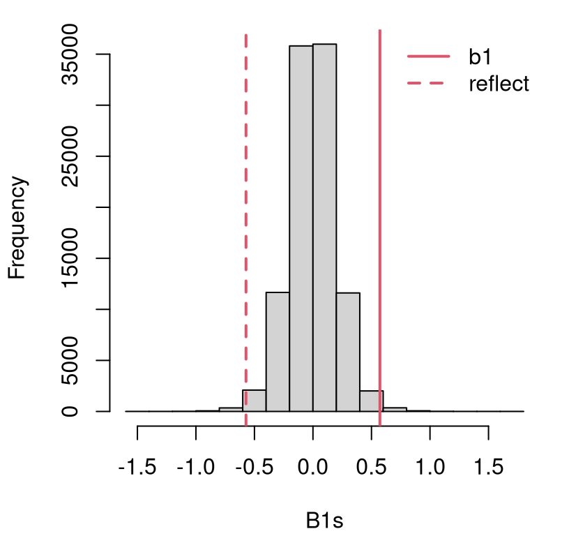
FIGURE 7.8: Histogram of sampled \(\hat{\beta}_1\) for testing \(\beta_1 = 0\) in the frat dash experiment.
A more precise assessment is provided by the \(p\)-value.
## [1] 0.01058Is it a coincidence that this is close to the \(p\)-value we got when testing \(\rho = 0\)? Recall that was \(\phi_{\rho = 0} = 0.0104\). The two pairs of hypotheses, in Eqs. (7.6) and (7.20), are not asking exactly the same question. Yet it’s a similar question, in part because of how the two are intimately linked (7.9).
Running back through a similar simulation in order to test some value for the intercept \(\beta_0\) is straightforward. I’m not going to bore you with that. In practice, one is rarely interested in testing the intercept. Its meaning in the context of an applied data analysis often isn’t immediate. However, it is definitely the case that you might want to test a value for \(\beta_1\) other than zero. Zero has a clear meaning: is the line useful? So do other values depending on context. For example, it is common to test \(\beta_1 = 1\). That could shed light on our frat dash analysis. A slope of unity means there’s no change running speed before and after a beer: \(\mathbb{E}\{Y(x)\} = \beta_0 + x\). That could be interesting to know.
I’m confident you could run back through the code above with a value of beta1 <- 1, so I’m not going to hold your hand on that here. Instead, I’d like to
run through a CI for \(\beta_1\). This is pretty easy too, since you can
simply use \(\beta_1 = \hat{\beta}_1 = b_1\) in that same MC. And, since a CI
is the inverse of a test, we can use it to ask any (two-sided) hypothesis
testing question implicitly.
B1s <- rep(NA, N)
for(i in 1:N) {
  sigma2 <- (n - 2)*s2/rchisq(1, n - 2)
  Ys <- rnorm(n, b0 + b1*x, sqrt(sigma2))        ## only change
  B1s[i] <- cor(Ys, x)*sd(Ys)/sd(x)
}
A CI may be extracted from quantiles of that empirical distribution.
##   2.5%  97.5%
## 0.1756 0.9696
As you can see, \(\beta_1 = 1\) is not included in this interval (barely). Therefore, we would reject \(\mathcal{H}_0: \beta_1 = 1\) in a two-sided test at the 5% level. It does appear that there is indeed a change in speed (a slow-down) after a beer. I’ll let you debate whether that’s due to inebriation, or the extra weight they’re carrying. (Forty ounces of beer is heavy. Just imagine how much slower you’d run if you were carrying an extra 40 oz in a backpack, or your bladder.)
Testing the slope by math
Although the correlation form (7.9) for \(\hat{\beta}_1\) is most intuitive, the covariance form (7.8) is easier to work with mathematically, at least in this context.
\[ \hat{\beta}_1 = b_1 = \frac{s_{yx}}{s_x^2} = \frac{\textstyle \sum_i (x_i - \bar{x})(y_i - \bar{y})}{\textstyle \sum_i (x_i - \bar{x})^2} = \frac{\textstyle \sum_i (x_i - \bar{x})y_i}{\textstyle \sum_i (x_i - \bar{x})^2}, \]
where the latter equality uses \(\sum_{i=1}^n (x_i - \bar{x}) = \sum_{i=1}^n x_i - n \bar{x} = 0\). This means that the MLE for slope can be written as a linear combination of \(y_i\) values.
\[ \hat{\beta}_1 = \sum_{i=1}^n w_i y_i \quad \mbox{ where } \quad w_i = \frac{(x_i - \bar{x})}{(n-1) s_x^2} \]
That’s convenient for expectations and variances via linearity properties, as we’ve done several times previously. Here are a few key facts about those weights that are easy to show given the info above.
\[\begin{equation} \sum_{i=1}^n w_i = 0, \quad \sum_{i=1}^n w_i x_i = 1, \quad \mbox{ and } \quad \sum_{i=1}^n w_i^2 = \frac{1}{(n-1) s_x^2} \tag{7.21} \end{equation}\]
Also, remember that only \(Y_i\)-values are random in this analysis, and \(Y_i = \beta_0 + \beta_1 x_i + \varepsilon_i\) so really only \(\varepsilon_i\) are random. Recall from Eq. (7.14) that \(\mathbb{E}\{\varepsilon_i\} = 0\) and \(\mathbb{V}\mathrm{ar}\{Y_i\} = \mathbb{V}\mathrm{ar}\{\varepsilon_i\} = \sigma^2\). These facts, together with Eq. (7.21), provide lots of potential for algebraic simplification.
Using linearity of means,
\[\begin{align} \mathbb{E}\{\hat{\beta}_1\} &= \sum_i w_i \mathbb{E}\{Y_i\} \notag \\ &= \beta_0 \sum_i w_i + \beta_1 \sum_i w_i x_i + \sum_i w_i \mathbb{E}\{\varepsilon_i\} \notag \\ &= 0 + \beta_1 + 0 \notag \\ &= \beta_1. \tag{7.22} \end{align}\]
So the MLE is unbiased for the slope. Using linearity of variances of independent \(\varepsilon_i\),
\[\begin{equation} \mathbb{V}\mathrm{ar}\{\hat{\beta}_1\} = \sum_{i=1}^n w_i^2 \mathbb{V}\mathrm{ar}\{Y_i\} = \sigma^2 \sum_{i=1}^n w_i^2 = \frac{\sigma^2}{(n-1) s_x^2}. \tag{7.23} \end{equation}\]
Putting Eqs. (7.22) and (7.23) together with the usual sum of independent Gaussians trick gives
\[ \hat{\beta}_1 \sim \mathcal{N}(\beta_1, \sigma_{b1}^2) \quad \mbox{ where } \quad \sigma_{b1}^2 = \frac{\sigma^2}{(n-1) s_x^2}. \]
Notice what affects uncertainty in estimated slope.
Overall variability in the sample, \(\sigma^2\). Noisier data makes it harder to learn \(\beta_1\).
Training data size, \(n\). This quantity is in the denominator. So bigger \(n\) means lower variance, more learning. As \(n \rightarrow \infty\) we have \(\sigma_{b1}^2 \rightarrow 0\).
Finally \(s_x^2\), also in the denominator. Apparently, the more spread you have in your inputs (not just more inputs, bigger \(n\)) the faster you learn.
This last item offers insight into experimental design strategies if you have the ability to control at which \(x\)-values \(y\)’s are observed. If you spread them out, then you can make more efficient use of your limited, \(n\)-sized sample. The terminology for this in statistical parlance is leverage. Unlike other stats jargon, this one makes sense intuitively. The farther your lever (think line, which looks like a lever) is from a pivot joint (think center of the data), the more force you can exert. You have more leverage.
Since \(\sigma^2 \sim (n-2)s^2 / \chi^2_{n-2}\) we may use a \(t\) statistic, which is more practical, after plugging in \(s^2\) estimating \(\sigma^2\).
\[\begin{equation} t_1 = \frac{\hat{\beta}_1 - \beta_1}{s_{b_1}} \quad \mbox{ with (squared) s.e. } \quad s_{b_1}^2 = \frac{s^2}{(n-1) s_x^2} \tag{7.24} \end{equation}\]
and \(T \sim t_{n-2}\) allowing a test of any \(\beta_1\) value. In R, for the frat dash example, testing \(\beta_1 = 0\) …
## [1] 0.1725 3.3153With \(|t| > 2\) we’ll reject \(\mathcal{H}_0: \beta_1 = 0\), but it’s nice to have a precise \(p\)-value.
##      mc    math
## 0.01058 0.01061
That’s pretty close to the MC result, but lots harder. However, it’s somewhat satisfying to patiently push through the logic behind a sampling distribution. Everything I showed you is either algebra (of sums), basic probability, and combinations thereof. Contrast that with testing Pearson’s \(\rho\). If already you’ve forgotten all my apologies and hand waving, then I won’t remind you. Shoot, I just did.
A CI follows the usual “\(\mathrm{est} \pm q \times \mathrm{se}\)” formula.
##        2.5%  97.5%
## mc   0.1756 0.9696
## math 0.1741 0.9699
This is again pretty close. I’ll leave it to you to check \(\beta_1 = 1\) via a
\(t\)-test, as compared to the MC I left for you as an exercise. (Just replace
b1 with b1 - 1 in the code.) Everything should check out.
There’s a library built into R that can do all this for you. Before we get to that, I want to show you how to work with the intercept \(\beta_0\). The MC is pretty much the same for intercepts and slopes, but the math is a little different because the formula for the intercept is different. In fact, the formula for the intercept MLE depends on the slope!
Using \(\bar{Y} = \frac{1}{n} \sum_{i=1}^n (\beta_0 + \beta_1 x_i + \varepsilon_i)\) and following a similar program yields
\[\begin{align*} \mathbb{E}\{\hat{\beta}_0\} &= \mathbb{E}\{\bar{Y}\} - \mathbb{E}\{\hat{\beta}_1\} \bar{x} \\ &= \frac{n}{n} \beta_0 + \frac{1}{n} \beta_1 \sum_i x_i + \frac{1}{n} \sum_i \mathbb{E}\{\varepsilon_i\} - \beta_1 \bar{x} \quad\quad \mbox{ since unbiased}\\ &= \beta_0 + \beta_1 \bar{x} + 0 - \beta_1 \bar{x} \\ &=\beta_0, \end{align*}\]
and so also unbiased. Similarly,
\[\begin{align} \mathbb{V}\mathrm{ar}\{\hat{\beta}_0 \} &= \notag \frac{1}{n^2} \sum_i \sigma^2 + \bar{x}^2 \mathbb{V}\mathrm{ar}\{\hat{\beta}_1\} - 2\bar{x} \mathbb{C}\mathrm{ov}(\bar{Y}, \hat{\beta}_1) \\ &= \frac{\sigma^2}{n} - \bar{x}^2 \sigma^2_{b_1} - 0 \notag \\ \mbox{defining } \quad \sigma_{b_0}^2 &= \sigma^2 \left(\frac{1}{n} + \frac{\bar{x}^2}{(n-1) s_x^2} \right), \tag{7.25} \end{align}\]
where \(\mathbb{C}\mathrm{ov}(\bar{Y}, \hat{\beta}_1) = 0\) can be shown explicitly, but I’ll appeal to your intuition that the average level of the data \(\bar{Y}\) has nothing to do with an estimated slope \(\hat{\beta}_1\). Move the data up by 100, or something, and it won’t change what you estimate for the slope. It will change the intercept though! Interpreting intercept variability (7.25) is similar to slope. More data (bigger \(n\)) and greater spread of inputs (\(s_x^2\)) balances out spread in outputs (\(\sigma^2\)). Eventually, as \(n \rightarrow \infty\) you can learn both without error.
As before, a sum of Gaussians is Gaussian, so \(\hat{\beta}_0 \sim \mathcal{N}(\beta_0, \sigma_{b_0}^2)\), but this result is more practical with estimated \(s^2\), leading to
\[\begin{equation} t_0 = \frac{\hat{\beta}_0 - \beta_0}{s_{b_0}} \quad \mbox{ with (squared) s.e. } \quad s_{b_0}^2 = s^2 \left(\frac{1}{n} + \frac{\bar{x}^2}{(n-1) s_x^2} \right). \tag{7.26} \end{equation}\]
Just to keep things moving, I’ll test \(\mathcal{H}_0: \beta_0 = 0\), even though I don’t think that “what if” is particularly interesting for the frat dash example. I want to use the values calculated in R, below, to make a connection to library output summarizing tests for linear models.
## [1] 2.710 2.734This is an easy reject of the null with \(p\)-value:
## [1] 0.02567Don’t worry \(s_{b_0}^2\) will come in handy in a less trivial way later in §7.7 when summarizing predictive uncertainty. For now, I want to arrange all of these parameter estimates, standard errors, \(t\) statistics, \(p\)-values and even \(r^2\) in a table. Everything all in one place, a little like the ANOVA table from §6.3. See Table 7.2.
tab <- cbind(c(b0, b1), c(sb0, sb1), c(t0, t1), c(b0.pval.t, b1.pval.t))
rownames(tab) <- c("icept", "slope")
colnames(tab) <- c("coef", "se", "tstat", "pval")
kable(round(tab, 4), caption="LM fit: \(s = 1.167\) on 8 DoF, \(r^2 = 0.579\)")| coef | se | tstat | pval | |
|---|---|---|---|---|
| icept | 7.410 | 2.7099 | 2.734 | 0.0257 |
| slope | 0.572 | 0.1725 | 3.315 | 0.0106 |
All \(t\) stats and \(p\)-values are for the null hypothesis that the coefficient
in that row is zero. Observe that the third column, with the \(t\) stat(s), is
the ratio of the first and second columns. You can get similar information in
R by calling summary on the fit object returned by lm.
##
## Call:
## lm(formula = y ~ x)
##
## Residuals:
##     Min      1Q  Median      3Q     Max
## -1.6913 -0.8138  0.0665  1.0181  1.4251
##
## Coefficients:
##             Estimate Std. Error t value Pr(>|t|)
## (Intercept)    7.410      2.710    2.73    0.026 *
## x              0.572      0.173    3.32    0.011 *
## ---
## Signif. codes:  0 '***' 0.001 '**' 0.01 '*' 0.05 '.' 0.1 ' ' 1
##
## Residual standard error: 1.17 on 8 degrees of freedom
## Multiple R-squared:  0.579,  Adjusted R-squared:  0.526
## F-statistic:   11 on 1 and 8 DF,  p-value: 0.0106
Notice that everything is there, and more, although it may go by a slightly different name. I won’t be explaining Adjusted \(r^2\), and we’ll talk more about that \(f\) statistic in Chapter 13, but it’s really not that different from the one in §6.3. The summary of residuals at the top may be reproduced as
##    Min. 1st Qu.  Median    Mean 3rd Qu.    Max.
## -1.6913 -0.8138  0.0665  0.0000  1.0181  1.4251
Observe how the “Mean” entry is missing in the R summary because,
always being zero, it’s pretty boring. Those “Signif. codes” (the stars)
are meant to provide a quick visual queue on significance. There are more
stars to the right of the \(p\)-value if it’s smaller. No star indicates
failure to reject the null that the coefficient in question is zero at the 5%
level. Like with ANOVA, a common homework or exam question involves omitting
some table entries and asking students to recover them forensically, possibly
along with some other helpful information not in the table, like
\(s^2_y, s_x^2, \bar{y},\bar{x}\), etc.
Finally, confint can be used on an lm-class object. By default, it does a
95% interval. I’m just showing you the part that corresponds to \(\beta_1\),
since that’s what we calculated by-hand and via MC earlier.
##        2.5%  97.5%
## mc   0.1756 0.9696
## math 0.1741 0.9699
## lib  0.1741 0.9699
Before pivoting to prediction, I want to note that there’s a lot more that could go here. I’ve introduced the most important and interesting parts – in my opinion – and left some others for you as homework exercises. What else is there? We glossed over leverage earlier. There’s what amounts to a whole section just on that at that Wikipedia link. You can do a whole semester-long class combining SLR and MLR. If you think this stuff is just a little-bit cool, you’ll think what’s not in here – in this chapter or elsewhere in the book – is “totally slay, Ohio-riz and has positive aura”. (My daughter said I had to work that into the book somehow. I’m pretty sure I did it wrong because, as she constantly reminds me, I’m “super cringe”.)
7.7 SLR prediction
Suppose you had new \(x\) and you wanted to know \(Y(x)\). We did this already in
§7.3, although not in a statistical modeling context.
Remember Brandon with \(x = 14.5\)? Some things will be the same here. All of
the uncertainty will be new. Note that \(x\) is an arbitrary input, so whatever
we do for one \(x\) should work for any \(x\). For all \(x\). We shall see equations
and procedures representing our predictions, and their uncertainty, that
are a function of \(x\), or would work for any value of xp provided in code,
including a vector of many xp.
In what follows, I’m going to develop predictions for a grid of one hundred \(x\)-values in the frat dash example that goes from a little below the smallest input to a little above the largest one.
This helps a lot with plotting, enabling a study of how predictions and
uncertainties change as a function of \(x\). There’s one \(x\) in xp that’s
close enough to Brandon’s time to use in lieu of actually plugging in 14.5.
You may certainly do that later if you’d like.
If we knew all of the Greek quantities, then the prediction would be \(Y(x) = \beta_0 + \beta_1 x + \varepsilon\). But we don’t, so we settle for estimates \(\hat{\beta}_0 = b_0\) and \(\hat{\beta_1} = b_1\). All we’ll ever know about \(\varepsilon\) is that it’s Gaussian with mean zero and variance \(\sigma^2\). Our estimate for \(\sigma^2\) is \(s^2\).
Using those estimates is straightforward if you follow the simple principles that are, I hope, starting to become second nature. It may seem superficially more complicated, because there are lots of estimated quantities all coming together at once, but with some patience you can get there. We already know how to develop the sampling distribution for each estimated quantity in isolation. All that remains is putting them together for \(Y(x)\).
As usual, I think it’s easier to begin with MC, and then see how the math matches with cute formulas.
Prediction by MC
The code chunk below starts out the same as the CI code for \(\beta_1\) from
§7.6. The first change is to additionally re-fit the
intercept. Notice that I don’t save each sample (of coefficients) separately.
Rather, I take those values and save the predicted line for xp. Finally,
that line is used to sample predictive “data” for xp.
YYmeans <- YYs <- matrix(NA, nrow=N, ncol=np)
for(i in 1:N) {
  sigma2s <- (n - 2)*s2/rchisq(1, n - 2)              ## noise variance
  Ys <- rnorm(n, b0 + b1*x, sqrt(sigma2s))            ## synthetic data
  B1s <- cor(Ys, x)*sd(Ys)/sd(x)                      ## re-fit slope
  B0s <- mean(Ys) - B1s*mean(x)                       ## re-fit intercept
  YYmeans[i,] <- B0s + B1s*xp                         ## predict line
  YYs[i,] <- rnorm(np, YYmeans[i,], sqrt(sigma2))     ## noise around line
}
Figure 7.9 shows a selection of those sampled lines. Showing
all \(N = 10^{5}\) of them is overkill, so I took that down by a factor of 100.
If I had saved all of B0s and B1s, I could have instead plotted
each line with an abline command. That’s a perfectly valid choice. However,
saving means is somewhat more versatile because it allows an interval to
be calculated via quantile. But hold that thought for a moment.
sel <- seq(1, N, by=100)
matplot(xp, t(YYmeans[sel,]), col="gray", type="l", lty=1,
  xlab="time before beer", ylab="time after beer",)
points(x, y)
legend("bottomright", "selection of YYmeans", col="gray", lty=1, bty="n")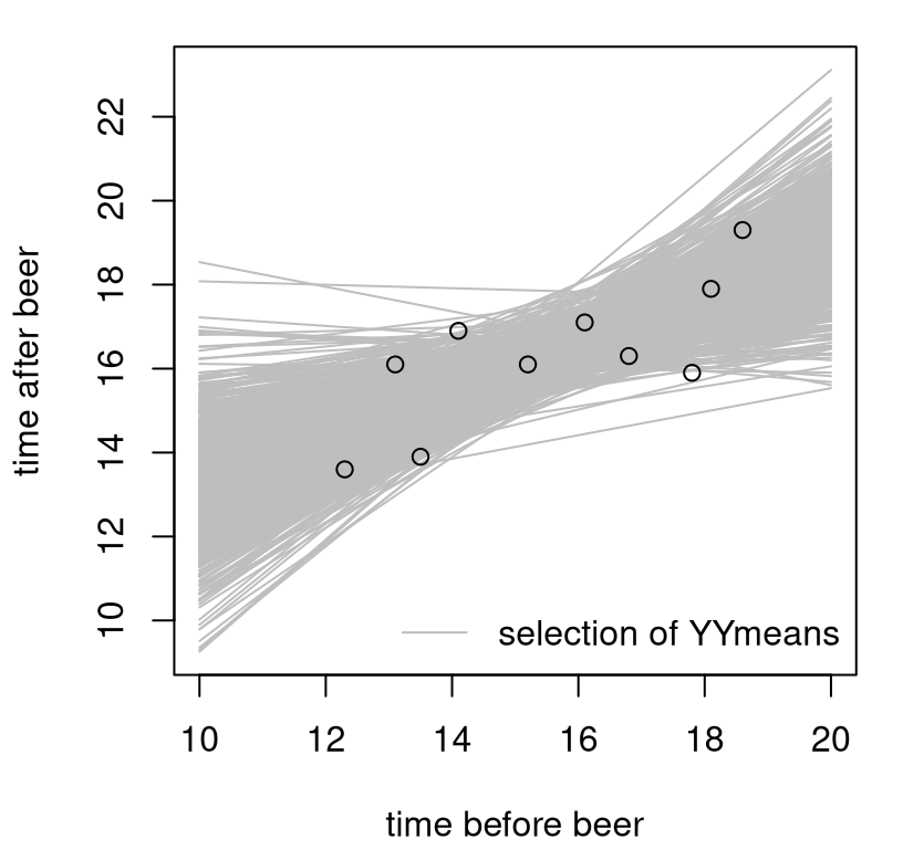
FIGURE 7.9: Empirical sampling distribution of predictive means.
Notice the diversity of lines in the plot. Most go through the data, but not all. Most have positive slope, but not all. Each one of these lines offers a potential explanation for the data, a potential prediction. Their spread derives from the sampling distribution of slopes and intercepts, about which there is considerable uncertainty, largely owing to the noise in this small-\(n\) sample.
You can make a similar plot for sampled YYs, but since these values have
extra iid noise around YYmeans it would look lots messier. Check that
yourself if curious. YYs are more useful to understand the spread of the
sample, via \(\sigma^2\), around the lines. The code provided below extracts quantiles
from both samples. The former defines what is known as a predictive interval
(PI), since it captures all uncertainties. The latter is called a CI because
it only captures uncertainty in the mean prediction, like a CI for \(\mu\) in
Chapter 3, but now as a function of \(x\) for \(\mu(x)\).
low.PI.mc <- apply(YYs, 2, quantile, prob=0.025)
high.PI.mc <- apply(YYs, 2, quantile, prob=0.975)
low.CI.mc <- apply(YYmeans, 2, quantile, prob=0.025)
high.CI.mc <- apply(YYmeans, 2, quantile, prob=0.975)
A visual is offered in Figure 7.10. This is a classic view of prediction and its decomposition of sources of uncertainty.
plot(x, y, xlim=range(xp), ylim=range(c(low.PI.mc, high.PI.mc)))
lines(xp, colMeans(YYmeans), lwd=2)
lines(xp, low.CI.mc, lwd=2, lty=2)
lines(xp, high.CI.mc, lwd=2, lty=2)
lines(xp, low.PI.mc, lwd=2, lty=2, col=2)
lines(xp, high.PI.mc, lwd=2, lty=2, col=2)
legend("bottomright", c("mean", "95% CI", "95% PI"),
  col=c(1, 1, 2),  lty=c(1, 2, 2), lwd=2, bty="n")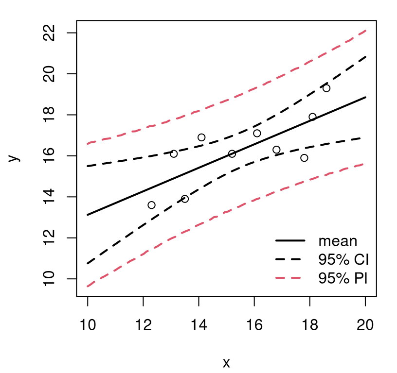
FIGURE 7.10: Full predictive distribution as means (of means) and error bars, via MC.
Notice how both sets of so-called error bars take on a hyperbolic shape, more accentuated for the CI but definitely still visible in the PI. Apparently, as you move away from the center of the data, your predictive uncertainty increases. That makes sense intuitively. It also connects back the concept of leverage that I glossed over earlier in §7.6, but here it’s the converse. The data have weaker influence on inferences that are farther away from its center of mass – farther from the pivot joint.
Prediction by math
Denote by \(\hat{Y}(x) = \hat{\beta}_0 + \hat{\beta}_1 x\) what you would predict given fitted coefficients for new input \(x\). Similarly, let \(\tilde{Y}(x) = \hat{\beta}_0 + \hat{\beta}_1 x + \varepsilon\) account for the additional population variance \(\sigma^2\). The former, \(\hat{Y}(x)\) is sometimes called the fitted value (of a prediction), because it’s similar to \(\hat{y}_i\) for each \(x_i\), but for new \(x\). It’s what you would predict for the fit, i.e., the mean line, and it is the basis of a CI summary (connecting back to our MC analysis). The latter, \(\tilde{Y}(x)\) is called the predicted value because it has the full population uncertainty, and is the basis of a PI. Note that both have the same mean since \(\mathbb{E}\{\varepsilon\} = 0\).
\[ \begin{aligned} \mathbb{E}\{ \tilde{Y}(x) \} &= \mathbb{E}\{\hat{\beta}_0\} + \mathbb{E}\{\hat{\beta}_1\} x + \mathbb{E}\{\varepsilon\} = \mathbb{E}\{\hat{\beta}_0\} + \mathbb{E}\{\hat{\beta}_1\} x \\ &= \mathbb{E}\{ \hat{Y}(x) \} = \beta_0 + \beta_1 x = \mathbb{E}\{Y(x)\} \end{aligned} \]
In other words, predictions are unbiased. Here they are in R.
For variance, consider one of those two options at a time.
\[\begin{align} \mathbb{V}\mathrm{ar}\{ \hat{Y}(x) \} &= \mathbb{V}\mathrm{ar}\{\hat{\beta}_0\} + \mathbb{V}\mathrm{ar}\{\hat{\beta}_1\} x^2 + 2x \mathbb{C}\mathrm{ov}(\hat{\beta}_0, \hat{\beta}_1) \notag \\ &= \sigma_{b_0}^2 + x^2 \sigma_{b_1}^2 + 2x \sigma_{b_{01}} \quad \mbox{ where } \quad \sigma_{b_{01}} = - \sigma^2 \left(\frac{\bar{x}}{(n-1) s_x^2}\right) \notag \\ \mbox{defining } \quad \sigma^2_{\mathrm{fit}}(x) \tag{7.27} &= \sigma^2 \left(\frac{1}{n} + \frac{(x - \bar{x})^2}{(n-1)s_x^2} \right) \end{align}\]
The last term involves pulling \(\sigma_{b_0}^2\) and \(\sigma_{b_1}^2\) from Eqs. (7.25) and (7.23), but \(\sigma_{b_{01}}\) is a bit of a doozy. You’ll have to take my word for that one until we get to Chapter 13. We talked earlier about how slope is negatively correlated with intercept: move one up and the other must go down, etc. It’s not impossible to derive, but it takes quite a bit of patience and would be a distraction here. (It’s not a great homework problem either, so I’ll spare you.)
Perhaps I can distract you by turning your attention to \(\sigma^2_{\mathrm{fit}}(x)\). Notice that as \(n \rightarrow \infty\) we get a “perfect fit”, as it were, out of our prediction of the mean. This is because we have the same property for estimated coefficients (7.23) and (7.25). For finite \(n\) there will always be some uncertainty.
Again, sums of Gaussians … and so we have \(\hat{Y}(x) \sim \mathcal{N}(\mathbb{E}\{Y(x)\}, \sigma_{\mathrm{fit}}^2(x))\), and making that practical involves substituting in an estimate for \(\sigma^2\) and upgrading to \(t_{n-2}\).
\[\begin{equation} t_\mathrm{fit}(x) = \frac{\hat{y}(x) - \mathbb{E}\{Y(x)\}}{s_{\mathrm{fit}}(x)} \quad \mbox{ with (squared) s.e. } \quad s_{\mathrm{fit}}^2(x) = s^2 \left( \frac{1}{n} + \frac{(x - \bar{x})^2}{(n-1)s_x^2} \right). \tag{7.28} \end{equation}\]
Note that \(\hat{y}(x) = b_0 + b_1 x\) is the actual prediction you calculated
with estimated coefficients \((b_0 = \hat{\beta}_0, b_1 = \hat{\beta}_1)\),
and stored in yp. Eq.
(7.28) is most useful as a CI: \(\hat{Y}(x) \pm q \times
s_{\mathrm{fit}}^2(x)\).
s2fit <- s2*(1/n + (xp - xbar)^2/((n - 1)*s2x))
sfit <- sqrt(s2fit)
low.CI.t <- yp + qt(0.025, n - 2)*sfit
high.CI.t <- yp + qt(0.975, n - 2)*sfit
I’ll show you how this measures up to the CI in Figure 7.10 in a moment. First, I have to give you the equations behind the PI, which is shown on the same plot. The hard work for that is done already.
\[\begin{align} \mathbb{V}\mathrm{ar}\{\tilde{Y}(x)\} & = \mathbb{V}\mathrm{ar}\{\hat{Y}(x)\} + \mathbb{V}\mathrm{ar}\{\varepsilon\} \notag \\ \mbox{so } \quad \sigma^2_{\mathrm{pred}}(x) &= \sigma^2_{\mathrm{fit}}(x) + \sigma^2 \tag{7.29} \end{align}\]
Notice that \(\sigma^2_{\mathrm{pred}}(x) \rightarrow \sigma^2\) as \(n \rightarrow \infty\). No matter how much data you have, you’ll never be able to predict any better than the underlying population variance. As long as \(n < \infty\) we have that \(\sigma^2_{\mathrm{pred}}(x) >\sigma^2\).
It may be a little pedantic, but for completeness …
\[\begin{equation} t_\mathrm{pred}(x) = \frac{\tilde{y}(x) - \mathbb{E}\{Y(x)\}}{s_{\mathrm{pred}}(x)} \quad \mbox{ with (s.e.)$^2$ } \quad s_{\mathrm{pred}}^2(x) = s^2 \left(1 + \frac{1}{n} + \frac{(x - \bar{x})^2}{(n-1)s_x^2} \right). \tag{7.30} \end{equation}\]
Again, note \(\tilde{y}(x) \equiv \hat{y}(x) = b_0 + b_1 x\) when you actually plug in estimated coefficients. In R …
spred <- sqrt(s2fit + s2)
low.PI.t <- yp + qt(0.025, n - 2)*spred
high.PI.t <- yp + qt(0.975, n - 2)*spred
It’s silly to make this plot, but check out Figure 7.11. Here the CI is given by Eq. (7.28) and the PI by (7.30). The lines in this plot are, at least to my eye, visually indistinguishable from MC-based versions from Figure 7.10,
plot(x, y, xlim=range(xp), ylim=range(c(low.PI.mc, high.PI.mc)))
lines(xp, yp, lwd=2)
lines(xp, low.CI.t, lwd=2, lty=2)
lines(xp, high.CI.t, lwd=2, lty=2)
lines(xp, low.PI.t, lwd=2, lty=2, col=2)
lines(xp, high.PI.t, lwd=2, lty=2, col=2)
legend("bottomright", c("mean", "95% CI", "95% PI"),
  col=c(1, 1, 2), lty=c(1, 2, 2), lwd=2, bty="n")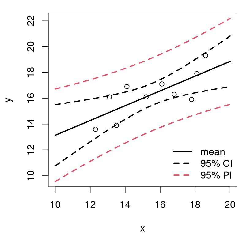
FIGURE 7.11: Full predictive distribution as means (of means) and error bars, via math.
They are different though, a little. Below I calculate a measure of discrepancy called root mean squared error (RMSE), one point at a time for each end of the interval, but separately for each CI and PI. Smaller RMSE is better, meaning the two things being compared – in this case, MC versus exact calculation – are more similar.
CI.rmse <- sqrt(mean((c(low.CI.t, high.CI.t) - c(low.CI.mc, high.CI.mc))^2))
PI.rmse <- sqrt(mean((c(low.PI.t, high.PI.t) - c(low.PI.mc, high.PI.mc))^2))
c(CI.rmse, PI.rmse)
## [1] 0.005647 0.105978Notice that the agreement is more accurate for the CI than the PI. This makes sense because a MC PI calculation involves more random numbers, meaning more MC error (§A.3) for fixed effort, \(N\).
In R you can make predictions using the predict command on the lm object
fit. Depending on whether you want a CI or PI, you have to give a different
interval argument. If you additionally want \(s_\mathrm{fit}(x)\), you must
specify yet another argument. The quantity \(s_{\mathrm{pred}}(x)\) is
not provided, but you can always follow Eq. (7.29), or with the code
immediately below: spred <- sqrt(s2fit + s2).
xp.df <- data.frame(x=xp)
pc <- predict(fit, newdata=xp.df, interval="confidence")
pp <- predict(fit, newdata=xp.df, interval="prediction")
sfit.lib <- predict(fit, newdata=xp.df, se.fit=TRUE)$se.fit
It’s a little cumbersome to specify xp, since it must be a data.frame
whose column names line up with names residing in the original x from your fit.
The reason for this will become more clear in §13.3. If you
plotted these, they’d be right on top of the ones we calculated by hand.
CI.rmse2 <- sqrt(mean((c(low.CI.t, high.CI.t) - c(pc[,2], pc[,3]))^2))
PI.rmse2 <- sqrt(mean((c(low.PI.t, high.PI.t) - c(pp[,2], pp[,3]))^2))
sfit.rmse <- sqrt(mean((sfit - sfit.lib)^2))
round(c(CI.rmse2, PI.rmse2, sfit.rmse), 10)
## [1] 0 0 0All numerically zero. R’s version matches our handiwork.
Well that’s it. This chapter ends somewhat abruptly, but actually there’s a lot more (as I already said) to regression, and also to correlation. First, in Chapter 12, we’ll revisit both topics from a nonparametric perspective. What’s that, you ask? It’s coming up next. It’ll blow your mind. I’ll do some simpler nonparametrics before we get to correlation and regression. Then, at the end of the book, I’ll circle back to parametric land with a regression reprise (ultimately MLR).
Regression is so important because it has so many applications, but also because it uses so many fundamentals all at once. Understand this stuff, and you’ve got it made. I almost can’t wait. I’m so excited about the new skills you’re developing!
7.8 Homework exercises
These exercises help gain experience with correlation and regression via tests and CIs. Whenever possible, I suggest doing the calculations both ways: via MC and with math. Questions that introduce data could be entertained as correlation or regression analysis. Verbiage below is suggestive of one or the other, but it would be good practice to try both if you feel it’s appropriate. I don’t want to set expectations too high, but there’s some really fun ones toward the end.
Do these problems with your own code, or code from this book. I encourage you
to check your work with library functions like cor.test, lm, summary and
predict. Check with your instructor first to see what’s allowed. Unless
stated explicitly otherwise, avoid use of libraries in your solutions.
#1: Bivariate Gaussian MLE
Derive MLEs for unknown quantities \(\theta = (\mu_y, \mu_x, \sigma_y^2, \sigma_x^2, \rho)\), but especially \(\rho\), in the bivariate Gaussian model (7.5). Derive the asymptotic sampling distribution for \(\rho\). Hint: use Fisher information.
#2: Library function monty.cor
Write a function called monty.cor that automates testing and CI calculation
for \(\rho\) under a bivariate Gaussian model (7.5). Follow
specifications similar to earlier monty.* implementations. Make sure you
cover both MC and math-based procedures. When testing via math,
use sensible defaults depending on whether the null is \(\rho = 0\) or not.
Your output should indicate which testing procedure was performed.
Hint: many of the following questions are easier after this one is squared away.
#3: Mother–daughter golf
A mother and daughter play golf together a handful of times over a summer at different courses near where they live. Here are their scores.
golf <- data.frame(
  mother=c(107, 108, 111, 102, 113, 109, 116, 109, 105, 115, 105, 114),
  daughter=c(102, 108, 95, 103, 99, 100, 98, 107, 104, 103, 106, 101))
Is there nonzero correlation between them? Additionally, provide a confidence interval for \(\rho\).
#4: Blood pressure
The file bloodpres.csv, linked from the course webpage, records a patient’s pulse (beats per minute) and their systolic and diastolic blood pressures (millimeters of mercury/mmHg). These data are originally from a Kaggle competition.
bloodpres <- read.csv("bloodpres.csv")
x <- bloodpres$pulse;    y <- bloodpres$systolic     ## pair 1
x <- bloodpres$pulse;    y <- bloodpres$diastolic    ## pair 2
x <- bloodpres$systolic; y <- bloodpres$diastolic    ## pair 3
Is there any correlation between any of these pairs of measurements?
#5: Crocodile size
Data below include measurements, rounded to the nearest centimeter, of the length of Indian crocodile bodies and heads (from the same crocodile). These data may be found, along with other measurements, on the Data and Story Library (DASL), which is a wonderful resource.
croc <- data.frame(
  body=c(177, 264, 311, 382, 385, 475, 548, 343, 386, 338, 319, 224, 202,
    218, 183, 203, 209, 161, 179, 226, 259, 287, 300, 342, 333, 406, 459,
    376, 380, 265, 349, 264),
  head=c(35, 49, 56, 64, 61, 71, 83, 51, 62, 52, 52, 40, 38, 37, 32,
    36, 38, 24, 24, 32, 35, 40, 40, 46, 48, 52, 60, 51, 54, 38, 46, 38))
It has been claimed that the correlation is 90%. Do these data support or refute this claim?
#6: Non-Gaussian correlation
This one is asking you to think outside the box a little. Consider
\((x,y)\) pairs in the following data.frame.
nonG <- data.frame(
  x=c(0, 2, 1, 1, 1, 0, 1, 1, 2, 0, 0, 1, 1, 1, 1, 1, 1, 0, 1, 0, 0, 1,
   3, 1, 0, 0, 0, 0, 2, 4),
  y=c(2, 5, 4, 2, 5, 2, 5, 8, 4, 3, 1, 6, 5, 3, 4, 3, 5, 1, 5, 2, 1, 3,
   10, 2, 2, 1, 3, 3, 6, 10))
Is it reasonable to use a bivariate Gaussian model (7.5) for these data? If not, what model(s) might be better for the margins, i.e., \(x\) and \(y\) separately. What do you estimate for the parameters of those distributions? Develop a MC-based procedure that uses those margins to test \(\rho = 0\), and provide a CI for \(\rho\). Can you think of any downsides to your procedure?
#7: Residual estimation
The following pair of prompts asks you to estimate coefficients \(b_0\) and \(b_1\) for data \((x_1, y_1), \dots, (x_n, y_n)\) under \(y_i = b_0 + b_1 x_i + e_i\), for \(i=1, \dots, n\).
- Fix a slope \(b_1\). Suppose \(\bar{e} = \frac{1}{n} \sum_{i=1}^n e_i = 0\) and solve for \(b_0\).
- Using \(b_0\) you found above, suppose that \(r_{ex} = 0\) and solve for \(b_1\).
What do you think?
#8: Biased MLE \(\hat{\sigma}^2\)
Show \(\mathbb{E}\{\hat{\sigma}^2\} = \frac{n-2}{n} \sigma^2\), with \(\hat{\sigma}^2\) given in Eq. (7.18). You may use that \(\hat{\beta}_0\) and \(\hat{\beta}_1\) are unbiased for \(\beta_0\) and \(\beta_1\), and any other results from the chapter (besides the actual result in question). Hint: start on the left-hand side. You may wish to look back at your solution to #5 from §3.5.
#9: Forensic SLR inference
Here is the first of three forensic analyses where you get to explore how well you understand quantities involved in an SLR.
| coef | se | tstat | pval | |
|---|---|---|---|---|
| icept | 0.0433 | 0.069 | ||
| slope | 0.1892 | 0.0657 |
Table 7.3 summarizes an SLR for data \((x_1, y_1), \dots, (x_n, y_n)\), but it is only partially completed. Use (some of) the information that is provided to fill in the information that’s missing. What do you think: is \(x\) useful for predicting \(y\)?
#10: Forensic SLR prediction
This one is a little more challenging. Suppose we have the following summary information for a SLR: \(n = 15\), \(\bar{y} = 3\), \(\bar{x} = 5\), \(s_x^2 = 4\), \(\hat{\beta}_1 = 3\) and \(s_{b_1} = 5\). What would you predict for \(Y(x)\) at a new input \(x = 2\)? Give a 95% interval around your prediction. (You can give a CI or PI, but you must say which you are doing.)
#11: Telemarking (more forensics)
Here’s a variation with R output instead. Details of an SLR fit are
provided below, via excerpts from the summary command in R, from data on
number of calls y placed by a telemarketer who has been on the job x
months, in the span of one hour. Some information in this output is
deliberately obscured.
> tele1 <- lm(y ~ x)
> summary(tele1)

Coefficients:
            Estimate Std. Error t value Pr(>|t|)
(Intercept) 13.67077    1.42697   (???)    (???)
x            0.74351    0.06666   (???)    (???)

Residual standard error: 1.787 on 18 degrees of freedom
Multiple R-squared:  0.8736
Is seniority an important indicator of productivity? Put another way, do employees who have been on the job longer make more calls per hour? Provide a CI for the number of additional calls placed per additional month on the job.
#12: Library functions monty.slr and predict.monty.slr
Write a function called monty.slr that automates testing and CI calculation
for coefficients \(\beta_0\) and \(\beta_1\) under the SLR model (7.14).
Then make predict.monty.slr that uses the object output by month.slr to
make predictions at new xp locations. Follow specifications similar to
earlier monty.* implementations. Make sure you cover both MC and math-based
procedures. You’ll need two different MCs for each coefficient, but you can
share one for confidence intervals. If you save all B0s and B1s from
the CI calculation you can use these later in predict.monty.slr. Same
for the math way; be sure to save enough to make predictions later.
Hint: many of the following questions are easier after this one is
squared away. If you want to get really fancy, ask your professor (or the
internet) to help you use S3 object-oriented features via the generic
predict method.
#13: Pay and labor
Greenberg and Kosters (1970) studied 39 demographic groupings of 6000 households where the primary breadwinner made less than $15,000 annually in 1966. One aspect of their study involved estimating the relationship between pay and labor supply, towards influencing social policy decisions and the debate on a guaranteed national wage. Here we shall use their data, provided in wages.csv on the course webpage, to entertain a linear relationship summarizing the effect of pay on labor supply for the working poor.
wages <- read.csv("wages.csv")
y <- wages$HRS                     ## number of hours worked/year
x <- wages$RATE                    ## pay per hour ($ in the 1960s)
Answer the following questions based on your SLR fit.
- Does pay rate have an association with number of hours worked?
- For every extra dollar-per-hour, how many more hours/year are worked? Provide an estimate and a 95% CI.
- For someone making $2/hr in the 1960s, provide a 95% PI summarizing the number of hours the fitted model says they’d work.
- Based on your fit, and in particular your estimated intercept \(\hat{\beta}_0\), and what you understand about the nature of labor, are there any pitfalls to this analysis?
#14: Tractor maintenance
The data.frame below contains ages (in years) along with six-monthly maintenance
costs (dollars) for seventeen tractors.
tractor <- data.frame(
  age=c(4.5, 2.5, 2.5, 4, 4, 4, 5, 5, 5.5, 5, 0.5, 0.5, 6, 6, 1, 1, 1),
  cost=c(619, 1049, 1033, 495, 723, 681, 890, 1522, 987, 1194, 163, 182,
   764, 1373, 978, 466, 549))
Based on an SLR fit with cost as the response and age as the predictor,
answer the following.
- What proportion of variability is explained by the fit?
- Suppose you were considering buying a tractor that’s 4 years old. What would you expect your six-monthly maintenance costs to be? Provide uncertainties along with your estimates and explain what they mean.
- Provide a visual of your fit, and overlay a prediction with CI and PI for tractors ranging from brand new to 10 years old.
#15: Rent
The data file rent.csv, linked from the book webpage, summarizes records of rental properties advertised around Chicagoland. Here, we will be primarily interested in how monthly rent (in thousands of dollars) relates to size (in thousands of square feet) for smaller units.
Based on an SLR fit, answer the following.
- What proportion of variability is explained by the fit?
- Is square-feet a useful predictor of rent?
- How much more does an additional 1,000 square feet cost? Provide a CI.
- Provide a visual of your fit, and overlay a prediction with CI and PI for dwellings ranging from zero to 20,000 square feet.
#16: Capital asset pricing model (CAPM)
One of the most important applications of linear regression in finance involves the so-called capital asset pricing model (CAPM). CAPM says, based on some theory, that asset returns (like from stocks) are linearly related to market returns (like from the Dow Jones Industrial Average/DJIA).
What is a return? It’s a normalized difference between prices, e.g., how much it costs to buy a share of the stock. Let \(p_t\) denote the price at time \(t\), say this month, and \(p_{t-1}\) be the price last month. Then, monthly returns may be calculated as follows.
\[ \mbox{return } \quad r_t = \frac{p_t - p_{t-1}}{p_{t-1}} \]
Here it is in R.
returns <- function(p)
  {
    p <- as.numeric(p)
    r <- (p[-1] - p[-length(p)])/p[-length(p)]
    return(r[-length(r)])
  }
Suppose we downloaded some prices from the internet. I’ve chosen Google, representing the asset, and an index tracking the DJIA.
This defines variables called GOOG and DIA in your current environment.
Each is a data.frame with lots of information about prices in the span of
many years (rows). You can adjust many aspects of what’s downloaded if you
want, but I’m trying to keep it simple. Code below uses the returns
function above to calculate returns based on one of the columns of that
data.frame.
Treat r$DIA as \(x\) and r$GOOG as \(y\) and answer the following.
- Do they look linearly related? (Is CAPM reasonable? If so, then this means that the essense of the relationship between hundreds of pairs of measurements can be captured by just two coefficients, plus \(s^2\) measuring variability. That’s pretty incredible!)
- Fit a model and interpret the estimated coefficients. In CAPM people talk about an asset’s \(\alpha\) and \(\beta\) where \(\alpha \equiv \beta_0\) is the intercept and \(\beta \equiv \beta_1\).
Here’s some context for part #b, above. If \(\alpha \ne 0\), then investing in the asset in question is either consistently better \((\alpha > 0)\) or worse \((\alpha < 0)\) than the average (i.e., the market as whole). If \(\beta = 1\), then the asset’s returns move about the same amount as the market. If the market goes up, the asset goes up by a similar amount. The same goes with down. But if \(\beta \ne 1\) then the asset either amplifies the market (\(\beta > 0\)) or dampens it (\(\beta < 0\)). What do you think?
See if you can find some asset (i.e., besides “GOOG”) where the outcome is
notably distinct from this analysis.
References
Ok, I made that number up. But it’s a lot.↩︎