Chapter 13 Fancy regression
My aim for this chapter is to offer a treat at the end – some dessert. Also, I really wanted to have thirteen chapters. A lucky number!
Regression is, in my opinion, the most important subject in statistics. Many models, methods, and procedures can be interpreted through the lens of regression, and you already know lots about it (Chapters 7 and 12). If it seems like fitting lines through points couldn’t possibly be that useful, my hope is that you’ll have a different perspective by the end of this chapter. Perhaps I’ll convince you to take a second class in statistics. I hope this whets your appetite for more. Also, I’ve left myself a number of loose ends from earlier in the book. Gotta ties those up.
Although long, this chapter will move fast, and I’ll only scratch the surface of many topics. We’ll use some fancy math without lots of fanfare, especially linear algebra and vector calculus. My hope is that this won’t be off-putting. I don’t think you need to fully understand those bits to appreciate what’s going on. For the most part, I shall use tools that are familiar to you, but you might not have realized that they can be used in that way.
Since you already know many of the tools, I’m going to (for the first time in the book) favor the classical, math-based/non-MC approach to inference. This will allow me to move more quickly. I’ll come back to MC towards the end (§13.5) to address something that is genuinely new: model selection for multiple linear regression (MLR). Once I explain to you what MLR is (§13.3), you’ll see why “model selection” is necessary. Things get complicated quickly and it helps to have a principled approach to exploring an MLR landscape. Some additional MC considerations are left for you as exercises in §13.6.
First, I have lots to say about simple linear regression (SLR). SLR is limiting because not many relationships neatly follow Gaussian noise added to a straight line (7.14)–(7.15). Fortunately, SLR need not be applied so simply. Lines needn’t be “straight” and Gaussian noise needn’t be additive. You may have heard of generalized linear models (GLMs), but that’s not what we’re doing. We’ll use ordinary LMs, but fancy. GLMs are super cool, but for another book, another course.
One last disclaimer: I shall favor a parametric (P) approach to inference, even though many of the methods have non-P versions. Again, that allows me to move more quickly, leaving some interesting explorations to your homework.
13.1 Log-transforms
This section is composed of three data analysis vignettes, introducing use of log-transforms on inputs and outputs. Commentary on other, non-log possibilities is provided. The idea is to reveal a pattern and to develop data-analytic instincts.
Used pickup trucks
Consider the selling price of second-hand pickup trucks regressed on model year (i.e., age). Data linked from pickups.csv on the book webpage were scraped from Craigslist by a colleague of mine, Matt Taddy while we were both at The University of Chicago. I owe a lot of the following presentation to Matt; although over the years it has evolved toward my own tastes.
Here’s something new to discuss right at the very start. Notice how I refer
to the names of columns in the formula price ~ year even though those
variables are not defined as objects. By providing data=pickups, using a
formula allows me to refer to columns as if those variables were defined in
the current environment. This is handy, as we shall see as examples progress.
Another thing that’ll be different about this chapter is that I’m usually not
defining x and y variables, explicitly. Rather, I’ll favor variable names
that are more descriptive of their contents/columns, relying on you to keep track
of which are inputs ($year) and outputs ($price).
Figure 13.1 provides two views summarizing our SLR fit. On the
left is a conventional scatterplot with the best-fitting, least-squares line
overlayed. On the right are fitted-values and residuals \((\hat{y}_i, e_i)\).
Recall that fitted values are perfectly correlated with inputs,
\(r_{\hat{y} c} = 1\). So it’s as if $year were on the \(x\)-axis rather than
\(\hat{y}_i\)-values. In this instance, it may have been simpler to use $year,
but when we get to MLR §13.3, there’s good reason to prefer
\(\hat{y}_i\).
par(mfrow=c(1, 2))
plot(pickups$year, pickups$price, xlab="year", ylab="price")
abline(fit, lwd=2)
legend("topleft", "least squares line", lwd=2, bty="n")
plot(fit$fitted, fit$resid,
  xlab="fitted values (yhat)", ylab="residuals (ei)")
abline(h=0, col=2, lty=2, lwd=2)
legend("topleft", "zero residual", col=2, lty=2, lwd=2, bty="n")
FIGURE 13.1: Pickup truck data and SLR fit (left) along with residuals versus fitted values (right).
Although the fit looks fairly decent on the left, the right panel reveals that residuals are not iid. All “linearness” has been extracted, but nonlinear pattern is left over. I see two patterns. One is that the line first under-predicts (positive residuals until about 5,000), then over-predicts (negative residuals until about 12,000), and then under-predicts again, on average. The second pattern is that the magnitude of the residuals, in absolute value, seems to be increasing from left to right. So there is a nonlinear mean pattern and a nonconstant variance pattern, violating two (basically all!) SLR modeling assumptions.
Quick digression on residual diagnostics. An SLR model (7.14) assumes \(\varepsilon_i \stackrel{\mathrm{iid}}{\sim} \mathcal{N}(0, \sigma^2)\), but we don’t observe \(\varepsilon_i\) values. Residuals \(e_i \ne \varepsilon_i\), and it may not be that \(e_i\) values are iid or even Gaussian. However, it turns out that both things are almost true. I’ll show you more in §13.3 once some additional scaffolding is in place. It stands to reason that if the assumed errors follow a particular distribution, then observed ones would be similar.
Checking for patterns in residuals, or deviations from Gaussian in their distribution, is a go-to diagnostic for detecting poor SLR fit. Many regression textbooks devote entire chapters to residual diagnostics. I’m not going to do that here. It’s an important subject, but not an exciting one. If you’re curious, read more on studentized residuals and QQ-plots. Besides plotting raw residuals versus fitted values, those two are the next most common tool for detecting issues.
Alright, back to pickup trucks. Another downside to the fit in Figure 13.1 is that predictions go negative for older trucks. Mentally extrapolate the line in the left panel to 1985 or older. Eventually you cross the \(x\)-axis. That doesn’t make a whole lot of sense. Would someone be willing to pay you to take the truck from them? I suppose stranger things could happen, but I wouldn’t bet on it.
Making a log-transformation of the response (\(y\), or $price in this
instance) solves all three problems, like magic. Check it …
pickups$lprice <- log(pickups$price)     ## augment the pickups data frame
lfit <- lm(lprice ~ year, data=pickups)
As with other uses of log in this book, the base is \(e\) but it doesn’t really matter as long as you’re consistent. Logarithms are an example of “variance stabilizing transformations” because they squash large values more than small ones. Square roots are also variance stabilizing, as are many other functions.
Both log and square root are monotonic, so they preserve direction (increasing
or decreasing). Both are also nonlinear, so they can impart or negate
curvature. Neither can take a negative argument, so you can’t use them if any
\(y_i < 0\) without some other adjustment. Fortunately for pickups$price, those
are all positive. One difference between \(\log(\cdot)\) and \(\sqrt{\cdot}\) is
that the former can have negative values in its image: \(\log y < 0\) if \(0 < y
< 1\). Square roots are always positive.
par(mfrow=c(1, 2))
plot(pickups$year, pickups$lprice, xlab="year", ylab="log price")
abline(lfit, lwd=2)
legend("topleft", "least squares line", lwd=2, bty="n")
plot(lfit$fitted, lfit$resid,
  xlab="fitted values (log yhat)", ylab="residuals (ei)")
abline(h=0, col=2, lty=2, lwd=2)
legend("bottomleft", "zero residual", col=2, lty=2, lwd=2, bty="n")
FIGURE 13.2: Pickup truck fit with logged response.
Figure 13.2 provides a log-outputs view of Figure 13.1. That’s a much better fit, right? No more oscillation between over- and under-predicting, and no more increasing variance from left to right. A downside to the view here is that log-price is hard to interpret. Ideally, we’d have a model, and predictions, that are back on the original output scale (dollars).
If
\[ \mbox{Model:} \quad\quad \mathbb{E}\{\log Y\} = \beta_0 + \beta_1 x \quad \mbox{ then } \quad Y \approx e^\beta_0 e^{\beta_1 x}. \]
This is an approximation, since you technically can’t reverse expectations, which are integrals, and logs. For more on that, see Jensen’s inequality. But it’s close. The message here is that an additive (linear) model on logged outputs is a multiplicative (nonlinear) model back on the original scale.
You may cringe at those exponents, but they’re ideal for this setting. Predictions for \(y\), no matter what’s estimated for intercept \(\beta_0\) and slope \(\beta_1\), will never go negative for any input \(x\). The image of an exponential is never negative: \(e^x > 0\) for all \(x \in \mathbb{R}\).
Therefore, predictions made in log-space will organically squish and expand back on the original output scale.
xp <- seq(min(pickups$year), max(pickups$year), length=1000)
p <- predict(lfit, newdata=data.frame(year=xp), interval="prediction")
Observe how I’m using xp, in keeping with our earlier use of \(x_p\) for
prediction in Chapters 7 and 12. However, that grid is
fed as newdata into predict with an indication that those quantities
should be interpreted as $year values via data.frame. Figure
13.3 shows back-transformed predictive means and PI
error bars.
plot(pickups$year, pickups$price, ylim=range(exp(p)),
  xlab="year", ylab="price")
lines(xp, exp(p[,1]), lwd=2)
lines(xp, exp(p[,2]), col=2, lty=2, lwd=2)
lines(xp, exp(p[,3]), col=2, lty=2, lwd=2)
legend("topleft", c("mean", "95% PI"), col=1:2, lty=1:2, lwd=2, bty="n")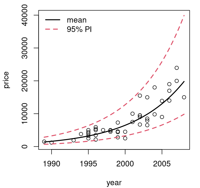
FIGURE 13.3: Back-transformed predictions for pickup trucks.
The first time I saw a visual like the one in Figure 13.3 was eye-opening. Lines are pretty basic, but it’s up to you as the practitioner to decide what, exactly, you want to model linearly. You get to choose what the input and output variables are. Someone may have collected raw \(x\) values in dollars, but it’s fine to choose to model \(f(x)\) just as it’s fine to collect heights in inches and decide to model centimeters instead.
What’s important is how results are communicated. If you report predictions on log-dollars folks probably won’t understand. People aren’t good at thinking in logarithms. Other times, preferred units are cultural. (Try telling a German that you’re 6’2”; they think in metric.) You get to choose what features are modeled, to use the machine learning jargon, but back-transforms are key to communication. Put it back the way you found it!
Finally, with log-transforms and \(\exp\) back-transforms, you’ll never look foolish predicting a negative price or other nonsense. Observe in the figure that the error bars forming PIs shrink to stay positive. A variance stabilizing transformation organically gives you nonconstant, monotonic variance on the original scale.
Mammal weight
I like to think of log-transforms as “unbunching”. Looking at Figure 13.3, \(y\)-values are bunched up at small values, and spread out for larger ones. Input \(x\)-values are more-or-less uniform. Take the log of the \(y\) values, and they’ll be on a different, more uniformly-spread scale (Figure 13.2, left). Leave the \(x\)’s alone.
Sometimes, there’s bunching in both inputs and outputs. Data in mammals.csv on the book webpage contains pairs of weights for the body (kilograms) and brain (grams) of 84 mammals. Early examples with these data are provided by Weisberg (1985) and Rousseeuw and Leroy (1987). See Figure 13.4, showing the original data (left) and a SLR fit to log-log input and output variables (right).
mammals <- read.csv("mammals.csv")
lbody <- log(mammals$body)
lbrain <- log(mammals$brain)
llfit <- lm(lbrain ~ lbody)
See what I mean about bunching on both axes? You may recall a similar GDP–Imports log-log fit from §12.5. The analysis here, for mammal weights, could easily be ported over to that setting.
par(mfrow=c(1, 2))
plot(mammals$body, mammals$brain,
  xlab="body weight (kg)", ylab="brain weight (g)")
plot(lbody, lbrain, xlab="log body weight", ylab="log brain weight")
abline(llfit, lwd=2)
legend("bottomright", "log-log fit", lwd=2, bty="n")
FIGURE 13.4: Raw mammals data (left) and log-log SLR fit (right).
Consider a multiplicative model \(\mathbb{E}\{Y \mid x\} = a x^b\). Take logs of both sides to get
\[ \mbox{Model:} \quad\quad \log( \mathbb{E}\{Y \mid x\} ) = \log(a) + b \log(x) \equiv \beta_0 + \beta_1 \log(x). \]
So the log-log model is appropriate whenever things are linearly related on a multiplicative, or percentage scale, i.e., when %\(y\) changes linearly with %\(x\). In that situation, estimated slope \(\hat{\beta}_1\) is known as elasticity. It may be interesting to test, for these data, whether brain and body weight have an elasticity of one, meaning that there’s a 1:1 relationship on percentage terms.
b1 <- as.numeric(coef(llfit)[2])
se1 <- summary(llfit)$coefficients[2, 2]
t <- (b1 - 1)/se1
pval <- pt(-abs(t), nrow(mammals) - 2)
c(b1=b1, pval=pval)
## b1 pval
## 7.432e-01 1.578e-11No. We can reject \(\mathcal{H}_0: \beta_1 = 1\). Apparently, brains of large mammals tend to be smaller, proportionately speaking, than those of smaller mammals. I find that counterintuitive. You’d think that you’d need a bigger brain to manage more body. Or at least I would, but I’m not a biologist.
How about a prediction back on the original scale?
xp <- seq(min(mammals$body), max(mammals$body), length=1000)
p <- predict(llfit, newdata=data.frame(lbody=log(xp)),
  interval="prediction")
Be careful to transform the predictive grid on the way into predict, and
then undo everything that comes out. Figure 13.5 shows the
resulting predictive distribution via mean and 95% PI error bars.
plot(mammals$body, mammals$brain, ylim=range(exp(p)),
  xlab="body weight", ylab="brain weight")
lines(xp, exp(p[,1]), lwd=2)
lines(xp, exp(p[,2]), col=2, lty=2, lwd=2)
lines(xp, exp(p[,3]), col=2, lty=2, lwd=2)
legend("topleft", c("mean", "95% PI"), col=1:2, lty=1:2, lwd=2, bty="n")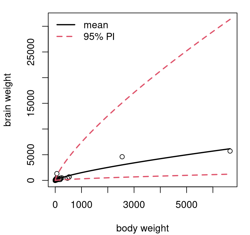
FIGURE 13.5: Predictive distribution for mammals’ weights.
Exponents, combined with very few large mammals in the data set, translates into wide error bars for predictions for those large mammals. Consequently, this view isn’t as pretty as some others we’ve seen, but it is what it is. At least we’ll never predict that a mammal could somehow have negative brain weight. That’s even worse than having to pay someone to take your pickup truck. You’re better off donating it to NPR.
Price elasticity
People tend to buy less stuff when it’s more expensive. Shocker! Sellers hope to find the sweet spot, balancing price, sales, and inventory, to maximize profit. Our final example comes from a subset of “Retail Scanner Data” found in the Nielsen-Kilts SCANTRACK database. Data in confood.csv on the book webpage record supermarket sales of canned food produced by Consolidated Foods at various price points.
confood <- read.csv("confood.csv")
lprice <- log(confood$price)
lsales <- log(confood$sales)
llfit <- lm(lsales ~ lprice)
Raw data values (left) and log-log versions with SLR fit (right) are shown in Figure 13.6.
par(mfrow=c(1, 2))
plot(confood$price, confood$sales,
  xlab="price ($)", ylab="sales volume (units)")
plot(lprice, lsales, xlab="log price", ylab="log sales")
abline(llfit, lwd=2)
legend("topright", "log-log fit", lwd=2, bty="n")
FIGURE 13.6: Raw Consolidated Foods data (left) and log-log SLR fit (right).
The view on the original scale is less pathological than the one in Figure
13.4 (left), but clearly nonlinear. Sales never dip below
zero, and you wouldn’t want to predict that either. Bunching is less
pronounced, and perhaps log(price) isn’t necessary, since prices seems to
vary uniformly (possibly no bunching on the \(x\)-axis). However, it can
sometimes be advantageous to use \(\log x\) whenever logging \(y\), automatically.
Log-log lends interpretability through an elasticity (or percent)
interpretation. Definitely don’t do it if it makes things look worse though.
Table 13.1 provides a summary of coefficients and standard errors for a log-log fit to Consolidated Foods sales. Everything is highly significant. Apparently, if you increase the price by 1%, then sales decrease by about 5%. Makes sense.
sumcoef <- summary(llfit)$coefficients
colnames(sumcoef) <- c("est", "stderr", "t stat", "p val")
kable(round(sumcoef, 4), caption="Confoods log-log LM/SLR fit.")| est | stderr | t stat | p val | |
|---|---|---|---|---|
| (Intercept) | 4.803 | 0.1744 | 27.53 | 0 |
| lprice | -5.148 | 0.5098 | -10.10 | 0 |
The sweet spot in that relationship depends on costs and how those compare to revenue: sales volume times price. For that, it can help to have predictions back on the original scale.
xp <- seq(min(confood$price), max(confood$price), length=1000)
p <- predict(llfit, newdata=data.frame(lprice=log(xp)),
  interval="prediction")
See Figure 13.7. Something like this could be invaluable to decision-making at several levels: supermarket, manufacturing, logistics, sales/promotions, etc.
plot(confood$price, confood$sales, ylim=range(exp(p)),
   xlab="price ($)", ylab="sales volume (units)")
lines(xp, exp(p[,1]), lwd=2)
lines(xp, exp(p[,2]), col=2, lty=2, lwd=2)
lines(xp, exp(p[,3]), col=2, lty=2, lwd=2)
legend("topright", c("mean", "95% PI"), col=1:2, lty=1:2, lwd=2, bty="n")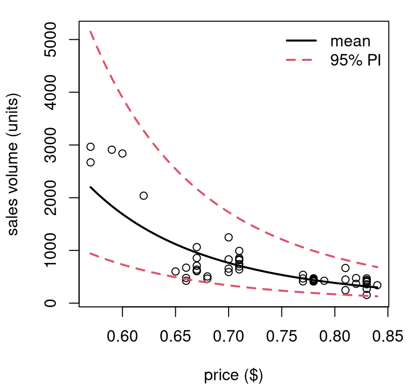
FIGURE 13.7: Predictive distribution for Consolidated Foods sales at varying price points.
I hope you’re starting to see what I mean by “SLR need not be applied so simply”. Not many relationships are linear, but lines are good approximations, at least locally. You can always transform your outputs, and/or inputs, and get additional flexibility. You can really do whatever you want, although logarithms are a good place to start. If log doesn’t work, try square root. If neither of those helps, you might need to try something different. I have some ideas for you; read on.
Be careful, if you change the scale of outputs (e.g., with \(\log y\)) then don’t make any direct quantitative comparisons to models fit on other/original scales. That means don’t compare standard errors or \(R^2\) values. Comparisons across transformations of inputs are fine though, as long as outputs are held constant. In fact, you don’t need to commit to just one.
13.2 Polynomials
If straight lines, possibly on a transformed space, aren’t providing a good fit, try upgrading to polynomials. Taylor’s theorem says any curve may be approximated, locally, by a low-degree polynomial. Weierstrass’ theorem says that you can approximate any function, globally over any bounded range, with a high-enough degree polynomial. The sweet spot, statistically speaking, is somewhere in-between.
What am I saying? Try
\[\begin{equation} \mbox{Model:} \quad\quad Y_i = \beta_0 + \beta_1 x_i + \beta_2 x_i^2 + \cdots + \varepsilon_i, \quad \varepsilon_i \stackrel{\mathrm{iid}}{\sim} \mathcal{N}(0, \sigma^2), \quad i=1,\dots, n. \tag{13.1} \end{equation}\]
Technically, this is a multiple linear regression (MLR) with powered-up features derived from scalar \(x_i\). So I’m doing things a little out of order; most of the details for MLR come next in §13.3. Just bear with me. I’ll show you that you already know how to code it up.
You can choose to power-up as much as you’d like, say up to degree \(\beta_d x_i^d\), but be careful. When \(n \leq d-1\) you get a “perfect fit”, with the polynomial going exactly through all pairs \((x_i, y_i)\), for \(i=1,\dots,n\). I say “perfect”, but it’s not “ideal”, since it means \(\varepsilon_i = 0\) for all \(i\). That’s not very Gaussian. As in any fitting exercise, it’s better to let the data help you decide, and when in doubt keep it simple to avoid overfit. Check if you need to go up to degree \(d\) by testing the hippopotamus that \(\beta_d = 0\). I’ll show you.
Polynomial features like this are a kind of transformation of \(x\); one that fits into the linear framework, albeit in higher dimension (an MLR). You can always combine this with other transformations, like a log if you have bunching or want to ensure positivity. Here is an example where both are used at once. (I told you we’d move fast.)
Consider an experiment relating soybean weight to various factors. See
Davidian and Giltinan (1995), with data provided by nmle on CRAN (Pinheiro, Bates, and R Core Team 2025). Here we
shall analyze a subset of these data and focus on a time–weight relationship.
library(nlme)    ## don't forget install.packages("nmle")
data(Soybean)
soy <- Soybean[Soybean$Time < 65 & Soybean$Variety == "P",]
Figure 13.8 shows two views into a fit on these data. The left panel uses original units, but has a fit derived from a linear model on the log-response.
x <- soy$Time
y <- log(soy$weight)                      ## transform output with y
lfit <- lm(y ~ x)                         ## (log) linear model fit
xp <- seq(min(x), max(x), length=1000)
p <- predict(lfit, newdata=data.frame(x=xp), interval="prediction")
When you look at the data, you can see why: there’s bunching in the \(y\)-axis. Plus, soybean weights can’t be negative. The residual analysis summarized in the right panel shows that the fit (to \(\log y\)) isn’t ideal. There’s nonlinearity left over in the residuals. Looking back at the left panel, perhaps it would’ve been possible to see the over-, then under-, then over-predicting pattern there, too. A residual analysis makes that much clearer by “zooming” in. What to do?
par(mfrow=c(1, 2))

## view in original space (left panel)
plot(soy$Time, soy$weight, xlab="time (days)", ylab="weight (g)")
lines(xp, exp(p[,1]), lwd=2)
lines(xp, exp(p[,2]), col=2, lty=2, lwd=2)
lines(xp, exp(p[,3]), col=2, lty=2, lwd=2)
legend("topleft", c("mean", "95% PI"), col=1:2, lty=1:2, lwd=2, bty="n")

## residual analysis (right panel)
plot(lfit$fitted, lfit$residual,
  xlab="fitted values (yhat)", ylab="residuals (e)")
abline(h=0, col=2, lty=2, lwd=2)
legend("bottom", "zero residual", col=2, lty=2, lwd=2, bty="n")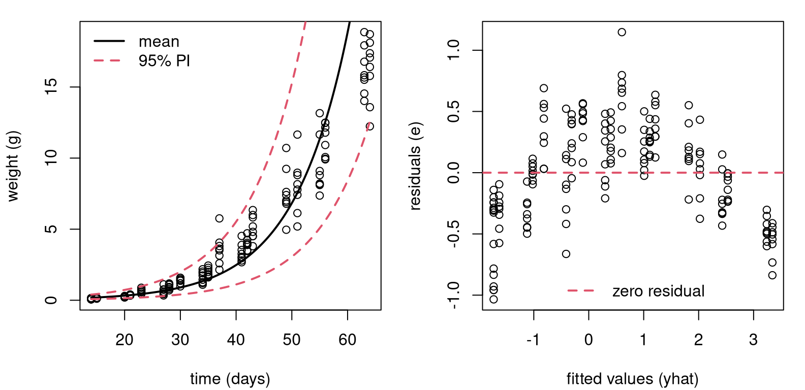
FIGURE 13.8: Fit to soybean data with log-response, back on original scale (left) and residual diagnostics on a log-scale (right).
Figure 13.9 shows what happens when you create a degree-2 feature
for \(x\), which is $Time, and use it in a degree-2 polynomial mean
– a quadratic regression.
x2 <- x^2                                 ## degree-2 training feature
lfit2 <- lm(y ~ x + x2)                   ## technically our first MLR
xp2 <- xp^2                               ## degree-2 testing feature
p2 <- predict(lfit2, newdata=data.frame(x=xp, x2=xp2),
  interval="prediction")
I know I’m moving lightning quick. Hold on tight. The left panel focuses on
the polynomial part. Look how adding the new feature x2, which is really
$Time^2, lends curvature to the surface when plotted as a function of
xp-values only. Notice how xp2-values are used in predict, but they
don’t feature later in the plot.
par(mfrow=c(1, 2))

## left panel, view in log y space
plot(x, y)
lines(xp, p2[,1], lwd=2)
lines(xp, p2[,2], col=2, lty=2, lwd=2)
lines(xp, p2[,3], col=2, lty=2, lwd=2)

## right panel, view in original y space
plot(soy$Time, soy$weight,
  xlab="time (days)", ylab="weight (g)")
lines(xp, exp(p2[,1]), lwd=2)
lines(xp, exp(p2[,2]), col=2, lty=2, lwd=2)
lines(xp, exp(p2[,3]), col=2, lty=2, lwd=2)
legend("topleft", c("mean", "95% PI"), col=1:2, lty=1:2, lwd=2, bty="n")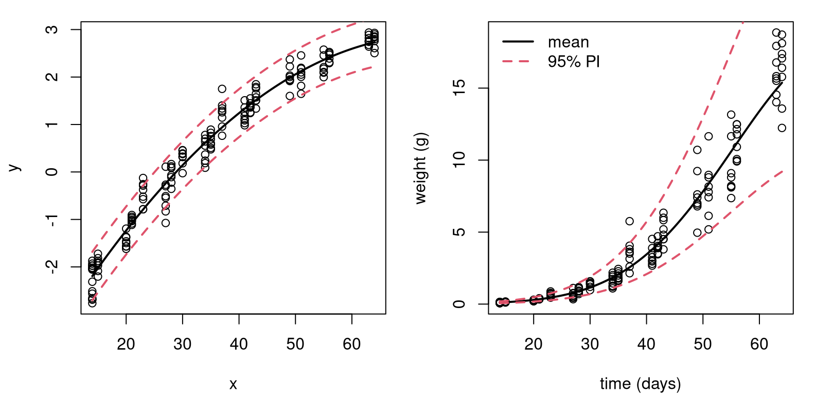
FIGURE 13.9: Degree-2 fit to soybean data with log-response, on log-scale (left) and back on the original scale (right).
The right panel in the figure undoes everything, putting our visual back on the original scale(s). Comparing to the left panel of Figure 13.8, differences are subtle. To my eye we now have a more nuanced, tighter nonlinear fit.
How can I know for sure that it was worthwhile to include an additional degree-2 feature? I can test \(\mathcal{H}_0: \beta_2 = 0\). Table 13.2 provides a summary of coefficients, standard errors, \(t\) statistics and \(p\)-values. Have a look at the new row corresponding to \(\beta_2\), and notice the zero \(p\)-value (after rounding).
sumcoef <- summary(lfit2)$coefficients
colnames(sumcoef) <- c("est", "stderr", "t stat", "p val")
kable(round(sumcoef, 4), caption="Soybean LM on log-y, quadratic fit.")| est | stderr | t stat | p val | |
|---|---|---|---|---|
| (Intercept) | -4.8233 | 0.1159 | -41.62 | 0 |
| x | 0.2074 | 0.0067 | 30.77 | 0 |
| x2 | -0.0014 | 0.0001 | -16.00 | 0 |
It could be that an even higher-degree polynomial would provide a better fit. That’s easy to check.
## [1] 0.1447There’s not enough evidence to reject \(\mathcal{H}_0: \beta_3 = 0\), so it must be that a degree-2 polynomial is sufficient for these data.
There was a lot going on in that example: logs, polynomials, residual
diagnostics and converting back and forth between original and transformed
scales. Hopefully each building block is not too much to take in, on its
own. The only real magic here is the lm command, which can apparently take
in more than one x-value if you string them together with + in the
formula: lm(y ~ x + x2 + x3). What’s going on under the hood?
13.3 Multiple linear regression
Many data analysis settings involve more than one independent variable or factor which affects the dependent or response variable. Reviewing some of the examples we explored previously, here are some possible extensions. There are multi-factor asset pricing models (beyond CAPM). Demand for a product may depend on prices of competing brands, advertising, household attributes, etc. House prices depend on more than just size.
In SLR, the conditional mean of \(Y\) depends on \(x\). Multiple linear regression (MLR) extends this idea to include more than one independent variable. As with SLR, there are several ways to write out the model. Two of them have direct SLR analogs, but my favorite is the third one, which is new.
\[\begin{align} 1: && Y_i &= \beta_0 + \beta_1 x_1 + \dots + \beta_d x_d + \varepsilon_i, \notag & \varepsilon_i &\stackrel{\mathrm{iid}}{\sim} \mathcal{N}(0, \sigma^2), \\ 2: && Y_i \mid x_{i1}, \dots, x_{id} & \stackrel{\mathrm{ind}}{\sim} \mathcal{N}(\beta_0 + \beta_1 x_1 + \dots + \beta_d x_d, \sigma^2) & i&=1, \dots, n \notag \\ 3: && Y &\sim \mathcal{N}_n(X \beta, \mathbb{I}_n \sigma^2). \tag{13.2} \end{align}\]
Above, \(\mathcal{N}_n\) indicates an \(n\)-variate multivariate normal (MVN) distribution. The new, vectorized approach (13.2) is easier to work with mathematically if you’re not afraid of some linear algebra, but it requires some unpacking.
- \(Y = (Y_1, \dots, Y_n)^\top\), with \(y\) (still an \(n\)-vector) being in used non-random contexts;
- \(\beta\) is a \(p=(d+1)\)-vector \((\beta_0, \beta_1, \dots, \beta_d)^\top\) of unknown regression coefficients;
- \(\mathbb{I}_n\) is an \(n \times n\) identity matrix;
- \(X\) is an \(n\times p\) design matrix with leading column of 1s, and each of \(d\) coordinates stacked as columns thereafter. Its \(i^\mathrm{th}\) row is \(x_i^\top = (1, \ x_{i1}, \cdots, x_{id}).\)
All of this applies to SLR as well, taking \(d=1\), but it could represent overkill in that setting. Eq. (13.2) is still a “linear” model even though \(\beta_0 + \sum_{j=1}^d \beta_j x_j\) is not a strictly a “line” unless \(d=1\). Linear simply refers to the way in which \(X\) and \(\beta\) are combined, as a matrix-vector product. Linear algebra, if it can be distilled down to a phrase, is merely an “abstraction of sums of products”, and other operations on those quantities. When \(d = 2\) the “linear” surface is a plane in two dimensions. For \(d = 3, 4, \dots\) we say hyperplane.
Quick digression on notation. Sometimes, I’ll write \(x_{\cdot j}\) to refer to the \(j^{\mathrm{th}}\) column of \(X\). Other times, I’ll use \(x_j\), interchangeably. A \(\cdot\) is intended to remind you of row indexing for any \(i=1,\dots,n\). In both cases, using \(j\) rather than \(i\) is intended to signal column indexing, whereas \(i\) is reserved for rows. Usually, my choice about one or the other is settled by a spur-of-the-moment decision.
Alright, back to MLR. Notice how polynomial regression (13.1) is
an MLR with \(x_j = x^j\) for \(j=1,\dots,d\). In fact, that allows me to begin
an illustration and draw a comparison to library-based calculations from
§13.2. The \(n\)-vector \(y\) is already stored in y,
containing log(soy$weight) values. An \(n\times p\) design matrix \(X\), where
\(p=3\) for the quadratic case, may be built as follows.
Recall that x = soy$time and x2 \(\equiv x^2\). If it bothers you that I’m
using a polynomial regression to illustrate MLR, don’t worry. I’ve got plenty
more MLR examples coming.
Importantly, key assumptions underlying MLR are the same as SLR. The conditional mean of \(Y_i\) is linear in the \(x_{ij}\) variables, for \(j=1,\dots,p\). Additive errors \(\varepsilon_i\), representing noisy deviations from the line, are still Gaussian, independent from each other, and identically distributed (i.e., they have constant variance, \(\sigma^2\)).
Interpretation of regression coefficients can be extended from the single covariate case through partial derivatives
\[ \beta_j = \frac{\partial \, \mathbb{E}\{Y \mid x_1, \dots, x_d\}}{\partial x_j}. \]
That is, holding all other variables constant, \(\beta_j\) is the average change in \(Y\) per unit change in \(x_j\).
Therein lies the biggest challenge: there’s more to keep track of with more columns of \(X\). Consequently, one looks through fitted values \(\hat{y}_i = \hat{y}_i = b_0 + b_1 x_{i1} + \dots + b_d x_{id}\), where \(b\) is any estimate of \(\beta\). That way, residuals are unchanged as \(e_i = y_i - \hat{y}_i\), and residual diagnostics need not proceed on an \(x_{\cdot j}\) basis. Least squares is also unchanged; just minimize the residual sum of squares \(\sum_{i=1}^n e_i^2\) via calculus: take a gradient and solve for the best \(b\)-vector. It may not surprise you that the answer is the same via the likelihood. I’ll take that route, in part because it allows me to fill in some gaps left earlier.
MLR inference and analysis
Calculating the MLE follows Alg. 3.1 where a likelihood is provided by Eq. (13.2). Using an MVN density with mean \(X\beta\) and variance \(\sigma^2 \mathbb{I}_n\), we have
\[\begin{align} L(\beta, \sigma^2) &= (2\pi\sigma^2)^{-n/2} \exp \left\{- \frac{1}{2\sigma^2} (y - X\beta)^\top(y - X\beta) \right\} \notag \\ \ell(\beta, \sigma^2) \equiv \log L &= c -\frac{n}{2} \log \sigma^2 - \frac{1}{2\sigma^2} (y - X\beta)^\top(y - X\beta) \tag{13.3} \\ &= c -\frac{n}{2} \log \sigma^2 - \notag \frac{1}{2\sigma^2} (y^\top y - 2 y^\top X\beta + \beta^\top X^\top X \beta). \end{align}\]
Even if you’re not super comfortable with linear algebra, I bet you can follow the development above if you’re patient with it. The term \((y - X\beta)^\top(y - X\beta)\), which is really a dot product, is one way to write out squared Euclidean distance in \(p\) dimensions.
\[\begin{equation} ||y - X\beta||^2 = (y - X\beta)^\top(y - X\beta) = \sum_{i=1}^n (y_i - \beta_0 - \beta_1 x_{i1} - \dots - \beta_d x_{id})^2 \tag{13.4} \end{equation}\]
The rest is factorizing products, simplifying and dropping terms (subsumed in \(c\)) which are constant with respect to parameters \(\sigma^2\) and \(\beta\). Note that \(y^\top X \beta = \beta^\top X^\top y\) since transposes reverse the order of matrix/vector products and both evaluate to scalars.
Returning back to our expression for the log-likelihood above, take partial derivatives with respect to \(\beta\) and solve.
\[ \begin{aligned} 0 = \frac{\partial \ell}{\partial \beta}\Big{|}_{\beta = \hat{\beta}} &= \frac{1}{\sigma^2} (X^\top y + X^\top X \hat{\beta}) \\ X^\top X \hat{\beta} &= X^\top y \\ \end{aligned} \]
As long as \(X^\top X\) is of invertible, which happens when \(X\) is of full rank,
\[\begin{equation} \hat{\beta} = (X^\top X)^{-1} X^\top y. \tag{13.5} \end{equation}\]
Look closely at that equation, it might be familiar. Does \(b_1 =
s_{yx}/s_{xx}\) ring any bells? It’s easy to verify that Eq.
(13.5) agrees with any of the \(d=1\) solutions in Chapter 7.
I’ll leave that to you and continue with the soy polynomial regression
illustration.
XtX <- t(X) %*% X             ## t is transpose, %*% is matrix product
XtXi <- solve(XtX)            ## solve is inv with only one argument
Xty  <- t(X) %*% y            ## %*% also for matrix-vector product
bhat <- drop(XtXi %*% Xty)    ## drop from a 1xp matrix to p-vector
rbind(coef(lfit2), bhat)
## (Intercept) x x2
## -4.823 0.2074 -0.001396
## bhat -4.823 0.2074 -0.001396Those are the same. I bet you can do that as a one-liner, but I didn’t because I wanted to go through it slowly. Also, I’ll need some of those intermediate building blocks later.
An important result for MVNs involves projection. Think of projection in this context as a marginal comprised of a linear combination of the components of a random vector. We already know that marginals of MVNs are Gaussian, and it turns out that projections are, too. The particular result I need here is the following: If \(Y \sim \mathcal{N}_n(\mu, \Sigma)\) and \(P\) is a \(p\times n\) matrix, then \(PY \sim \mathcal{N}_p(P \mu, P \Sigma P^\top\)).
What is that useful for? Let \(P = (X^\top X)^{-1} X^\top\) so that \(\hat{\beta} = Py\). Observe that
\[ \begin{aligned} P X \beta &= (X^\top X)^{-1} X^\top X \beta = \beta, \\ \mbox{and } \quad P P^\top &= (X^\top X)^{-1} X^\top X (X^\top X)^{-1} = (X^\top X)^{-1} \end{aligned} \]
since \(X^\top X\) is symmetric, and then so is its inverse. Therefore, using the MVN result above, we obtain
\[\begin{equation} \hat{\beta} = PY \sim \mathcal{N}_p (\beta, \sigma^2 (X^\top X)^{-1}) \tag{13.6} \end{equation}\]
giving the sampling distribution of \(\hat{\beta}\). This works for all \(p\) components of \(\hat{\beta}\) at once. Isn’t that neat? You get one (vectorized) formula for the entire set of coefficients, slope(s) and intercept combined. No need to separate them out like Eqs. (7.25) and (7.23). And their covariance (7.27) comes for free!
I saved XtXi earlier, how prescient! Before that can be used to extract
standard errors for \(p\)-values and CIs, I need an estimate of \(\sigma^2\).
Plugging in \(\hat{\beta}\) into the log-likelihood (13.3) with Eq.
(13.4) gives
\[ \ell(\hat{\beta}, \sigma^2) = -\frac{n}{2} \log \sigma^2 - \frac{1}{2\sigma^2} || y - X\hat{\beta}||^2. \]
Differentiating with respect to \(\sigma^2\) and solving, yields
\[ \begin{aligned} 0 = \frac{\partial \ell}{\partial \sigma^2}\Big{|}_{(\hat{\beta}, \hat{\sigma}^2)} & = - \frac{n}{2\hat{\sigma}^2} + \frac{1}{2\hat{\sigma}^4} ||y - X\beta||^2 \\ \hat{\sigma}^2 &= \frac{1}{n} || y - X\hat{\beta} ||^2. \end{aligned} \]
One can argue that this induces bias which is corrected with
\[\begin{equation} s^2 = \frac{1}{n-p} || y - X\hat{\beta} ||^2 \tag{13.7} \end{equation}\]
where \(p=d+1\) is the degrees of freedom (DoF): the number of parameters estimated via \(\hat{\beta}\) before calculating variance. As with \(s^2\) back in Chapter 3, Eq. (3.16), it may be shown that \(\sigma^2 \sim (n-p) s^2 / \chi^2_{n-p}\) following Cochran’s theorem, but I’ll spare you the details.
p <- ncol(X)
n <- nrow(X)
s2 <- sum((y - X %*% bhat)^2)/(n - p)
c(hand=s2, lib=summary(lfit2)$sigma^2)
## hand lib
## 0.06457 0.06457Also like in Chapter 3, estimating \(\sigma^2\) changes an MVN into a (multivariate) Student-\(t\). Table 13.3 is the by-hand version of Table 13.2. It seems sorta silly to put two copies of the same table, but it’s important to check this so there’s no smoke-and-mirrors.
se <- sqrt(s2*diag(XtXi))
t <- bhat/se
pval <- 2*pt(-abs(t), n - p)
tab <- cbind(bhat, se, t, pval)
colnames(tab) <- c("est", "stderr", "t stat", "p val")
rownames(tab) <- c("(Intercept)", "x", "x2")
kable(round(tab, 4), caption="By-hand re-do of soybean summary.")| est | stderr | t stat | p val | |
|---|---|---|---|---|
| (Intercept) | -4.8233 | 0.1159 | -41.62 | 0 |
| x | 0.2074 | 0.0067 | 30.77 | 0 |
| x2 | -0.0014 | 0.0001 | -16.00 | 0 |
MLR leverage and Prediction
Indulge me for one more thing. (Actually, I’ve got two more things, but if you look at them in a certain way they’re the same.) The projection trick can be used a second time to derive the distribution of errors, \(e\). Let
\[\begin{equation} H = X (X^\top X)^{-1} X^\top \tag{13.8} \end{equation}\]
so that \(\hat{y} = H y = X \hat{\beta}\). Sometimes, \(H\) is called the hat matrix because it “puts the hat on \(y\)”. This is one of those rare instances of a clever name from the stats community.
\(H\) is a special kind of matrix called an orthogonal projection, with many nice properties: \(H^\top = H\), \(H^2 = H\), \((\mathbb{I}_n - H)^\top = (\mathbb{I}_n - H)\), and \((\mathbb{I}_n - H)^2 = (\mathbb{I}_n - H)\). Eponymously, \(Hy\) and \(y - Hy\) are orthogonal, meaning their product is the identity. How is that useful?
Observe that
\[ e = Y-\hat{Y} = Y-X\hat{\beta} = Y-X(X^\top X)^{-1} X^\top Y \equiv (\mathbb{I}_n-H)Y. \]
If \(Y\sim N_n(X\beta, \sigma^2 I)\) is correct, our result about projections of MVNs gives
\[\begin{align} e &\sim N_n((\mathbb{I}_n-H)X\beta, \sigma^2(\mathbb{I}_n-H)(\mathbb{I}_n-H)^\top). \notag \\ \mbox{Therefore } \quad e &\sim N_n(0, \sigma^2(\mathbb{I}_n-H)), \tag{13.9} \end{align}\]
since \(H\) is a projection and \(X\beta - H X\beta = 0\). In words, residual vector \(e\) is MVN like \(\varepsilon\), but its covariance is not a scaled identity. Residuals are correlated, not independent. That’s what leads to the hyperbolic shape of predictive error bars, which I’m coming to next.
A really good check of understanding here is the following trivia question. Which line is closer to the data: (a) the estimated line using MLE \(\hat{\beta}\); or (b) the true line using \(\beta\)? I’ll give you a hint. The answer involves comparing Eq. (13.9) to the distribution for \(\varepsilon\) implied by Eq. (13.2). Maybe you’ll see that on a quiz.
Components on the diagonal of \(H\), which are often notated as \(h_i = \mathrm{diag}(H)_i\), are referred as the leverage or influence of point \((x_i, y_i)\). Quantity \(h_i\) measures how much \((x_i, y_i\)) pulls \(e_i\) toward zero in \(\mathbb{V}\mathrm{ar}\{e\}\). Importantly, \(h_i\) only depends on \(x_i\), not \(y_i\). That’s another good trivia question.
In 1d, leverage and distance between \(x_i\) and \(\bar{x}\) are pretty much the same thing, so the metaphor works. A lever exerts more force if you push/pull on it far from the pivot joint, \(\bar{x}\). With \(p=3\) columns of \(X\), especially ones that are powers of a single \(x\), the notion of distance becomes more complicated. Figure 13.10 provides a visual of the leverage of the training data points in the soybean quadratic regression.
h <- diag(H)
jit <- rnorm(length(x), 0, 0.5)  ## horizontal jitter
plot(x + jit, h, pch=18,
  xlab="inputs xi (time)", ylab="leverage hi")
FIGURE 13.10: Illustrating leverage for the soybean quadratic regression.
There are many repeated \(x\)-values in that example, so there are many fewer than \(n = 168\) unique leverages (20). I’ve jitterd them a little on the \(x\)-axis to help reveal their multitude. As you can see in the figure, distance from the middle of the \(x\)-values contributes to leverage, but it’s not the whole story.
If you re-purpose the hat matrix (13.8) with a predictive vector \(x_p\), rather than training \(X\), you can use it for prediction:
\[ h_p = x_p^\top (X^\top X)^{-1} x_p. \]
Understanding the distribution of predictive errors, \(e_p = 1 + h_p\) is the hard part; predicting with \(x_p^\top \hat{\beta}\) is easy. I know I’m moving fast here, but similar projection arguments for \(e\) with \(H\) can be used to deduce that \(\mathbb{V}\mathrm{ar}\{Y_p \mid x_p\} = \sigma^2 (1 + h_p) = \sigma^2(1 + x_p^\top (X^\top X)^{-1} x_p)\). Notice the \(1+\) here rather than \(\mathbb{I}_n -\) in Eq. (13.9). That’s not a mistake. Residuals \(e\) are pulled to zero by their leverage. The opposite thing happens when predicting. That pull is translated into uncertainty, imparting a hyperbolic shape.
Here that is in code, for multiple \(x_p\) at once, forming predictive matrix \(X_p\).
Xp <- cbind(1, xp, xp2)
Hp <- Xp %*% XtXi %*% t(Xp)
Spred <- s2*(diag(1, nrow(Xp)) + Hp)           ## for PIs
spred <- sqrt(diag(Spred))
Sfit <- s2*Hp                                  ## for CIs if desired
sfit <- sqrt(diag(Sfit))                       ## not used below
q <- qt(0.975, n - p)
PI.u <- drop(Xp %*% bhat) + q*spred            ## checking upper PI only
round(mean((PI.u - p2[,3])^2), 8)              ## lower would be similar
## [1] 0As you can see, the upper PI error bar is within machine precision as compared
to the one calculated earlier via predict in §13.2. A
comparison on the lower one would be similar.
13.4 Dummies and Interactions
A dummy variable is smarter than it sounds. It allows you to use a categorical input, like a grouping variable for ANOVA (§6.3), in an MLR. For example, one of the columns of the pickup truck data is vehicle make.
##
## Dodge  Ford   GMC
##    10    12    23
Dummies can be used to convert a non-numeric grouping into a real-valued
predictor (actually binary)
that can be used with MLR linear algebra, as outlined in the previous section.
For example, here are two dummy variables for the three categories of pickup
truck $make, notated as \(w_i\) for \(i=1,\dots,n\).
\[ x_{i2} = \mathbb{I}_{\{w_i = \mathrm{Ford}\}} \quad \mbox{ and } \quad x_{i3} = \mathbb{I}_{\{w_i = \mathrm{GMC}\}} \]
These two new columns of \(X\) can represent each \(w_i\) for all three categories: Dodge is \((x_{i2}, x_{i3}) = (0,0)\), Ford is \((1,0)\), and GMC is \((0,0)\). Notice that Dodge’s representation is in the negative space of neither Ford nor GMC. It is said to be “in the intercept” since slopes \(\beta_2\) and \(\beta_3\) in the MLR would be zero:
\[ \mbox{Model:} \quad\quad Y = \beta_0 + \beta_1 x_1 + \beta_2 x_2 + \beta_3 x_3 + \varepsilon. \]
Recall that \(x_{\cdot 1}\) in the pickup truck MLR is year. One may create a design matrix containing dummy variables in R as follows.
X <- cbind(1, pickups$year, pickups$make == "Ford", pickups$make == "GMC")
y <- log(pickups$price)
bhat <- drop(solve(t(X) %*% X) %*% t(X) %*% y)
Or, R will do it for you if you provide a categorical input in the lm
formula.
##      (Intercept)   year makeFord makeGMC
##           -272.7 0.1407   0.1257  0.1355
## bhat      -272.7 0.1407   0.1257  0.1355
R builds dummy variables alphanumerically unless you relevel the categorical
factor to specify a different order. That puts the first pickups$make, which
is Dodge, in the intercept. Was it worthwhile including these two additional
degrees of freedom? Table 13.4 shows that the answer is no.
Neither of the \(p\)-values for the two dummy variables is below the usual 5%
threshold.
sumcoef <- summary(fit)$coefficients
colnames(sumcoef) <- c("est", "stderr", "t stat", "p val")
kable(round(sumcoef, 4), caption="Pickup truck LM/SLR fit with dummies.")| est | stderr | t stat | p val | |
|---|---|---|---|---|
| (Intercept) | -272.6906 | 22.0835 | -12.3482 | 0.0000 |
| year | 0.1407 | 0.0110 | 12.7430 | 0.0000 |
| makeFord | 0.1257 | 0.1435 | 0.8758 | 0.3862 |
| makeGMC | 0.1355 | 0.1276 | 1.0620 | 0.2945 |
A word of caution here: that conclusion was reached by doing two \(t\)-tests simultaneously, when technically they must be one-at-a-time. A better way is via partial \(f\)-testing, which is the subject of §13.5.
You can even do an MLR entirely with dummy variables, and guess what? That’s
an ANOVA! Recall the frozen treats example from Chapter 6. Scoop
weights are written out a little differently below, but the ydf object
should be the same as the data.frame used in §6.3.
## data from Chapter 6
sorbet <- c(4.0, 5.5, 4.9, 3.8, 4.3, 4.4, 5.1, 4.1, 4.0)
icecream <- c(3.0, 3.7, 3.4, 3.6, 3.0, 3.5, 4.0)
fatfree <- c(3.5, 3.4, 3.7, 3.4, 3.9, 4.2, 4.0, 4.0, 3.8, 3.8)

## data.frame representation
ydf <- data.frame(
  weight=c(sorbet, icecream, fatfree),
  type=c(rep("sorbet", length(sorbet)), rep("icecream", length(icecream)),
    rep("fatfree", length(fatfree))))

## linear model fit and f statistic
fit <- lm(weight ~ type, data=ydf)
summary(fit)$fstatistic
## value numdf dendf
## 11.9 2.0 23.0Check that this is the same as what was provided in Table 6.1. The difference here is that sums of squares are not directly involved. Hold that thought until §13.5. Although an MLR model (13.2) is superficially different than an ANOVA one (6.5), they are operationally equivalent. They have the same number of parameters, assume Gaussians whose means are determined by \(d\) levels or slopes (and intercept) and common variance \(\sigma^2\). Group means can be recovered from an MLR fit with dummies by adding the intercept to the slopes.
bhat <- coef(fit)
rbind(
  c(fatfree=mean(fatfree), icecream=mean(icecream), sorbet=mean(sorbet)),
  c(bhat[1], bhat[1] + bhat[-1]))
## fatfree icecream sorbet
## [1,] 3.77 3.457 4.456
## [2,] 3.77 3.457 4.456That’s dummies – pretty smart, right? Now I get to pivot to something entirely different, but equally important in an MLR context.
Interactions
So far we’ve considered the impact of each predictor variable \(x_j\) in an additive way. A valuable extension which keeps us in the MLR framework, but allows \(x_j\) to affect the mean in a less independent fashion, is through multiplicative interaction effects:
\[ \mbox{Model:} \quad\quad Y_i = \beta_0 + \beta_1 x_{i1} + \beta_2 x_{i2} + \beta_3 x_{i1} x_{i2} + \dots + \varepsilon_i, \]
so that, for example
\[ \frac{\partial \mathbb{E}\{ Y \mid x_1, x_2\}}{\partial x_1} = \beta_1 + \beta_3 x_2. \]
Interactions are useful whenever the rate of change in the response due to one input depends on the setting of another input.
I like to think of interaction terms as new features, \(x_{1:2} = x_1 x_2\) derived from a product of two other base inputs or features \(x_2\) and \(x_3\). Sometimes, you’ll see regression coefficients notated similarly as \(\beta_{1:2}\) or \(\beta_{12}\) rather than \(\beta_3\). You can even interact and input with itself, like \(x_1 x_1\), building a quadratic term \(x_1^2\).
Consider the connection between college (i.e., bachelor’s degree) grades and grades in a Masters of Business Administration (MBA) program. You might think that students who performed well during their bachelor’s study would also do well in an MBA program. A model capturing that might look like the following, using some shorthand:
\[ \mbox{Model:} \quad\quad \mathrm{GPA}^{\mathrm{MBA}} = \beta_0 + \beta_1 \mathrm{GPA}^{\mathrm{Bach}} + \varepsilon. \]
Here’s a fit to some data collected at the University of Chicago Booth School of Business, and available on the book webpage as grades.csv.
grades <- read.csv("grades.csv")
fit1 <- lm(MBAGPA ~ BachGPA, data=grades)
summary(fit1)$coefficients
## Estimate Std. Error t value Pr(>|t|)
## (Intercept) 2.5899 0.31206 8.299 1.199e-11
## BachGPA 0.2627 0.09244 2.842 6.066e-03I’m skipping the formal table environment here to help streamline things a
bit. Hope you don’t mind. You can see from the summary above that the slope
on BachGPA is positive and statistically significant. For every one point
increase in college GPA, expected MBA GPA increases by about 0.26 points.
What other things might affect MBA GPA? The data file contains an age column;
we could try incorporating that.
##             Estimate Std. Error t value  Pr(>|t|)
## (Intercept)  3.66400   0.444203   8.248 1.645e-11
## BachGPA      0.19495   0.088793   2.196 3.194e-02
## Age         -0.03024   0.009446  -3.201 2.173e-03
Yes, age matters and the coefficient is negative. Apparently, older students tend not to do as well as younger ones. I don’t know about you, but that doesn’t feel right to me. Many MBA students enroll after they’ve worked in industry, gaining valuable experience in the workforce after graduating with their bachelor’s. The very best students, with the highest GPAs, get the best jobs and may be the most likely to delay further education. In other words, what’s really going on might be more nuanced. It may be worth entertaining an interaction between age and college GPA.
In R, there are two clean ways to invoke an interactions via lm. One is to
explicitly write out the new feature as BachGPA:Age, along with anything
else. Or, include both so-called “marginal effects” BachGPA and Age as
well as their interaction BachGPA:AGE with shorthand BachGPA*Age.
fit3 <- lm(MBAGPA ~ BachGPA*Age, data=grades)
## or lm(MBAGPA ~ BachGPA + Age + BachGPA:Age, data=grades)
summary(fit3)$coefficients
## Estimate Std. Error t value Pr(>|t|)
## (Intercept) -0.27964 2.59259 -0.1079 0.91447
## BachGPA 1.36936 0.76596 1.7878 0.07886
## Age 0.10974 0.09117 1.2036 0.23346
## BachGPA:Age -0.04181 0.02709 -1.5434 0.12798What happened? We have a fit that makes more sense, that’s what. Both
BachGPA and Age have positive coefficients. The interaction
BachGPA:Age has a negative coefficient, meaning that how well you did in
college matters less over time. That’s the good news.
The bad news is that none of the coefficients are statistically significant. This happened because our columns of \(X\), the design matrix, are multicollinear. More on that is coming next in §13.5. For now, it simply means that we’ve used too many DoFs to explore variability in our data, making it difficult to detect (an over-complicated) signal from noise.
How about including the interaction effect, but not both marginal effects? That’s one fewer DoF, a more parsimonious model.
fit4 <- lm(MBAGPA ~ BachGPA*Age - Age, data=grades)
## same as lm(MBAGPA ~ BachGPA + BachGPA:Age)
summary(fit4)$coefficients
## Estimate Std. Error t value Pr(>|t|)
## (Intercept) 2.820494 0.296928 9.499 1.227e-13
## BachGPA 0.455750 0.103026 4.424 4.073e-05
## BachGPA:Age -0.009377 0.002786 -3.366 1.323e-03Would you look at that! Everything is statistically significant and the story makes sense. People who did better in college tend to do better in graduate school, but the effect is weakened for older students who’ve gained valuable experience in industry before enrolling in an MBA.
It is interesting to contrast predictive surfaces under a main effects-only
model (fit2), meaning without interactions, and one with interactions
(fit4). Have a look at Figure
13.11. There’s a lot going on in the code for the figure, and I
realize this is the first time you’re seeing an image and contour plot. Redder
is lower and yellower/whiter is higher. Contours trace out evenly-spaced
zero-gradient ridges adding precision to a visual topography provided by
color. Pretty cool, right?
## calculate predictions under both models
ggrid <- seq(min(grades$BachGPA), max(grades$BachGPA), length=100)
agrid <- seq(min(grades$Age), max(grades$Age), length=100)
g <- expand.grid(ggrid, agrid)
p2 <- predict(fit2, newdata=data.frame(BachGPA=g[,1], Age=g[,2]))
p4 <- predict(fit4, newdata=data.frame(BachGPA=g[,1], Age=g[,2]))

## ensure same color palette for both images
cs <- heat.colors(128)
bs <- seq(min(grades$MBAGPA), max(grades$MBAGPA), length=129)

## main effects on left, interactions on right
par(mfrow=c(1, 2))
image(ggrid, agrid, matrix(p2, ncol=100), col=cs, breaks=bs,
  xlab="Bachelors GPA", "ylab"="Age")
contour(ggrid, agrid, matrix(p2, ncol=100), add=TRUE)
image(ggrid, agrid, matrix(p4, ncol=100), col=cs, breaks=bs,
  xlab="Bachelors GPA", "ylab"="Age")
contour(ggrid, agrid, matrix(p4, ncol=100), add=TRUE)
FIGURE 13.11: Comparing main effects only (left) to main effects plus interaction (right) on the MBA grades data.
The main thing to notice in the figure is that contour lines are straight on the left, tracing out a plane in 2D. On the right, those lines are curved because variables are interacting. Polynomial regression leverages nonlinearity in features (powers of \(x\)) to wring non-linearity out of an inherently linear framework (13.2). Interactions provide nonlinear response surfaces across pairs of inputs.
There are shorthands in R to obtain model fits with all main effects and/or all interactions.
fit5 <- lm(MBAGPA ~ ., data=grades)         ## all main effects .
fit6 <- lm(MBAGPA ~ . + .^2, data=grades)   ## plus interactions .^2
If you use one of these, be careful to ensure that the contents of the data=
argument only has columns that you intend to use. If, for example, you have
augmented the data frame with transformed versions (like with pickups in
§13.1), you’ll get something other than intended/wrong
results.
I’m going to leave it to you to look at fit5 and fit6 later
(§13.6). We’ve explored a lot of models already. How do
you know which ones are really the best?
13.5 Model selection
We’ve made it to the last non-homework/Appendix section in the book, and I promised you some Monte Carlo (MC). Choosing the “right” MLR is hard because there could be many predictors (inputs), and many features derived from those predictors (quadratic, interaction, log-transform), and chances are that many of them are collinear with one another.
Multicollinearity
What does that last thing mean? It means that the individual inputs, columns
\(x_{\cdot j}\) of \(X\), don’t have “unique” information about our response \(y\).
I put “unique” in quotes because the right word here is
orthogonal, but it’s a bit
nerdy. Consider the pickup truck data. One of the columns is $miles, which is
collinear with $year. Older vehicles tend to have been driven farther.
Those predictors don’t have unique information about the response, $price.
Sometimes collinearity is unavoidable, other times it’s in there on purpose,
like when introducing interaction or quadratic terms.
Multicollinearity means that the columns of \(X\) covary with one another, so they muddy the water when extracting correlation with \(y\) in a linear model. In symbols, when multicollinearity is high \(X^\top X\) is unstable relative to \(X^\top y\) in \(\hat{\beta} = (X^\top X)^{-1} X^\top y\). The result may be spuriously large components \(\hat{\beta}_j\) and/or standard errors (13.6) on the diagonal of \((X^\top X)\).
I’m going to pivot to a different example, where the degree of multicollinearity is high. You’ll have a chance to play more with pickup trucks on your homework. Consider a survey of employees at a company who’ve been asked to rate their boss on seven criteria. The seventh criterion is “overall”, and will serve as the response, \(y\). Other criteria include \(x_{\cdot 2}\), opportunity to learn new things; \(x_{\cdot 3}\), does not allow special privileges; and \(x_{\cdot 4}\), raises based on performance; etc.
You’ll find the data in boss.csv on the book webpage.
##        X2     X3     X4
## X2 1.0000 0.4933 0.6403
## X3 0.4933 1.0000 0.4455
## X4 0.6403 0.4455 1.0000
To keep the output matrix small, the code above looks at correlation (which is normalized covariance) for just three inputs. See how \(x_{\cdot 4}\) is 49% the same, and \(x_{\cdot 5}\) is 64% the same, as \(x_{\cdot 3}\). That’s serious multicollinearity. Consequently, when you fit an MLR with all those columns, \(t\)-tests indicate that only \(x_1\) is useful (on its own) for predicting \(y\).
##             Estimate Std. Error t value  Pr(>|t|)
## (Intercept) 10.78708    11.5893  0.9308 0.3616337
## X1           0.61319     0.1610  3.8090 0.0009029
## X2           0.32033     0.1685  1.9009 0.0699253
## X3          -0.07305     0.1357 -0.5382 0.5955939
## X4           0.08173     0.2215  0.3690 0.7154801
## X5           0.03838     0.1470  0.2611 0.7963343
## X6          -0.21706     0.1782 -1.2180 0.2355770
Yet, if I drop several of the multicollinear columns, and fit a simpler/more parsimonious model …
##             Estimate Std. Error t value  Pr(>|t|)
## (Intercept)   9.8709     7.0612   1.398 1.735e-01
## X1            0.6435     0.1185   5.432 9.574e-06
## X2            0.2112     0.1344   1.571 1.278e-01
… I see that both $X1 and $X2 are useful for predicting $Y. What gives?
Multicollinearity makes it hard to see the marginal effect of a particular
input, \(x_{\cdot j}\). You can’t get a look at one of them at a time when
they are so similar to, and covary with, one another. Which leads me to the
subject of this section. How does one decide which fit is best, full or
base? Do I need predictors $X3, …, $X6, in addition to $X1 and
$X2, or is a simpler model with \(d=2\) inputs sufficient?
How to select a model? Here I’m focusing on selecting one from just two options. Baby steps. Later I’ll mention how to scale that up to look at many combinations. As with any testing setup, one must choose a statistic and derive its sampling distribution under a null hypothesis. We need something that summarizes the whole fit of a model.
How about \(r^2\)? Recall that \(r^2\) for SLR is the correlation between \(y\) and \(\hat{y}\) values. It’s the same for MLR, only \(\hat{y}\) is more complicated. There are two \(r^2\) values, one for each model.
r2f <- summary(full)$r.squared   ## same as cor(boss$y, full$fitted)
r2b <- summary(base)$r.squared   ## same as cor(boss$y, base$fitted)
c(full=r2f, base=r2b)
## full base
## 0.7326 0.7080Since these two models are nested, meaning that full contains all slope (and
intercept) coefficients involved in base, its \(r^2\) will be bigger. More
coefficients \(\beta_3, \dots, \beta_6\) mean more DoF, a smaller residual sum of
squares, and a “better” fit. I say “better” because it just means the points
are closer to the line (the hyperplane). It doesn’t mean that you’ll get
better predictions for new data. The more complicated, full, model could
just be fitting the noise, or
overfitting.
How to distill those two \(r^2\) values down to one statistic for testing? Why not look at their difference? Since they’re nested, putting the larger one first, \(r^2_{\Delta} = r^2_f - r^2_b\), guarantees a value in \([0,1]\).
## [1] 0.02459So we get a 2.5% better fit from an additional …
## full base diff
##    7    3    4
… \(p_{\Delta} = 4\) parameters. Is that worth it?
I’ve put the cart before the horse a little, jumping right to the statistic without mentioning what the competing hypotheses are. My preference would be to write hypotheses generically using “complexity” via \(p_f\) and \(p_b\) and the difference between them \(p_\Delta\). In a way, this is what the machine learning community does, and I’ll say more about that below. But it doesn’t mesh well with a classical statistics setup. Perhaps that makes stats old-fashioned, but actually both mindsets serve us well in this context, and there’s comfort (I find) in convention.
Taking inspiration from ANOVA (6.6), consider the following hypotheses.
\[\begin{align} \mathcal{H}_0 &: \beta_{p_{\mathrm{base}} +1} =\beta_{p_{\mathrm{base}} +2} = \cdots = \beta_{p_{\mathrm{full}}} = 0 \notag \\ \mathcal{H}_1 &: \mbox{at least one } \beta_j \neq 0 \mbox{ for } j > p_{\mathrm{base}} \tag{13.10} \end{align}\]
See how that’s a formal, but long-winded way of asking the model selection
question of interest? \(\mathcal{H}_0\) assumes that any additional
coefficients are zero (the base model), whereas \(\mathcal{H}_1\) says at
least one is useful (full). Connection to ANOVA is not just coincidental or
inspirational. As with dummy variables in §13.4, MLR
subsumes ANOVA in many respects. The advantage to having something like Eq.
(13.10) is that it tells you exactly what to simulate via MC.
Before jumping in, it’s worth pointing out that individual \(t\)-tests for particular coefficients don’t apply here. Those are one-at-a-time procedures, whose standard errors and \(p\)-values must be interpreted as conditional on other parameters being in the model.
You could, of course, do a sequence of \(t\)-tests, singling out one \(\beta_j\) at a time. However, performing multiple smaller tests – asking multiple questions, statistically speaking – is inferior to performing a single big test – just one question – if the latter is really what you’re after. Recall the multiple testing hazard from §6.4. After rejecting the null for the big question, if that’s what happens, it might be worthwhile to perform other, smaller tests.
Model selection via MC
First, here’s a little setup to make it easier when we get to the loop. In
particular, I need a data frame (Dfs below) that I can use to hold
randomly generated \(Y\)-values along with original inputs \(X\).
Code below encodes \(\mathcal{H}_0\), and extracts useful quantities for simulation.
beta <- c(as.numeric(coef(base)), rep(0, 4))  ## coefficients under H0
mu <- beta[1] + X %*% beta[-1]                ## mean/prediction under H0
s2 <- summary(base)$sigma^2                   ## est. uncertainty under H0
Ok, ready? Generate data under the null (base), then calculate fits for
base and full, and save their difference in \(R^2\)s.
N <- 100000
R2fs <- R2bs <- R2diffs <- rep(NA, N)
for(i in 1:N) {

  ## simulate data under H0 (via residuals)
  sigma2 <- s2  ## or sigma2 <- (n - pb)*s2/rchisq(1, n - pb)
  Ys <- rnorm(n, mu, sqrt(sigma2))

  ## put simulated Ys along with the data Xs
  Dfs$Y <- Ys

  ## and then fit both models to these simulated data
  Fs <- lm(Y ~ X1 + X2 + X3 + X4 + X5 + X6, data=Dfs)     # H1
  Bs <- lm(Y ~ X1 + X2, data=Dfs)                         # H0

  ## extract both R2 values
  R2fs[i] <- summary(Fs)$r.squared
  R2bs[i] <- summary(Bs)$r.squared

  ## save their difference
  R2diffs[i] <- R2fs[i] - R2bs[i]
}
You may have noticed that I took a little shortcut by not sampling \(\sigma^2\) values via inverse-\(\chi^2\). That’s definitely doable if you’d like, but results are pretty much the same because \(n\) is large. Figure 13.12 shows the empirical sampling distribution of \(R^2_\Delta\) values, alongside our observed value from the data.
hist(R2diffs, main="", xlab="sampled R2diff values")
abline(v=r2diff, col=2, lwd=2)
legend("right", "observed", col=2, lwd=2, bty="n")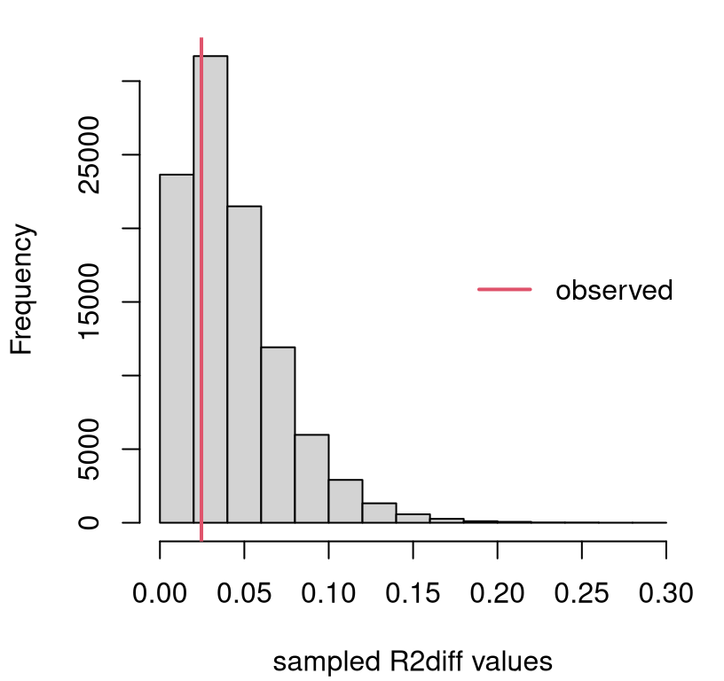
FIGURE 13.12: Sampling distribution of \(R^2_\Delta\) for the boss data example.
We only care about large observed \(r^2_\Delta\) values, since small ones support the null. So this is a right-tailed test. Clearly there’s not enough evidence to reject \(\mathcal{H}_0\), since the observed value is near the mode. It never hurts to calculate a \(p\)-value.
## [1] 0.6854In conclusion, the additional flexibility offered by those four extra
coefficients is not helpful. That doesn’t mean that none of them are useful
on their own. It just means that in the presence of $X1 and $X2, you don’t
need any of $X3 … $X4. Due to collinearity, it may be that one of those
would be useful if one of $X1 or $X2 were dropped from the model. Hold that
thought.
Model selection via math
\(R^2_\Delta\) is beautifully intuitive. It takes something well-understood from two similar models and pits them against one another. Unfortunately, its sampling distribution is not available in closed form. (Although the MC is simple enough.) Fortunately, some clever mathematicians showed that a similar statistic does have a known distribution.
The story goes like this: \(R^2\) is a squared correlation, which is a ratio of (co-)variances, which are residual sums of squares (SSs), which have a \(\chi^2\) distribution, and ratios of \(\chi^2\)s have an \(F\) distribution. Sound familiar? That’s the same as the ANOVA \(F\) story.
If you don’t care about an ANOVA connection, you can go directly to the \(f\) statistic through \(r^2\). The formula below connects the two, which is known as a partial \(f\) statistic.
\[\begin{equation} f = \frac{R^2_\Delta/p_\Delta}{(1 - R^2_{\mathrm{full}})/(n - p_{\mathrm{full}})} = \tag{13.11} \frac{(\mathrm{SSE}_{\mathrm{full}}-\mathrm{SSE}_{\mathrm{base}})/p_\Delta}{\mathrm{SSE}_{\mathrm{full}}/(n-p_{\mathrm{full}})} \end{equation}\]
When the base model is null or empty, meaning that it only has an intercept
term \(\beta_0\) and no slopes (i.e., \(p_{\mathrm{base} = 1}\)), an ordinary or
full \(f\) statistic is obtained. When dummy variables exclusively encode
groups, as described in §13.4, an ANOVA \(f\) statistic
(6.11) is recovered.
## [1] 0.5287Its random analog follows \(F \sim F_{p_\Delta, n - p_{\mathrm{full}} }\). Figure 13.13 provides a visual, along with the observed value of the statistic for comparison.
fs <- seq(0, 5, length=1000)
plot(fs, df(fs, pf - pb, n - pf), type="l")
abline(v=f, col=2, lwd=2)
legend("right", "observed", col=2, lwd=2, bty="n")
FIGURE 13.13: Sampling distribution of \(F\) for the boss data example.
That view is similar to Figure 13.12 excepting labels on the \(x\)-axis. However, \(p\)-values under the two tests (MC via \(r^2\) and closed form via \(f\)) differ slightly …
##    MCr      f
## 0.6854 0.7158
… because they’re not based on exactly the same statistic, and so they have different power (see A.2). Yet, if you similarly normalize the \(R^2\) values …
## [1] 0.7166… then MC and closed-form \(p\)-values agree as \(N \rightarrow \infty\).
One downside to this analysis, whether in closed form or via MC, is that comparisons must be nested. One model must be a special case of the other with some of its coefficients implicitly being zero (13.10). Things are more complicated when an arbitrary comparison is made, but it is possible.
You can even automate a search for good MLR models, which some might call
data mining. There are various
ways to do that, but most studies start with what is known as stepwise
regression. See ?step in
R. Other approaches include least angle
regression, which is a
family or methods of which the well-known
LASSO is a special case.
See lars for R (Hastie and Efron 2022).
13.6 Homework exercises
These exercises help gain experience with transformations, dummy variables, interactions and model selection in MLR. These are somewhat more open-ended than others in the book, as this chapter is a bit of a bonus. Most test several skills at once. Some of them are quite involved. Good luck!
Do these problems with your own code, or code from this book. In contrast
with other chapters, you’re encouraged to use library functions (such as
lm) as long as they have been discussed in the chapter. Don’t just grab
whatever off the web or CRAN.
#1: Non-P SLR with log-transform
Revisit our pickup truck \(\log y\) analysis with a non-P approach. Specifically, recreate Figure 13.3 using the methods behind Figure 12.8.
#2: Non-P log-log SLR
Revisit our Consolidated Foods log-log analysis with a non-P approach. Specifically, recreate Figure 13.7 using the methods behind Figure 12.8.
#3: Import elasticity, redux
Revisit #12 from §12.5, where a non-P test was performed to determine if import elasticity conformed with economic theory. Provide predictions back on the original scale. You may choose to do this via non-P or P methods.
#4: Telemarketing
Data linked in telemkt.csv on
the book webpage records the number of $calls made by telemarketers after
they’ve been on the job for a certain amount of time ($months).
Fit an appropriate polynomial regression to these data and provide a
prediction, complete with error bars, over the range of $months in the data.
Provide statistical justification for each term in your polynomial, beginning
with a linear model and ending with the highest degree you’ve found to be
useful.
#5: Electricity demand
The file elec.csv on the book
webpage contains data on the rate, measured in megawatts ($MW), of
electricity delivered to Gulf Energy customers
in Alabama. Also provided are average daily temperature readings ($temp
in degrees Fahrenheit) for each day corresponding to the megawatt reading.
Your task is to build a model to predict electricity usage from temperature. Begin by plotting these data so that you can entertain sensible transformations. Once you’ve decided on your model, use it to make predictions for a grid of temperatures spanning those provided in the data. Always include an assessment of uncertainty with any prediction.
Hint: compare the following transformation log(100 - elec$temp) to other
simple ones like (ordinary) log or square-root. Why is this one better?
#6: Asymptotic MLR
Take second derivatives \(\partial^2 \ell/\partial \beta^2\), and any expectations required for calculating the Fisher information, and thereby verify that the asymptotic distribution of the MLE for \(\hat{\beta}\) is exact (13.6).
#7: Miles with pickups
Incorporate $miles into our Craigslist pickup analysis via MLR. Does it
help to use a log-transform? Is this new predictor collinear with $year? Do
you prefer a model fit with $miles (or $lmiles) and $year or just the
one with $year. How about including $make? Back your
conclusions up with statistical analysis.
I know we dismissed it back in §13.3, but we never did the partial \(f\)-test.
#8: Mileage, redux
Return to mileage.csv
first studied in §12.5 and perform parametric MLR
analysis ignoring the $MakeModel column.
Explore fits for these data. Should any of the variables be transformed? Should any be eliminated? What about interactions? Report on your best fit (with any transformed variables) in two settings: (a) without any interactions, but with all main effects you find useful; (b) with interactions (and main effects) that you feel are helpful.
Provide two $mpg predictions, including error bars, for a Honda CRV with the
following specifications.
One (a) using main effects only; and another (b) with interactions.
#9: MBA grades with GMAT
Incorporate $GMAT into our bachelor’s/MBA GPA analysis. Consider it both as
a main effect, and in interactions with other variables. Try to find what you
think is the best fit, both statistically and what makes sense to you.
#10: Gender, age and income
Data provided in census2000.csv on the book webpage contains records from the USA National Census exercise in 2000. In this question, and the next three, I’ll ask you to work on a subset of these data for working-age residents.
census <- read.csv("census2000.csv")
workers <- (census$hours > 500) & (census$income > 5000) & (census$age < 60)
census <- census[workers,]
In this question, explore (log) wage rate (income per hour), as defined in the code below, as a function of age and gender.
Ignore all other columns, some of which are involved in the next question(s).
Fit an MLR that allows you to predict (log) wage rate as a function of age and gender. You may wish to consider adding polynomial and interaction effects, or make other transformations. However, do not split the data into separate sets! Keep everything together and use appropriate MLR constructs to differentiate your fit as necessary.
You may wish to begin by plotting the data. Be warned: there are a lot of data points (\(n = 25403\)), and looking at all of them could be a hot mess if you’re not careful. Figure 13.14 offers a visual based on averages that you may find inspiring.
men <- sex == "M"
malemean <- tapply(lWR[men], age[men], mean)
femalemean <- tapply(lWR[!men], age[!men], mean)
plot(18:59, malemean, type="l", lwd=2, col=4, xlab="age",
     ylab="avg log-wage rate", xlim=c(19,60), ylim=c(1.8,3))
lines(18:59, femalemean, lwd=2, col=6)
text(x = rep(60,2), y = c(malemean[42],femalemean[42]),
     labels=c("M","F"), col=c(4,6))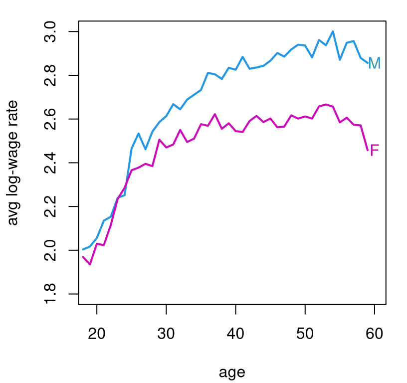
FIGURE 13.14: Average log-wage rate from the 2000 census by age and gender.
Feel free to use that visual as a basis of your own presentation, but note that it does not make use of any model fits/MLR. That’s your job. As always, ensure that your predictions contain error bars to quantify uncertainty.
#11: Education and income
Using the census data from #10, explore the relationship between education
($edu) and log-wage rate. Use the same workers subset, but only use
$edu, a categorical variable, and don’t use any of the other predictors.
That makes this an ANOVA, but I want you to take an MLR approach. Is
education a good predictor of pay? Are all of those education categories
useful? If not, consider combining any that seem indistinct from the
“intercept”. Report on what you find. Provide a prediction, with PI, for
(un-logged) wage rate for each education category.
#12: Combining #10 and #11
Combine your analysis of (log) wage rate based on age, gender, and education. Try to find the best fitting model using the tools you know. Comment on what the data says affects pay. What affects it most/least? Considering that eventually you’ll get older (I hope), but it’s hard to change your gender, what can you do in order to meet your income goals?
#13: All census columns
You might think I was just stretching things out so that I’d have thirteen questions in Chapter 13. Perhaps I was, subconsciously.
Now, use all of the columns of the census data. That means additionally
incorporate $marital and $race. Look back at #12 and answer the same
questions about what affects pay, and what you can control.
Hint: one thing that makes this question challenging is that not all
categories of $marital and $race are “useful”. They’re too granular.
##            race
## marital     Asian Black NativeAmerican Other White
##   Divorced     54   334             27   176  2467
##   Married     531  1004            109   907 12387
##   Separated    55   257             10   186   710
##   Single      218   930             47   552  4154
##   Widow         5    61              3    19   200
This is especially so when combined with the eight categories of $edu.
Explore reducing the number of categories by combining some of them. For
example, it may be easy to justify combining “Divorced” and “Separated”
categories. Only do that if it also makes sense statistically.
References
lars: Least Angle Regression, Lasso and Forward Stagewise. https://doi.org/10.32614/CRAN.package.lars.
nlme: Linear and Nonlinear Mixed Effects Models. https://doi.org/10.32614/CRAN.package.nlme.